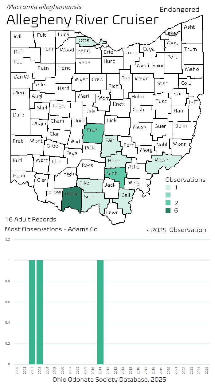
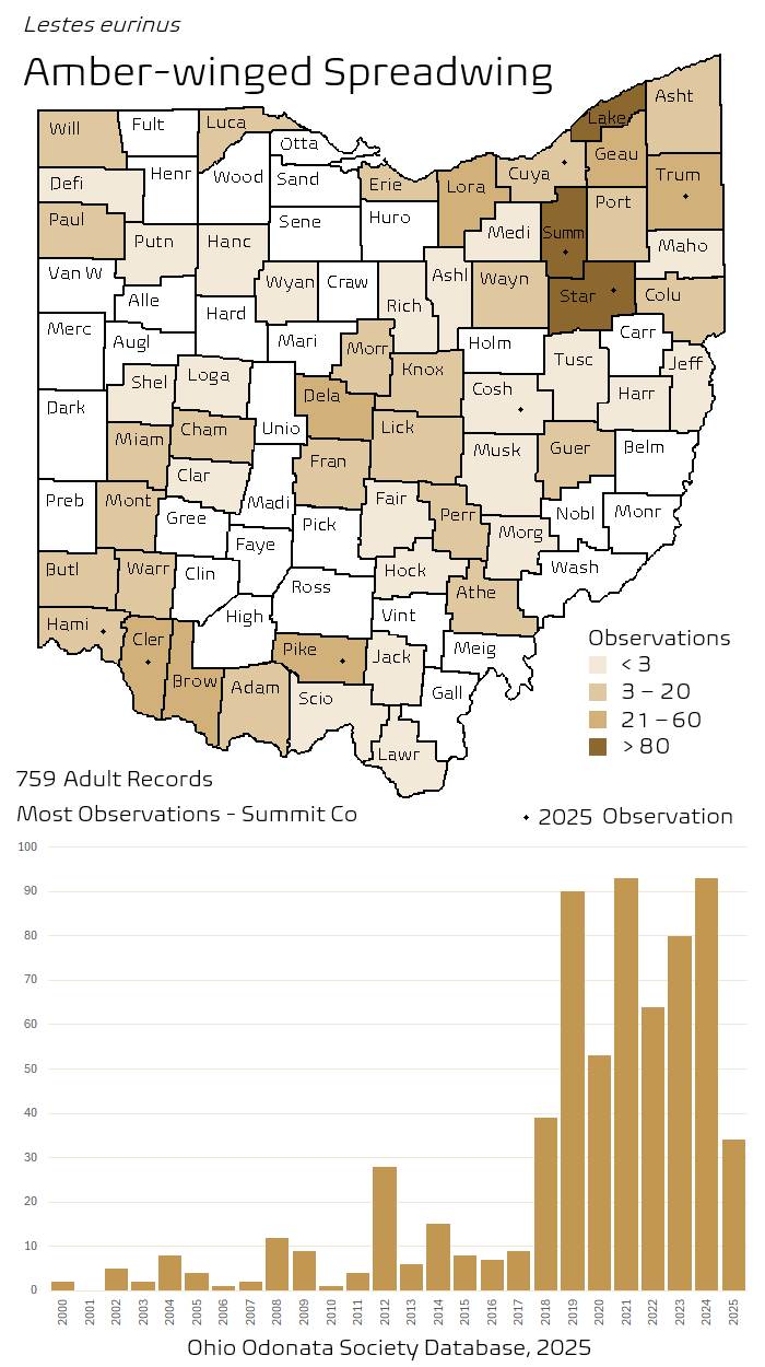
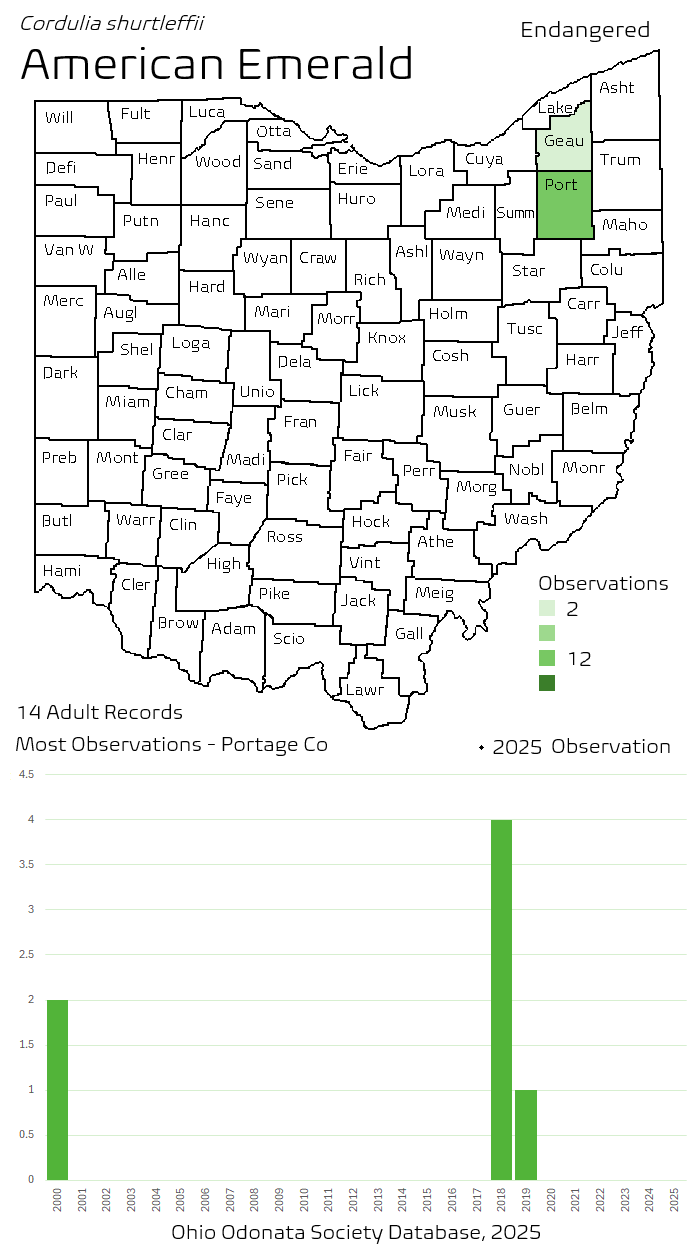
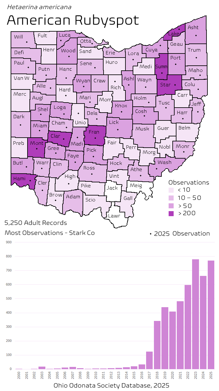
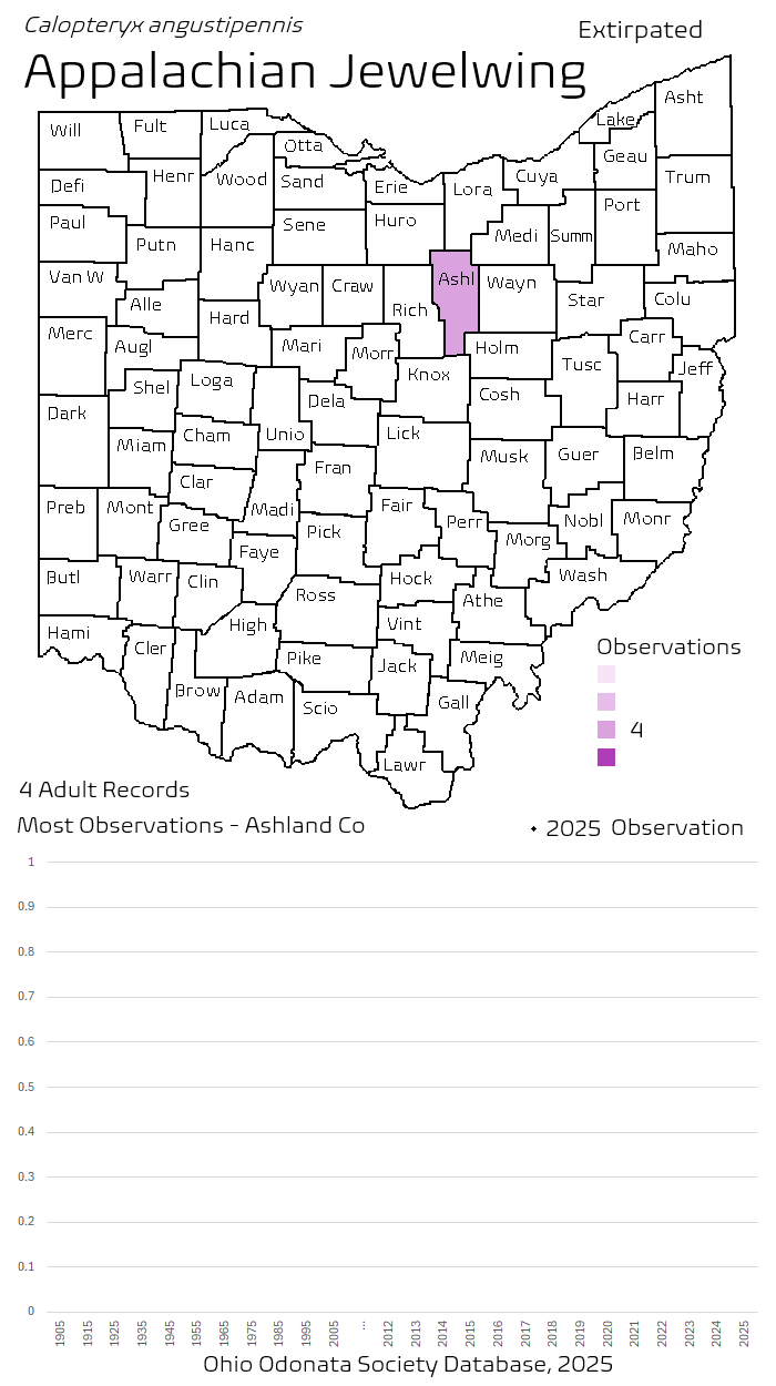
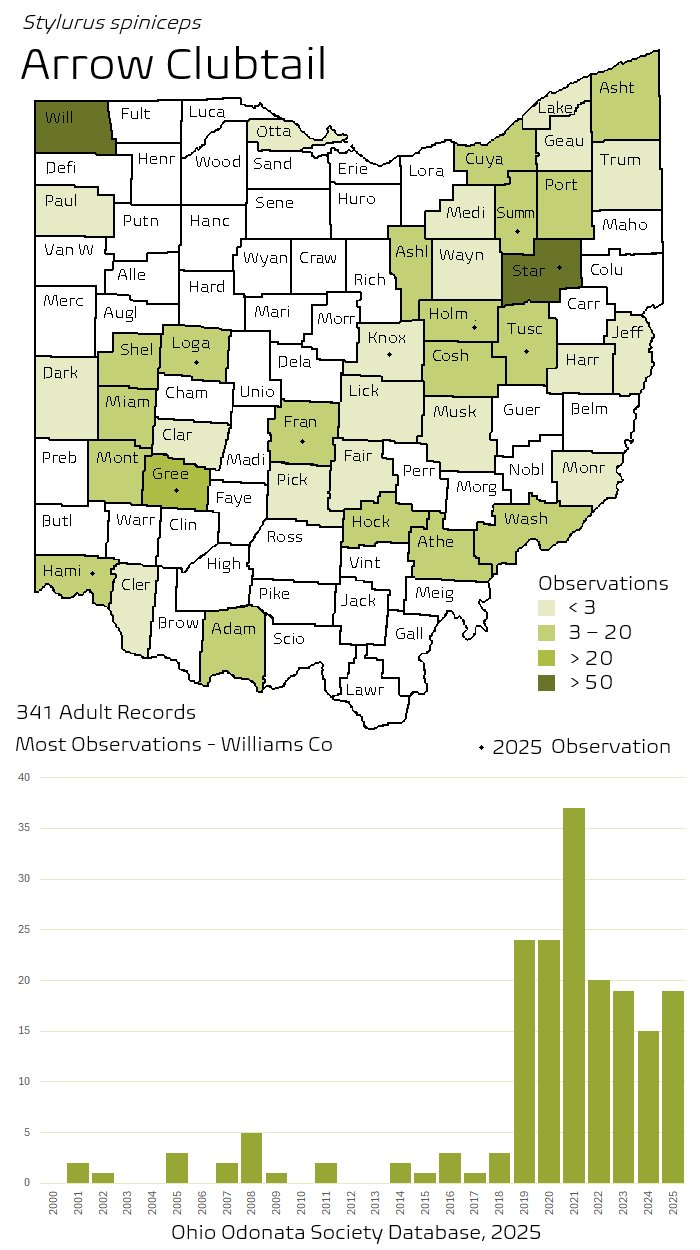
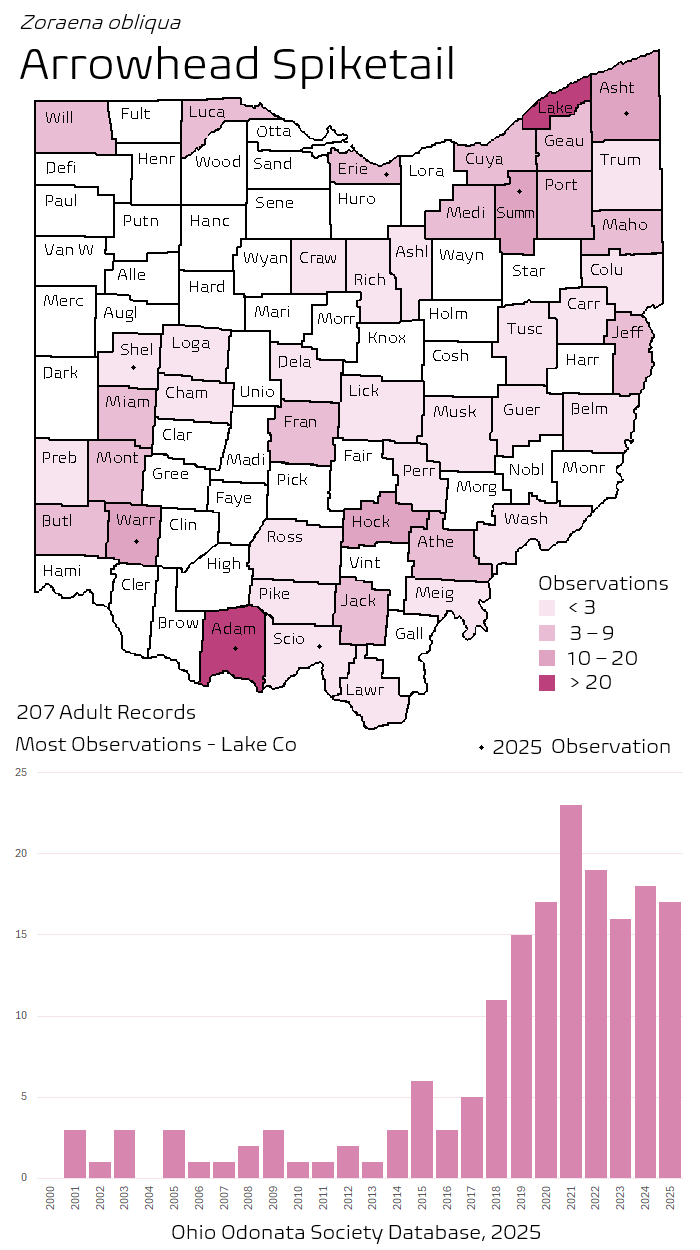
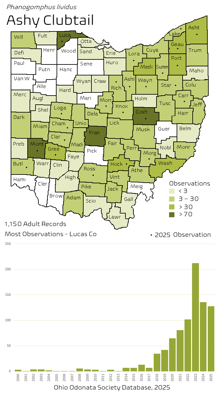
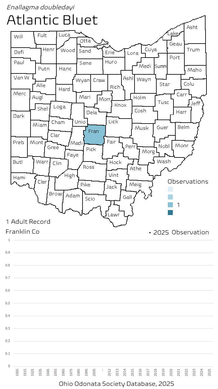
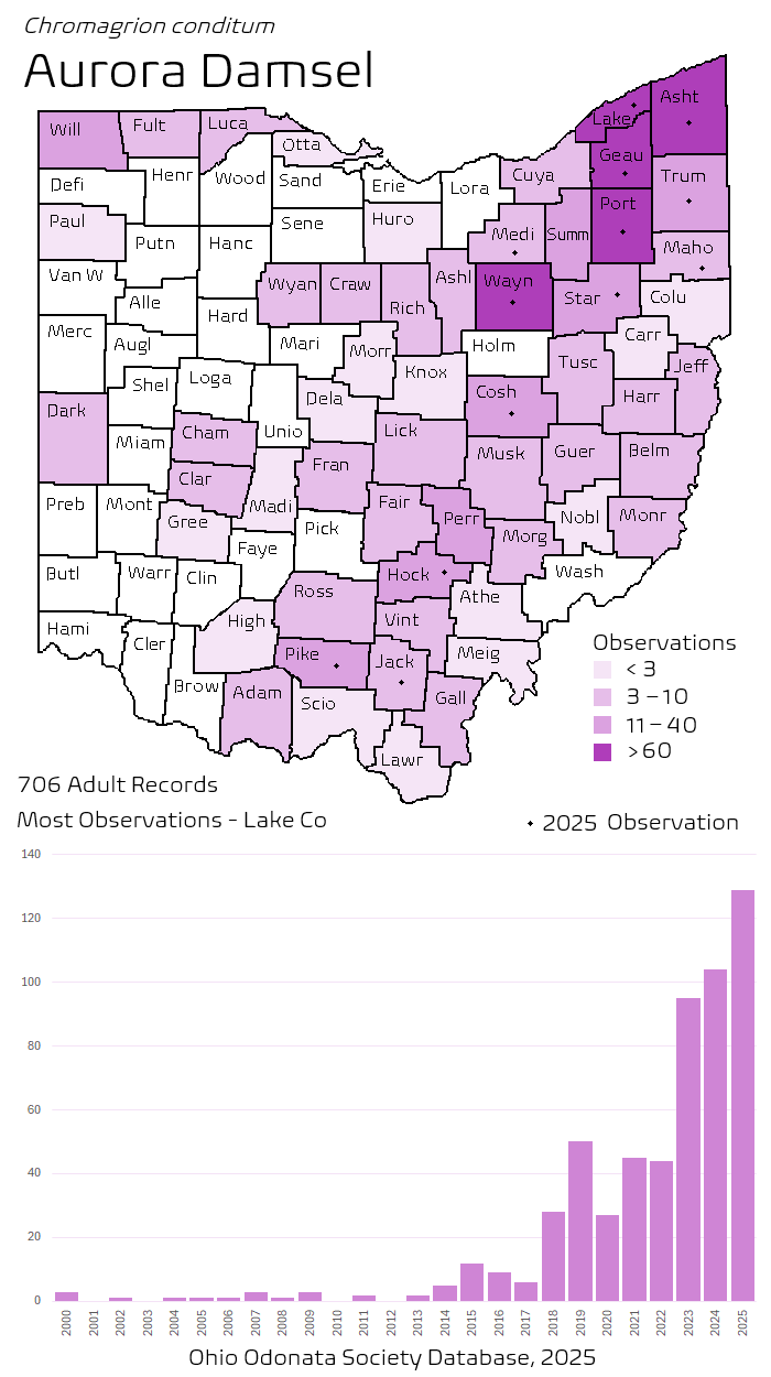
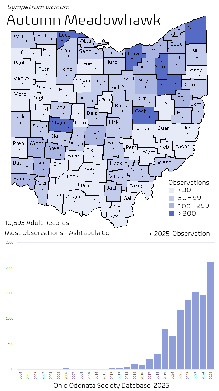
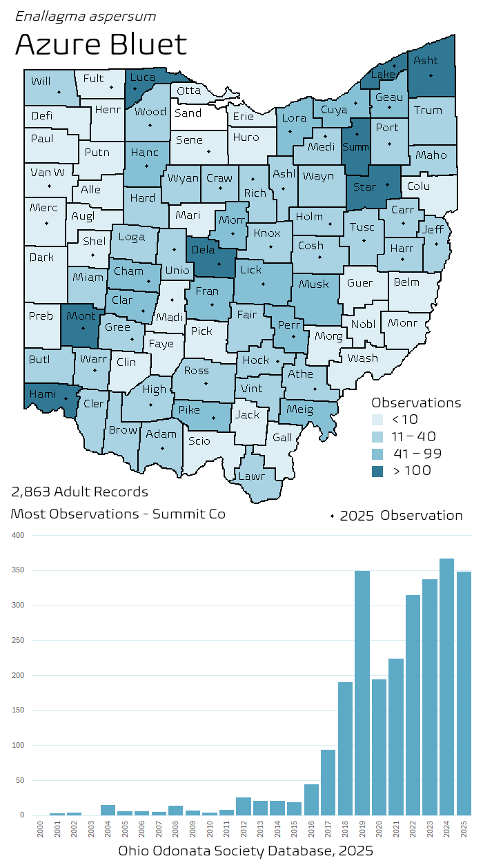
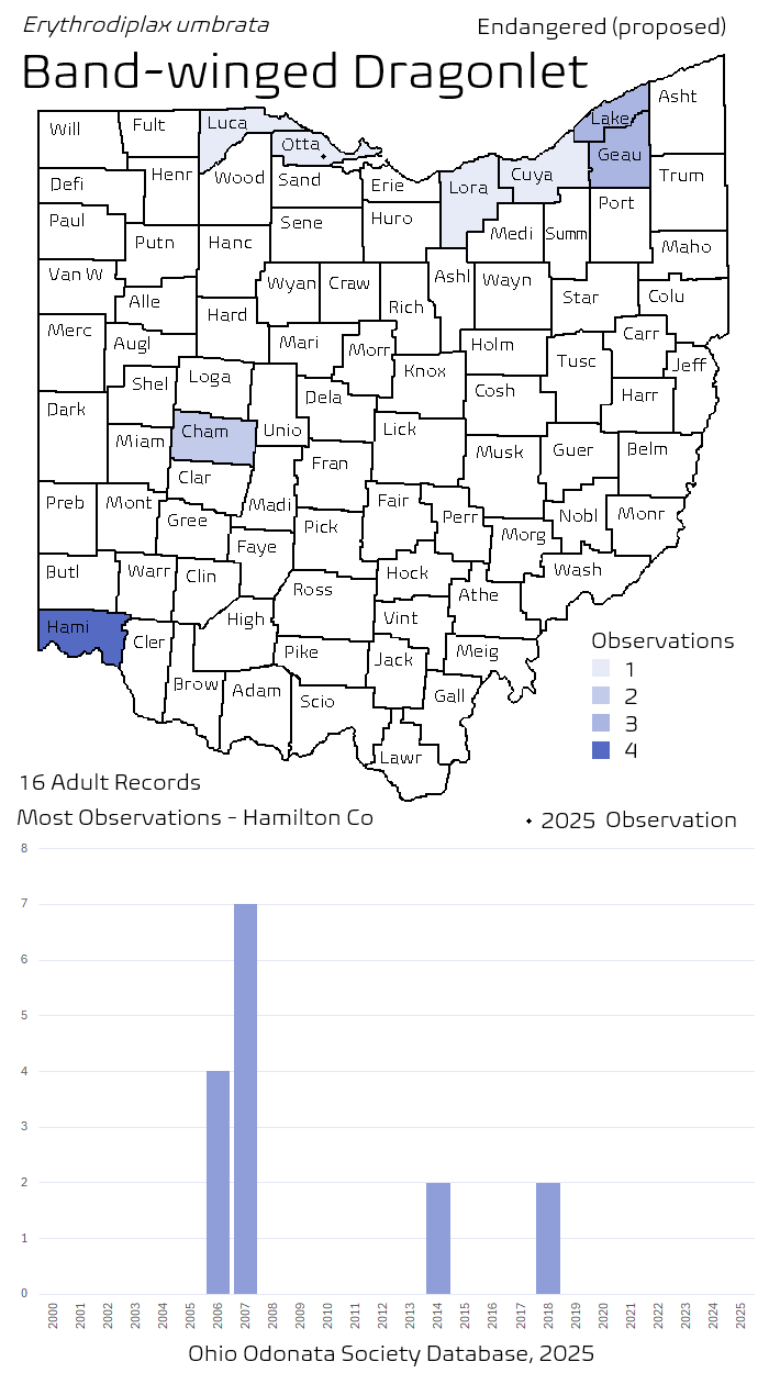
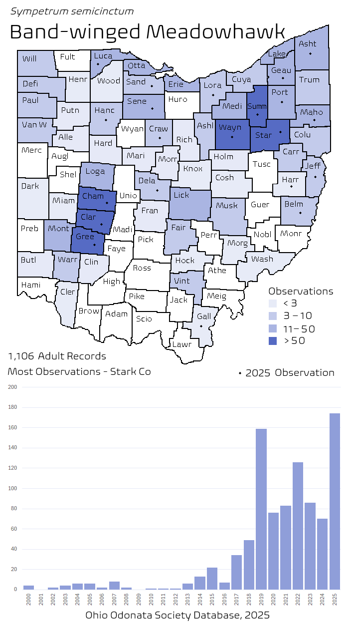
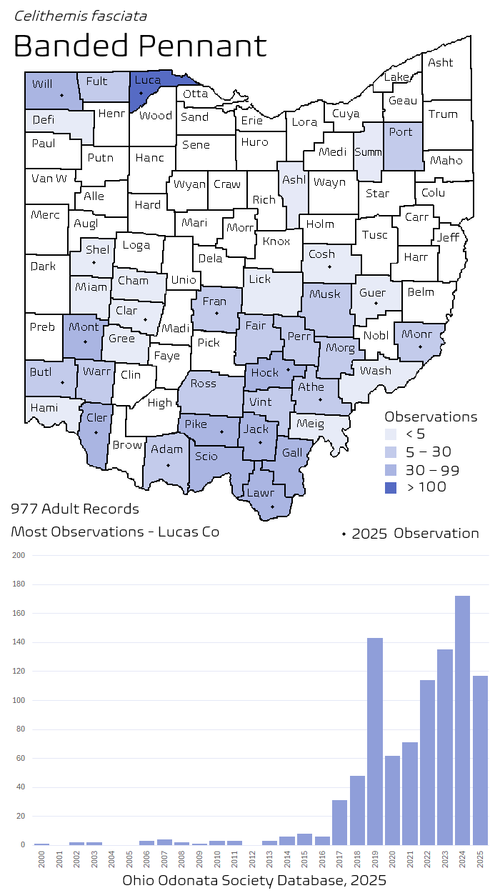
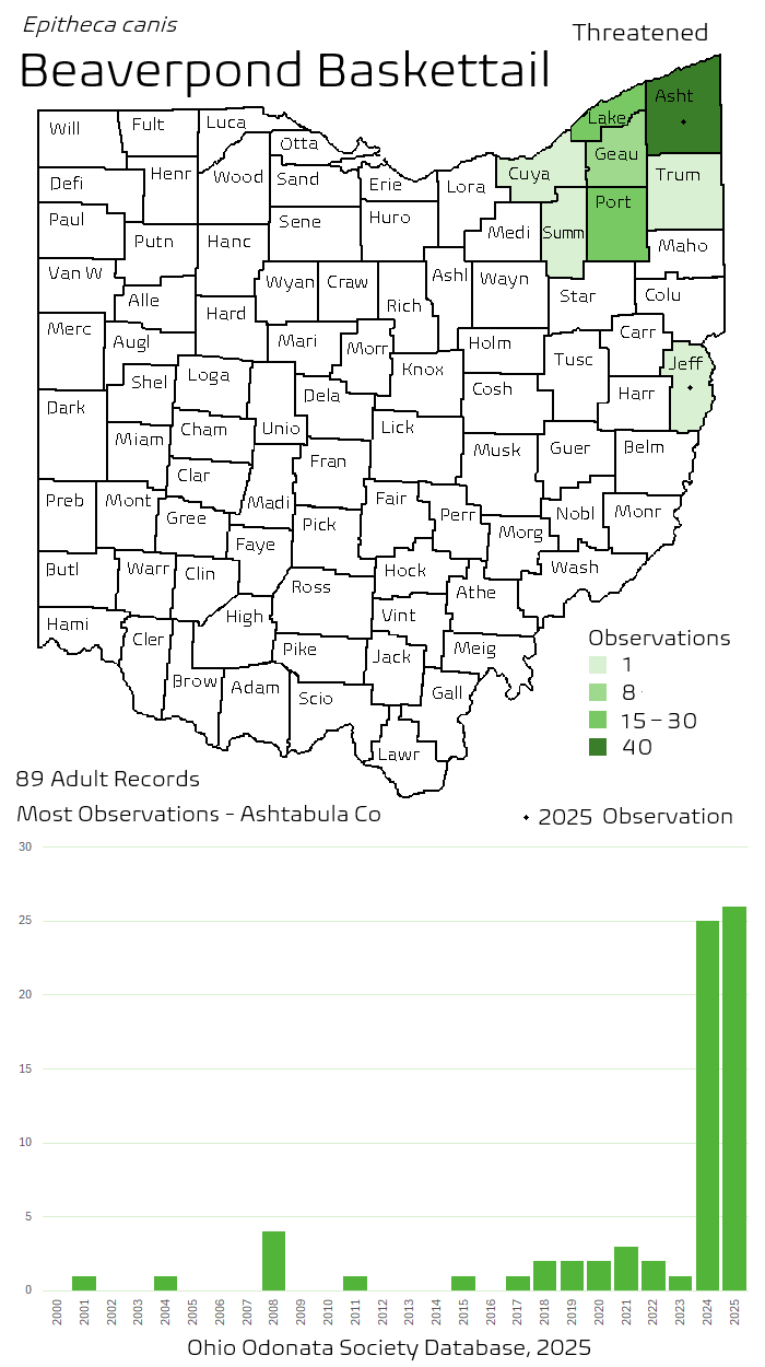
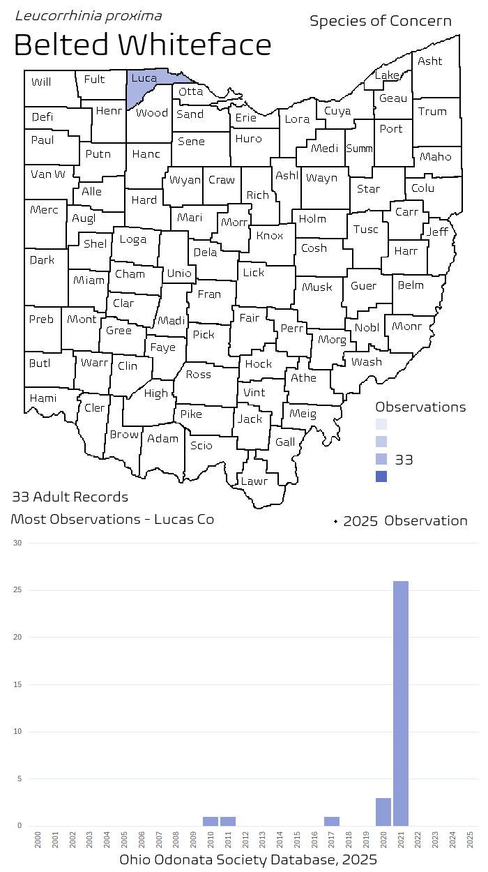
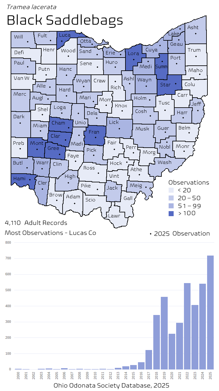
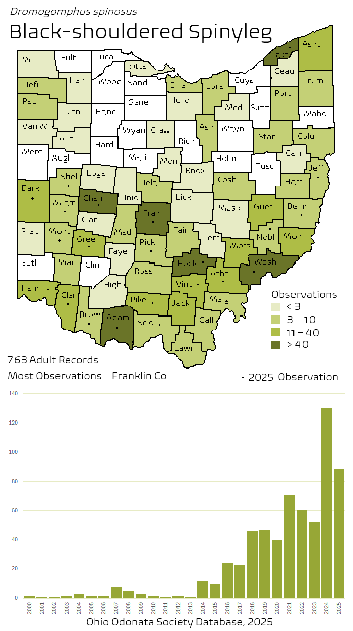
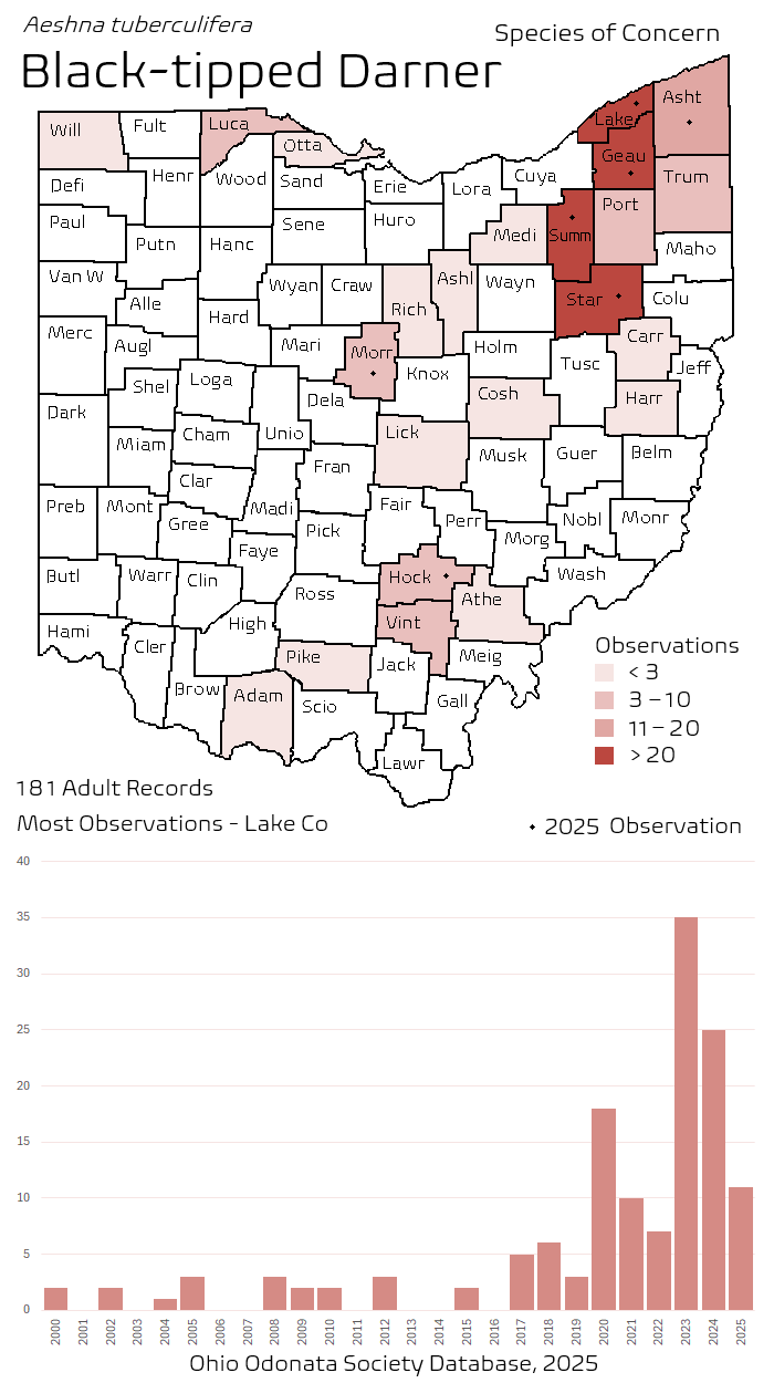
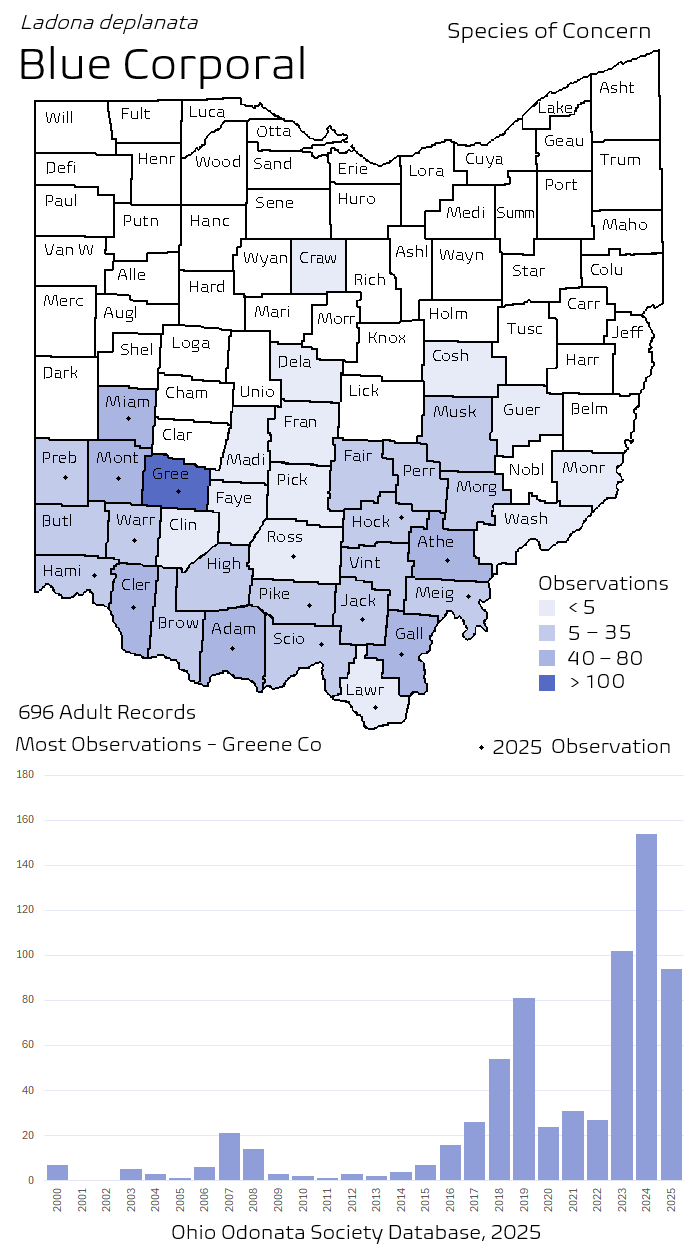
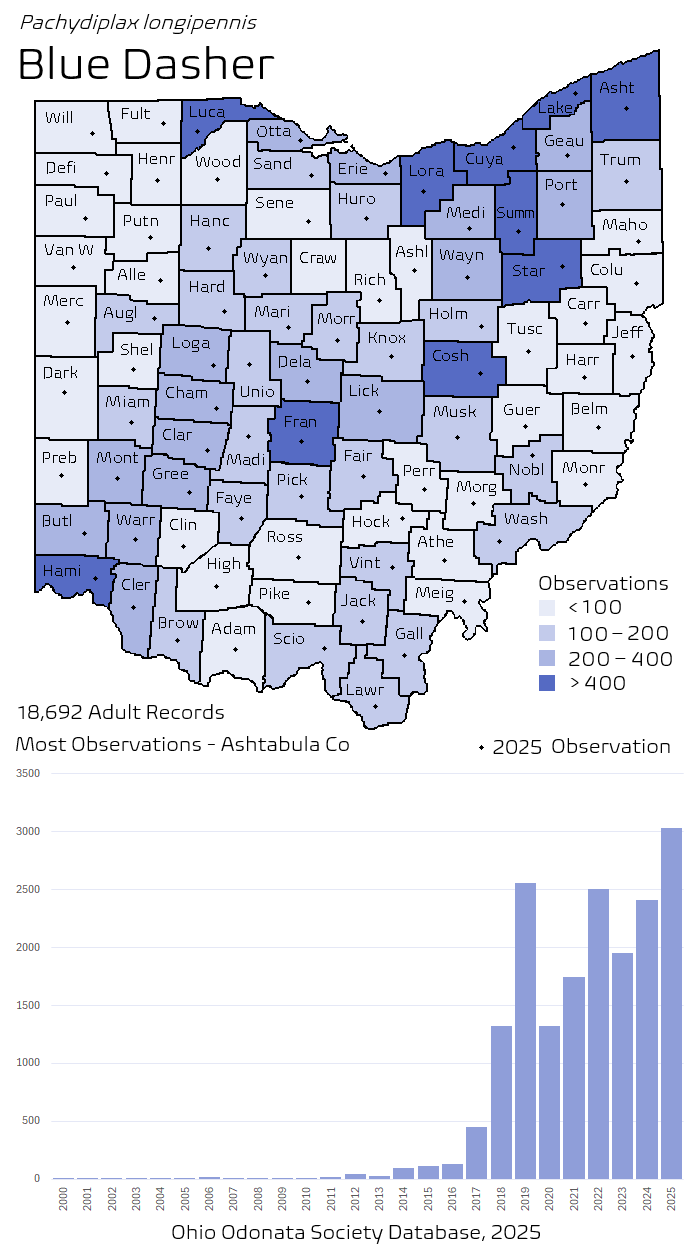
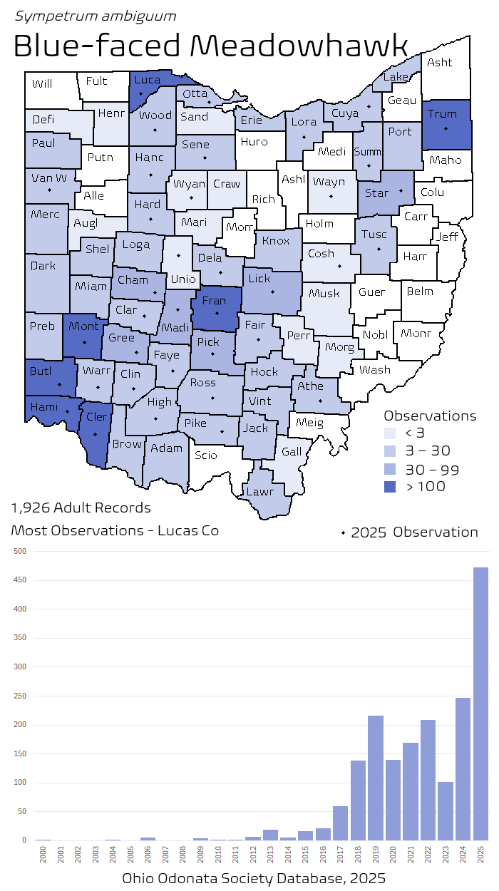
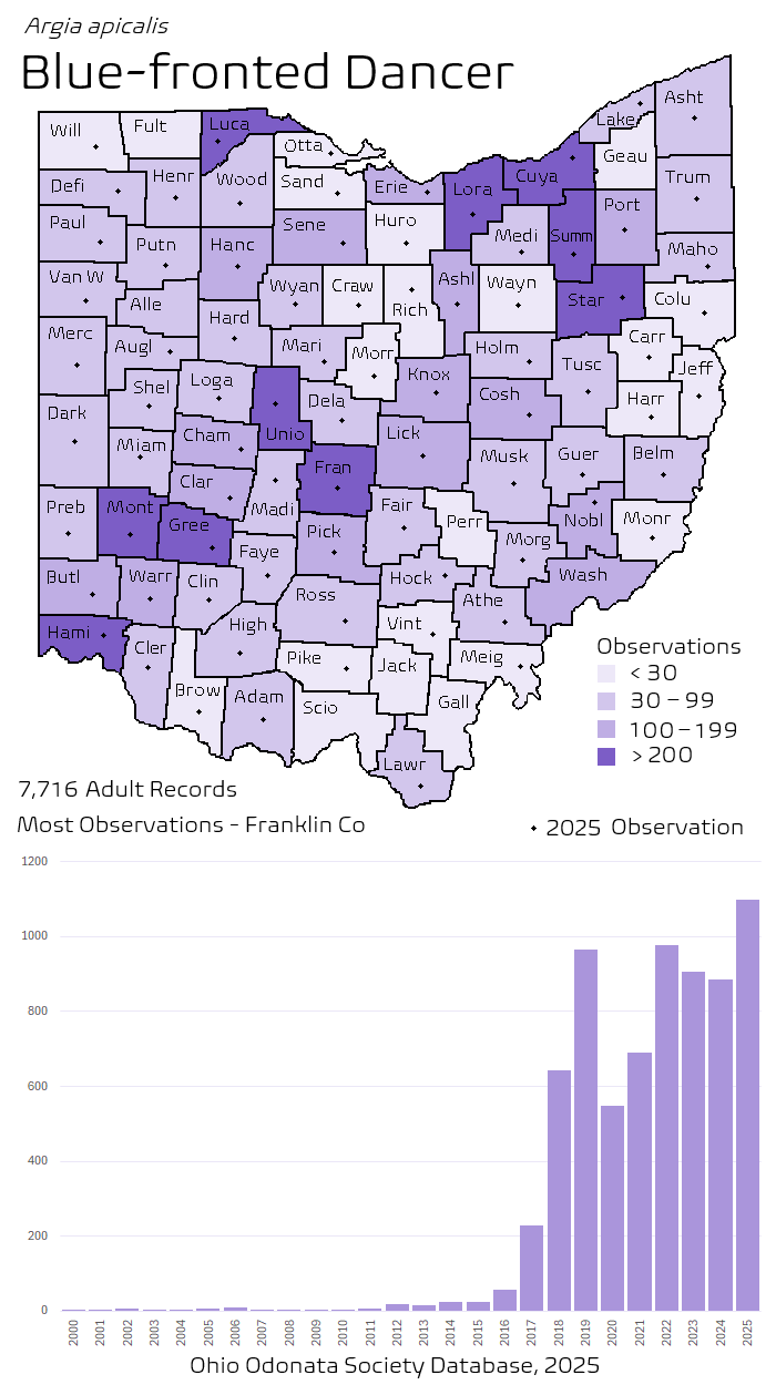
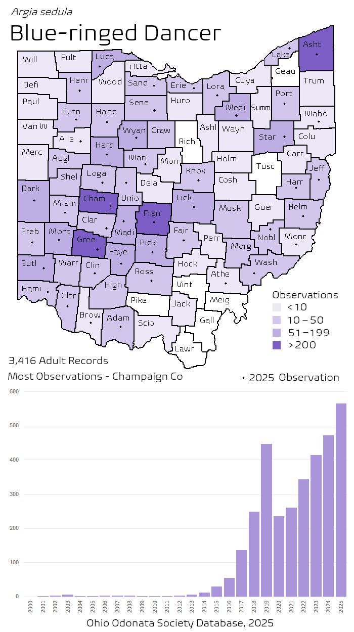
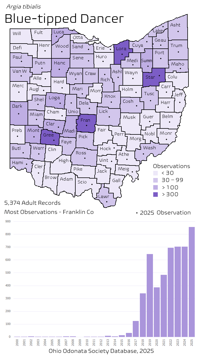
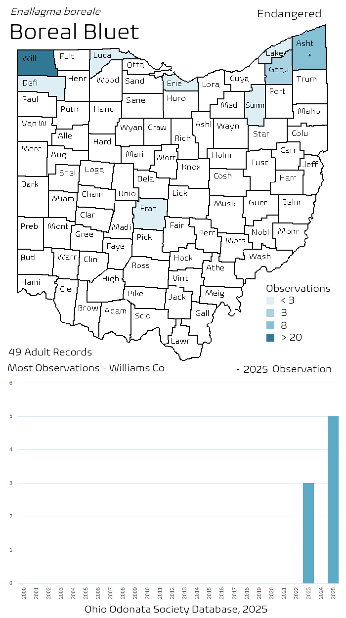
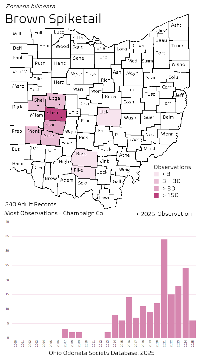
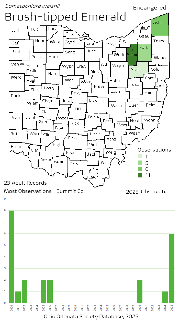
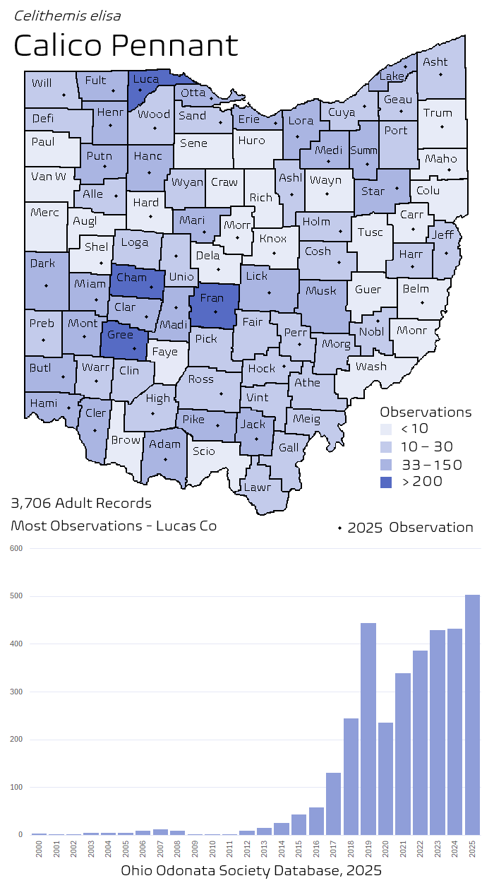
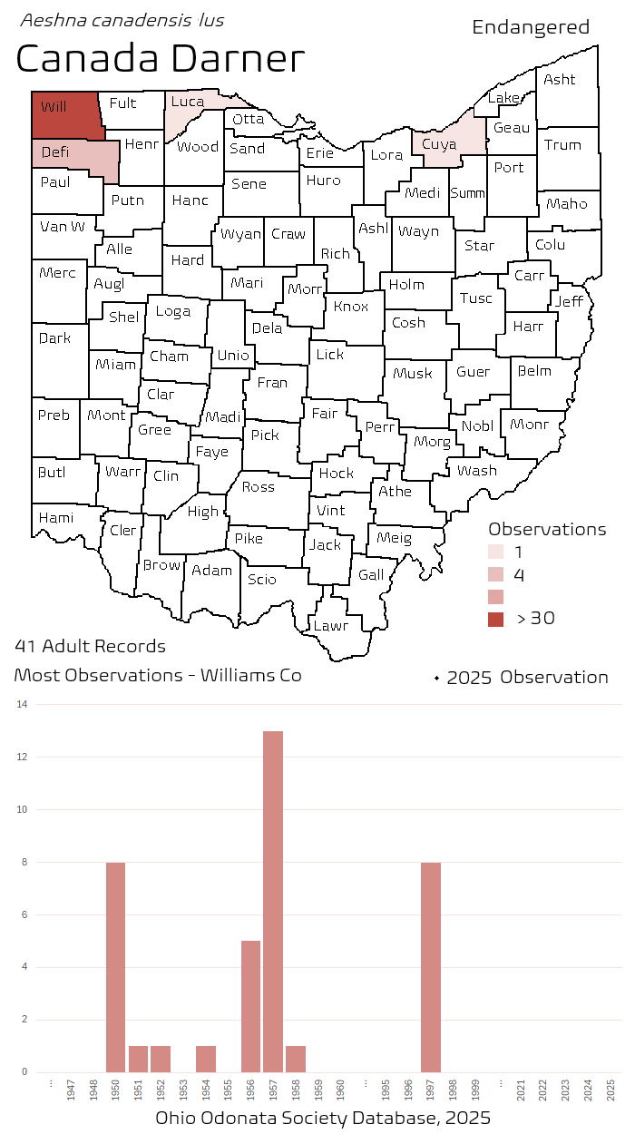
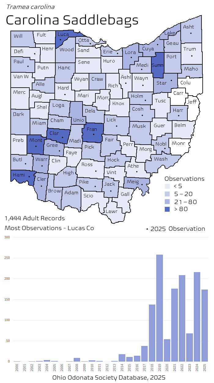
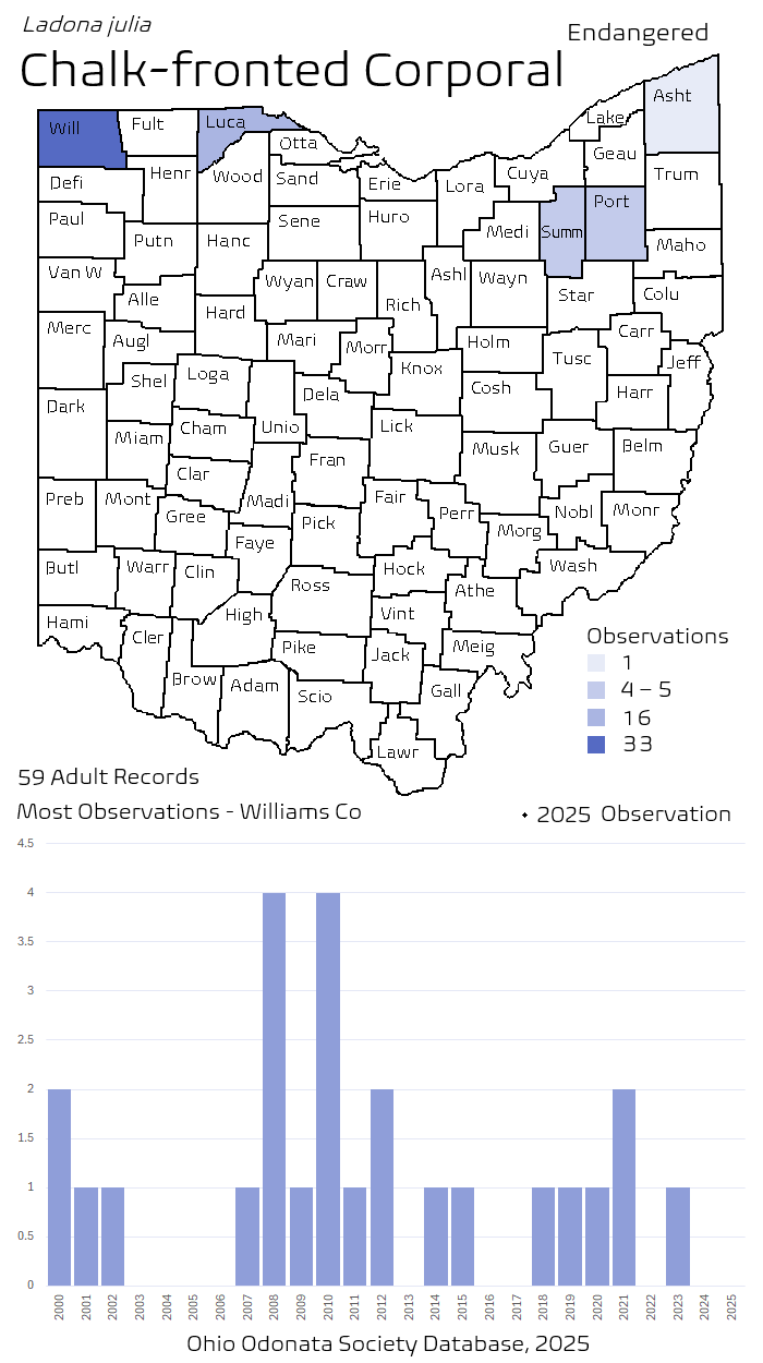
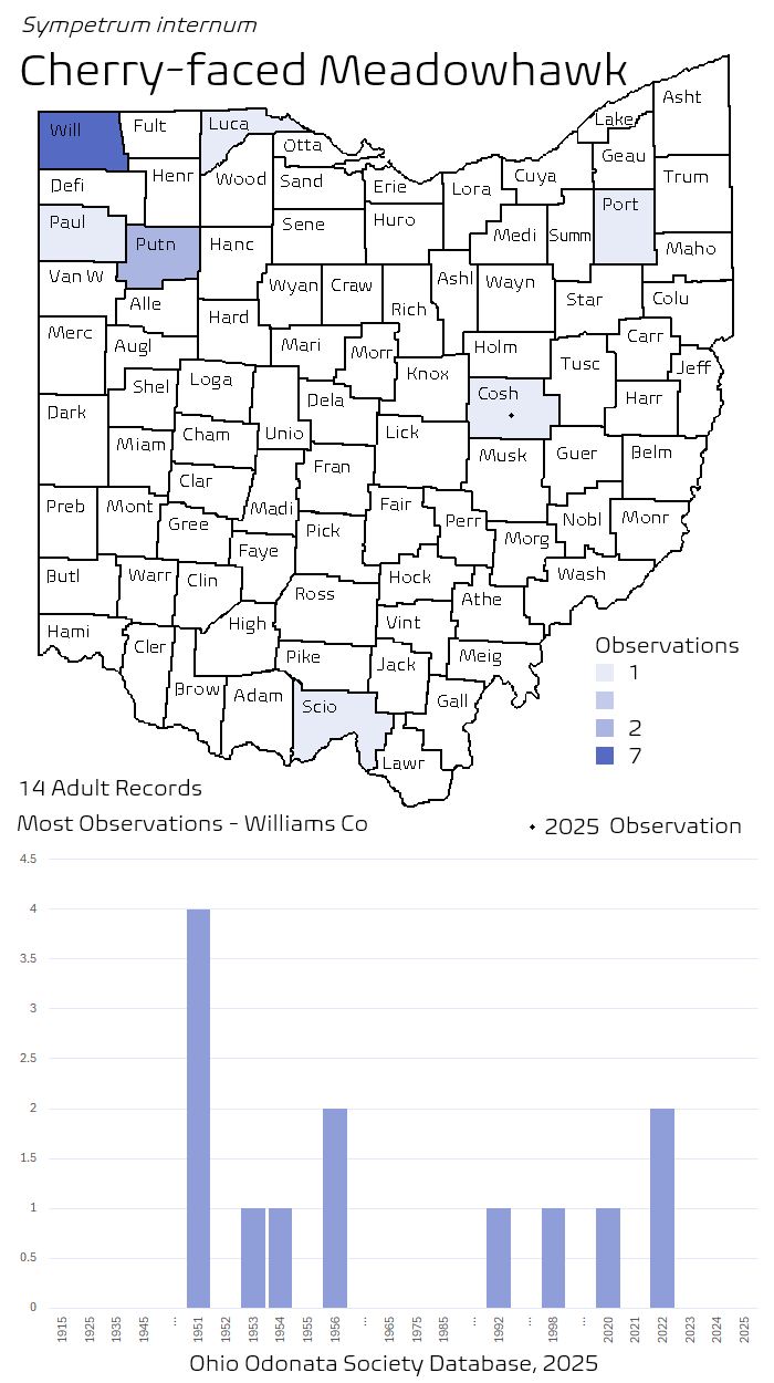
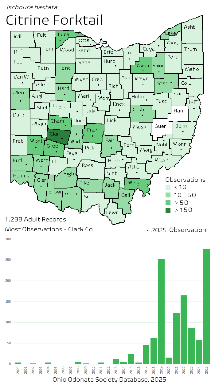
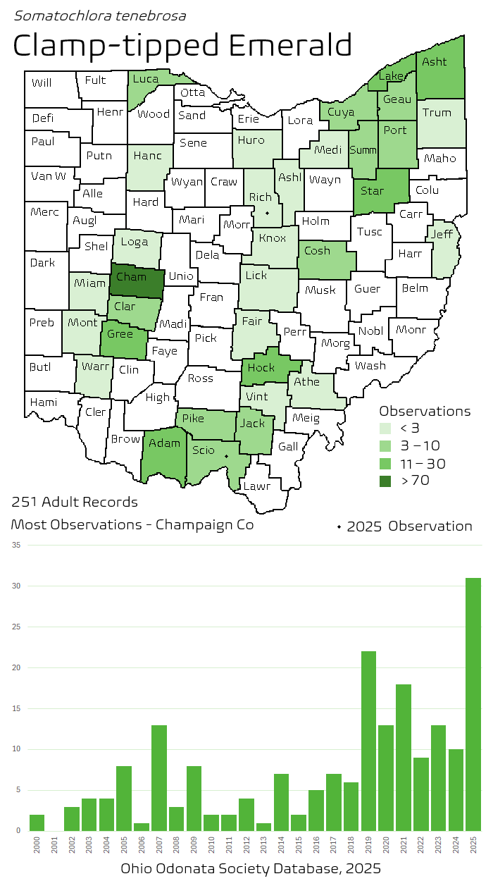
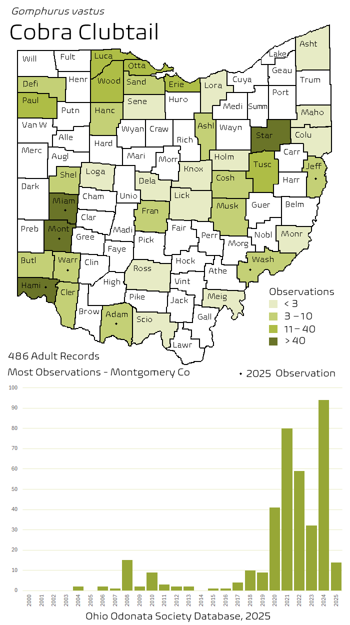
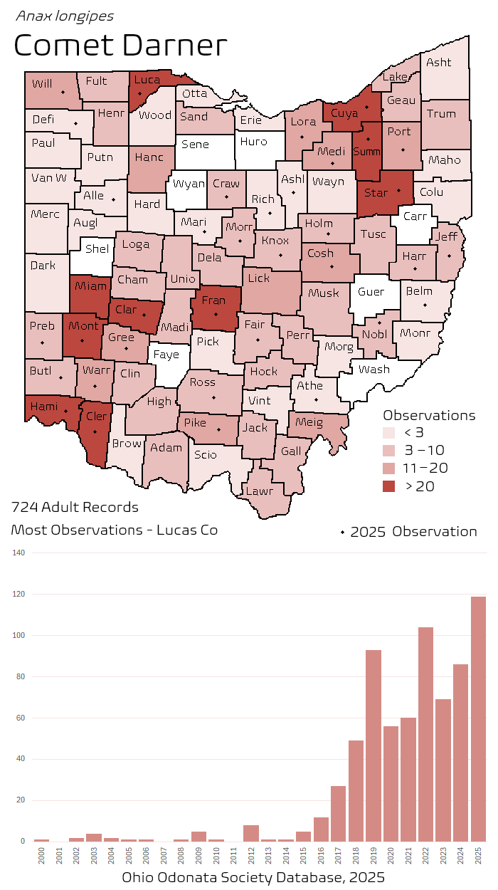
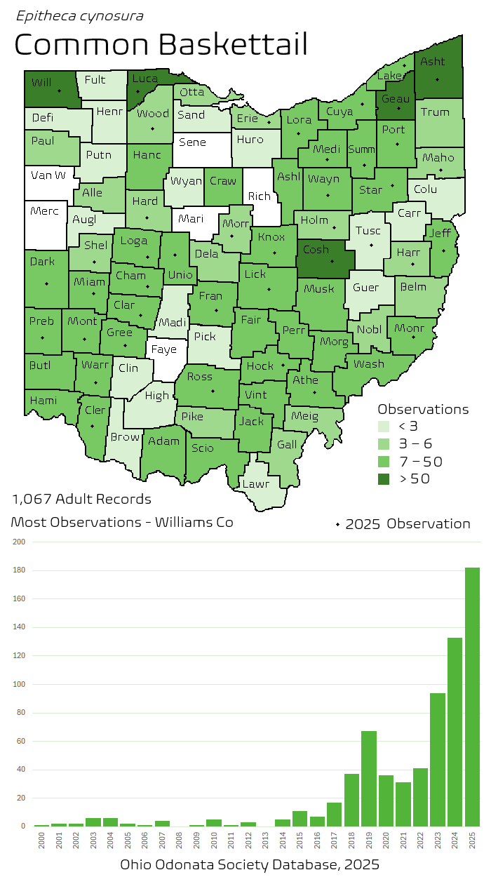
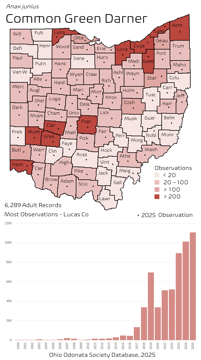
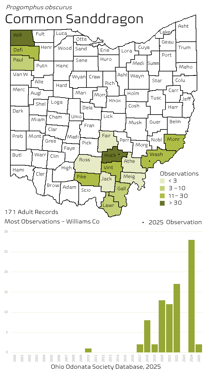
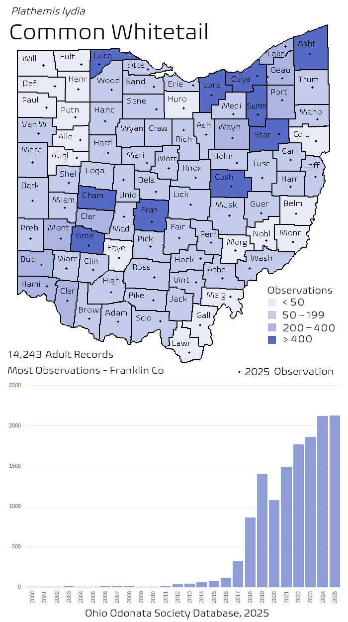
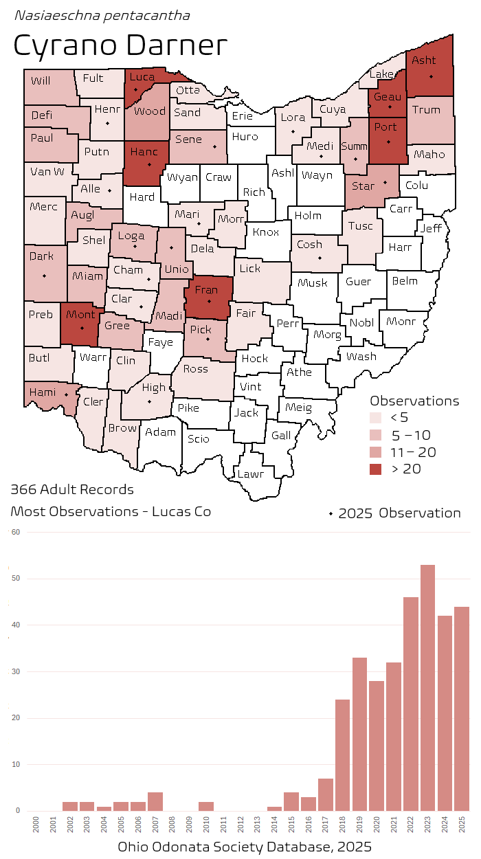
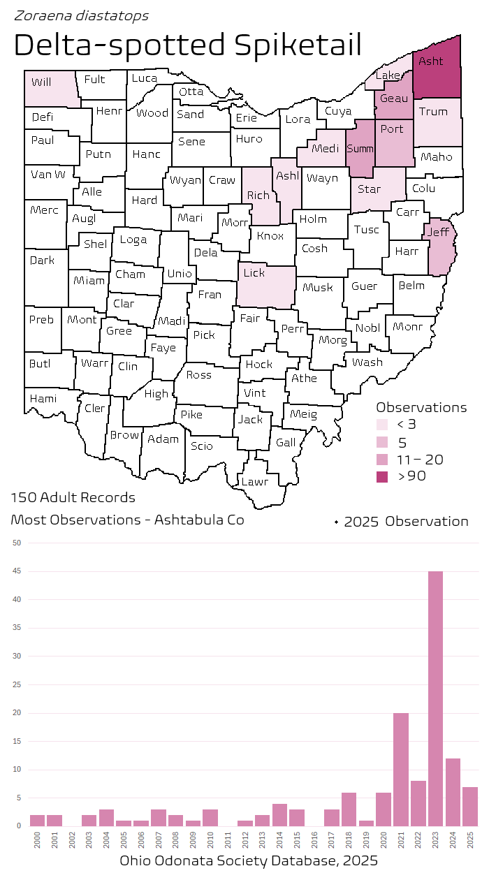
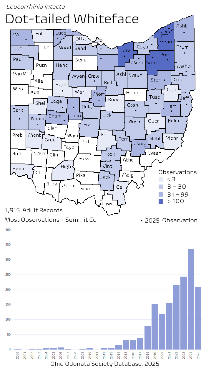
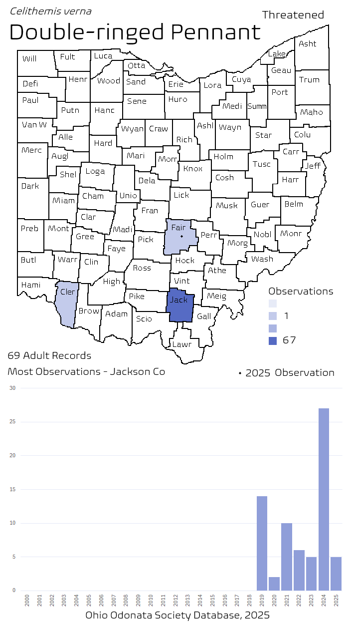
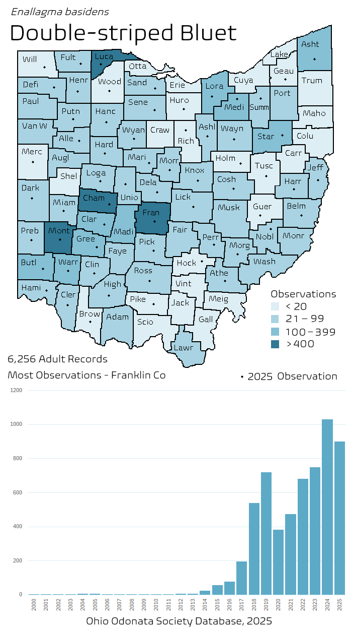
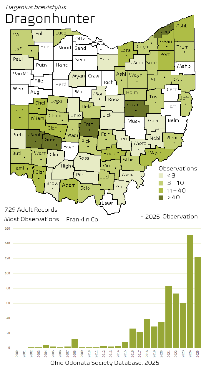
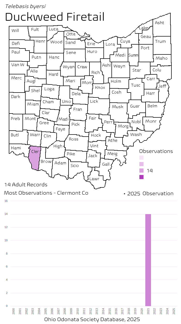
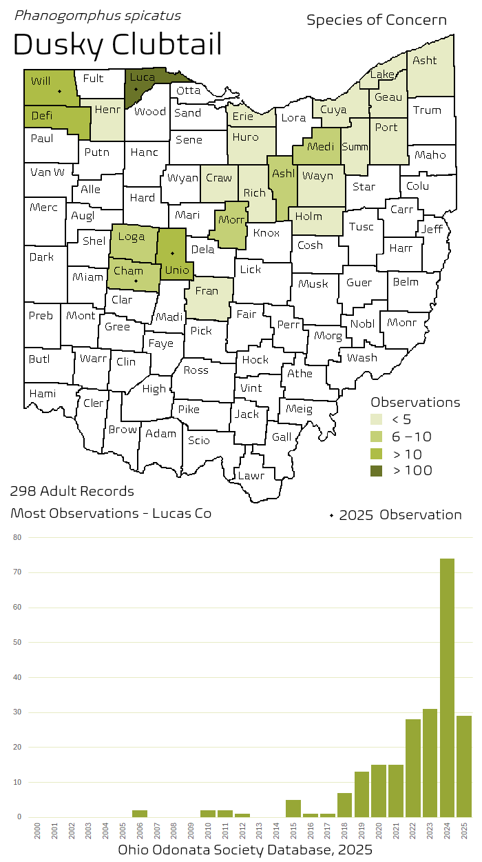
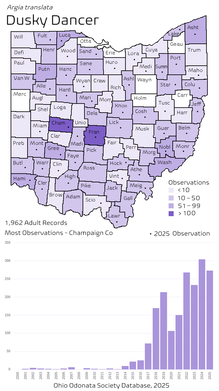
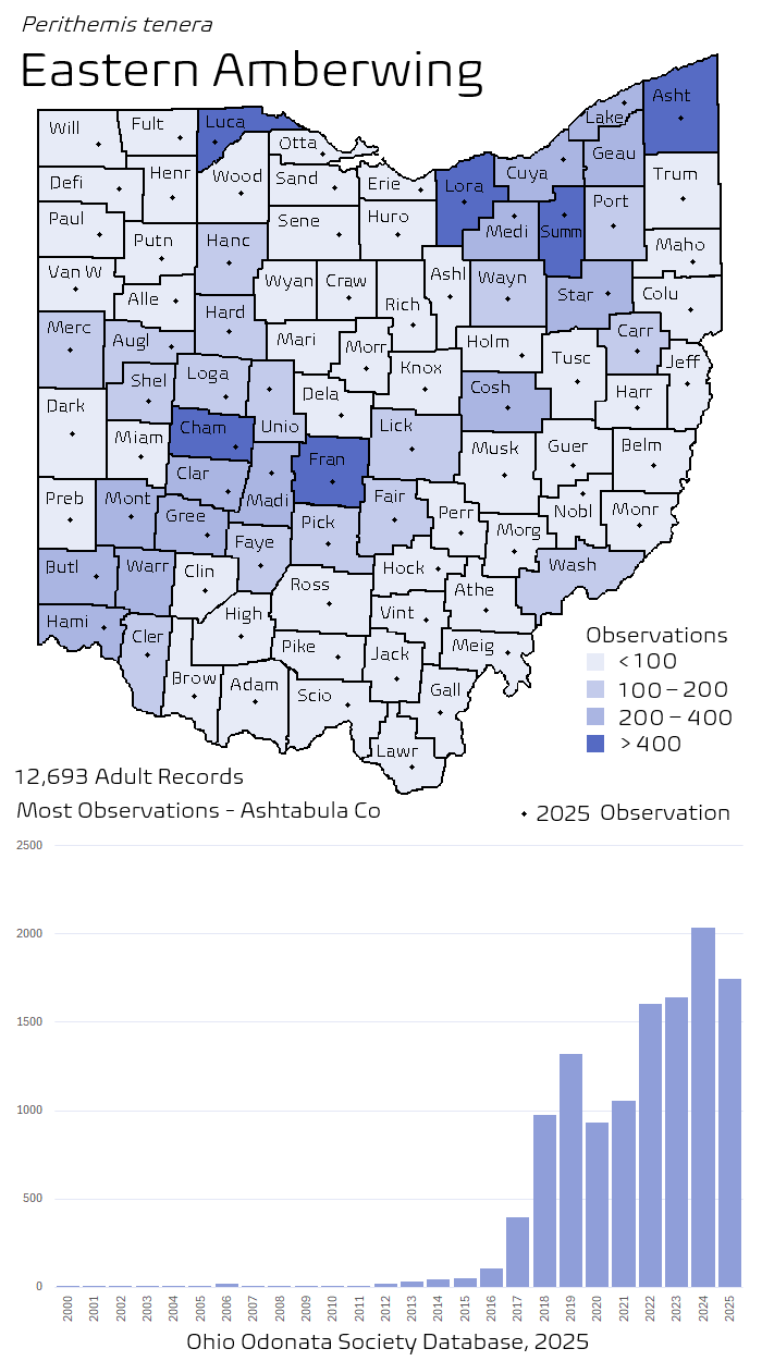
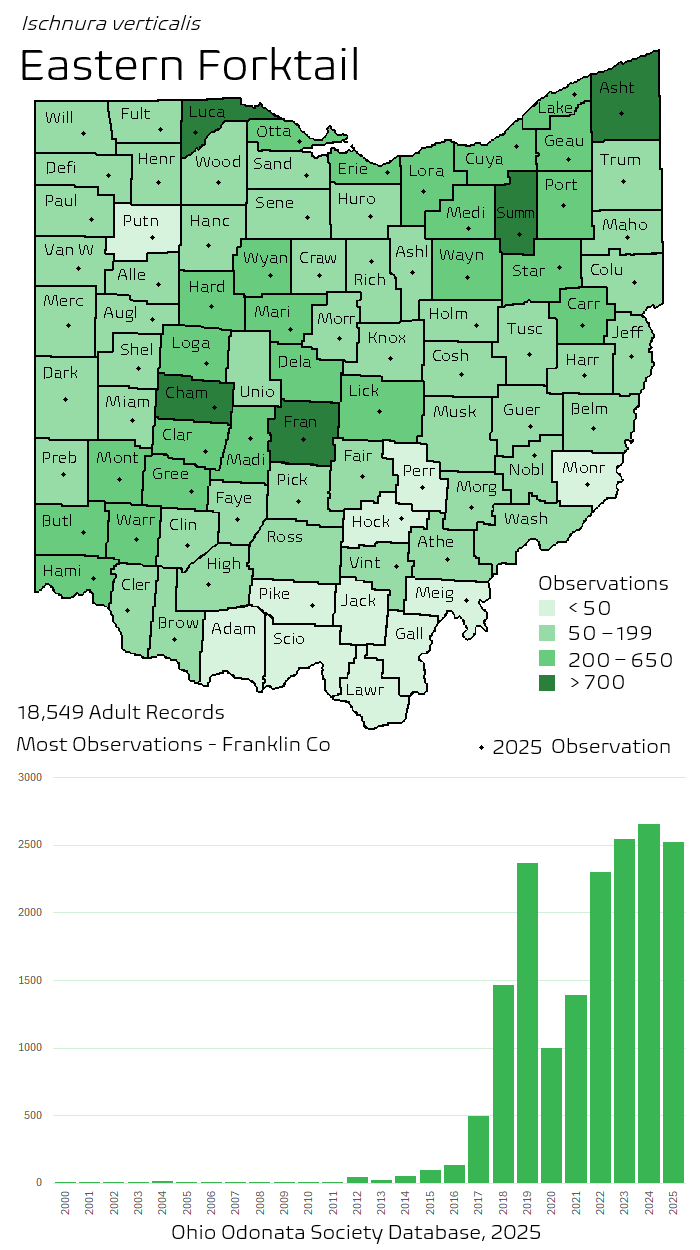
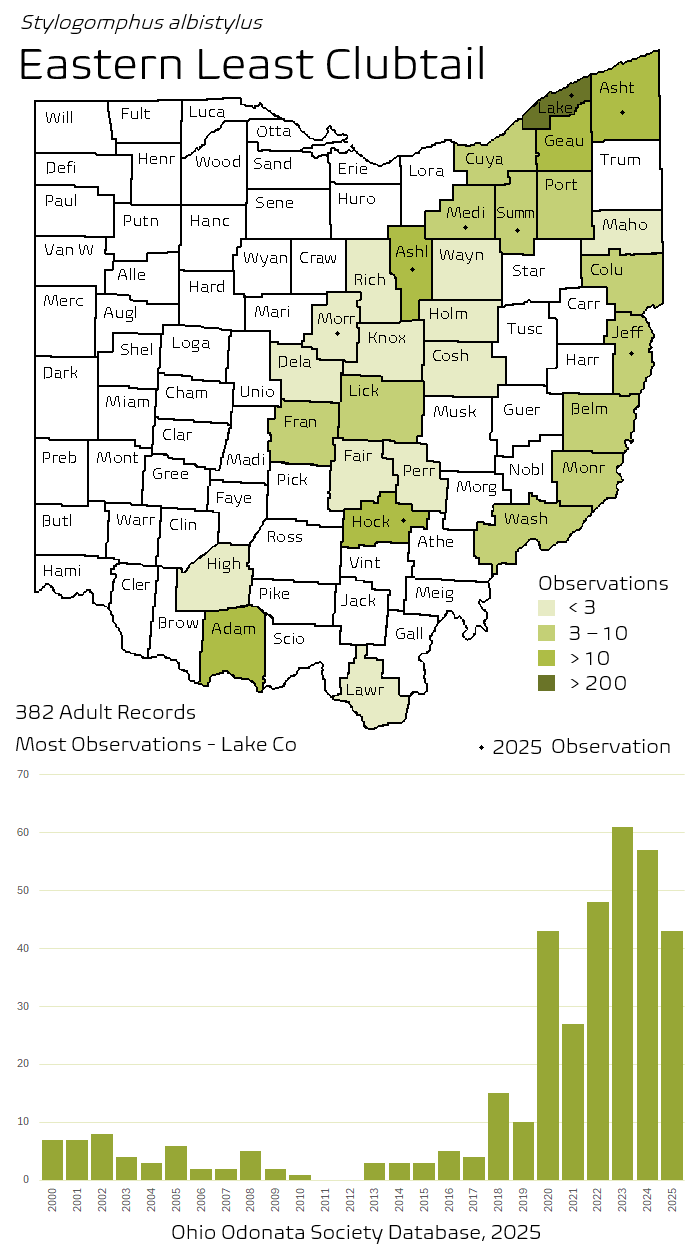
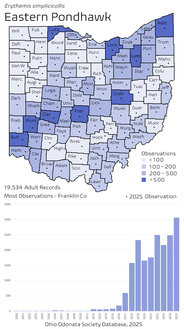
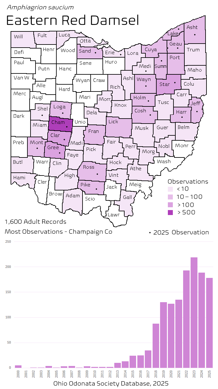
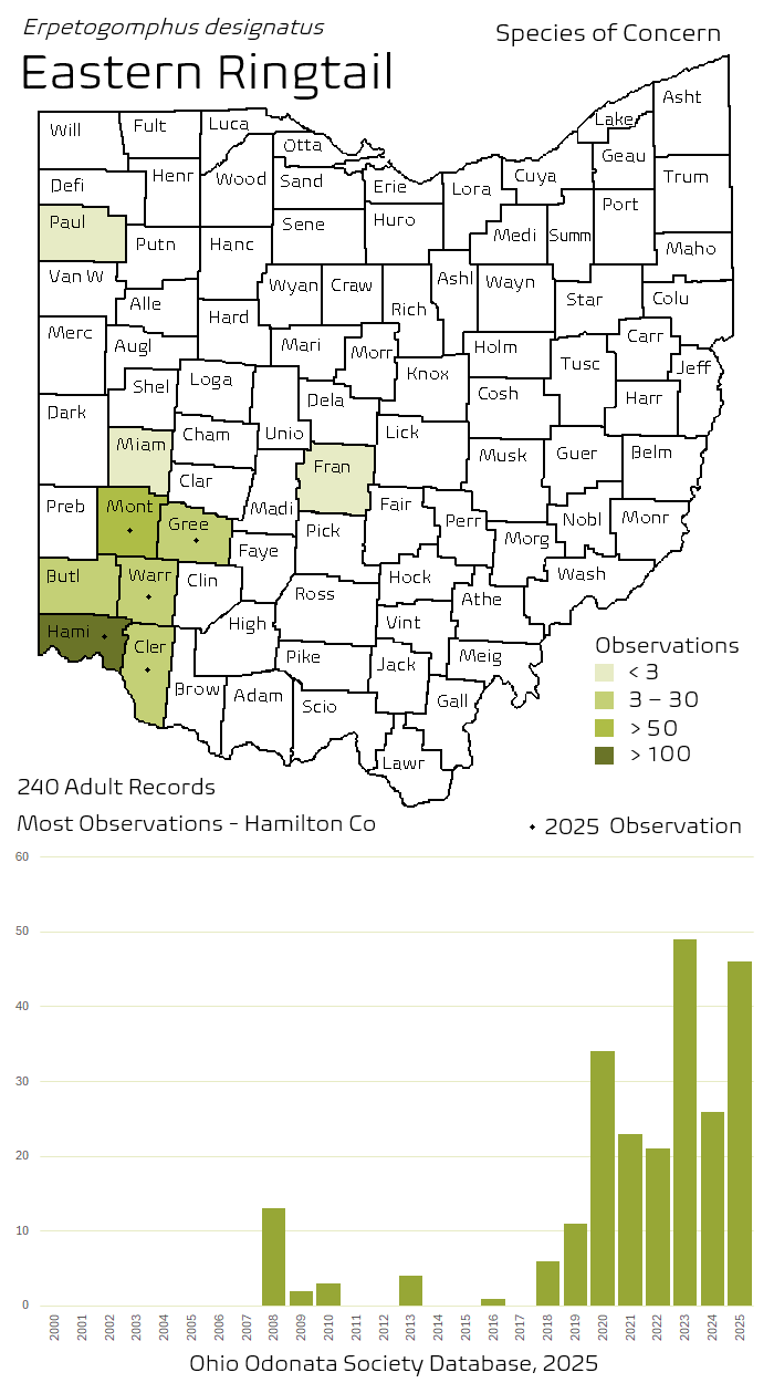
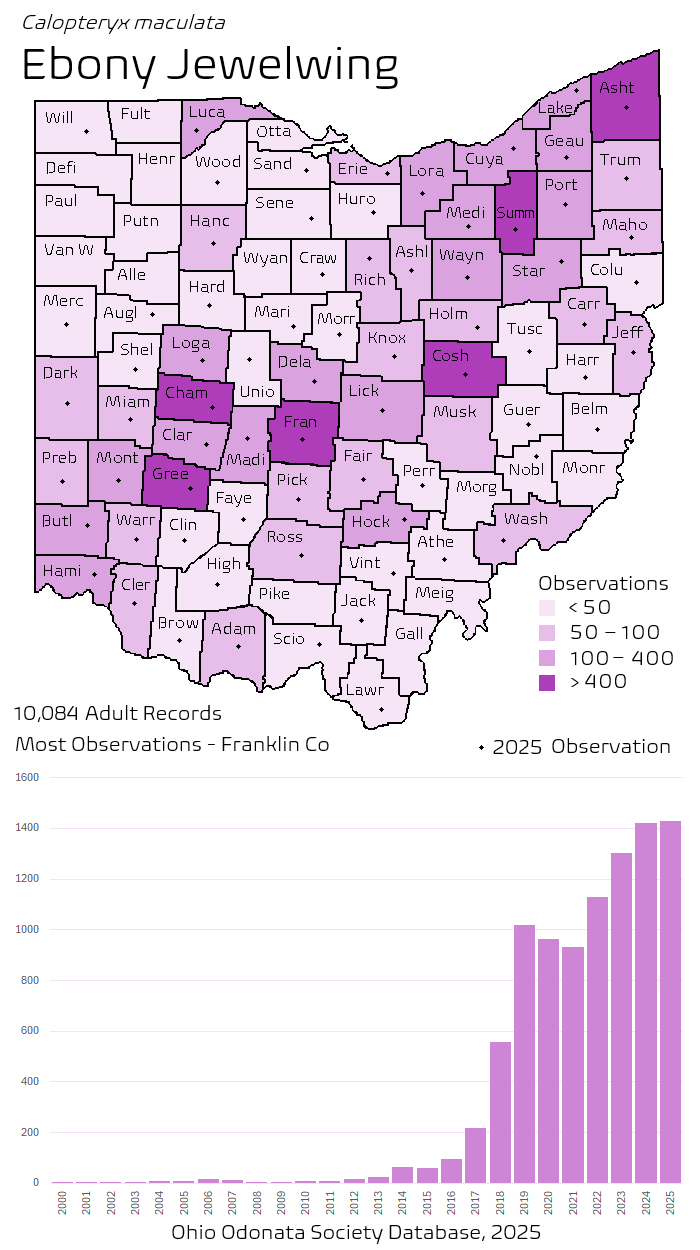
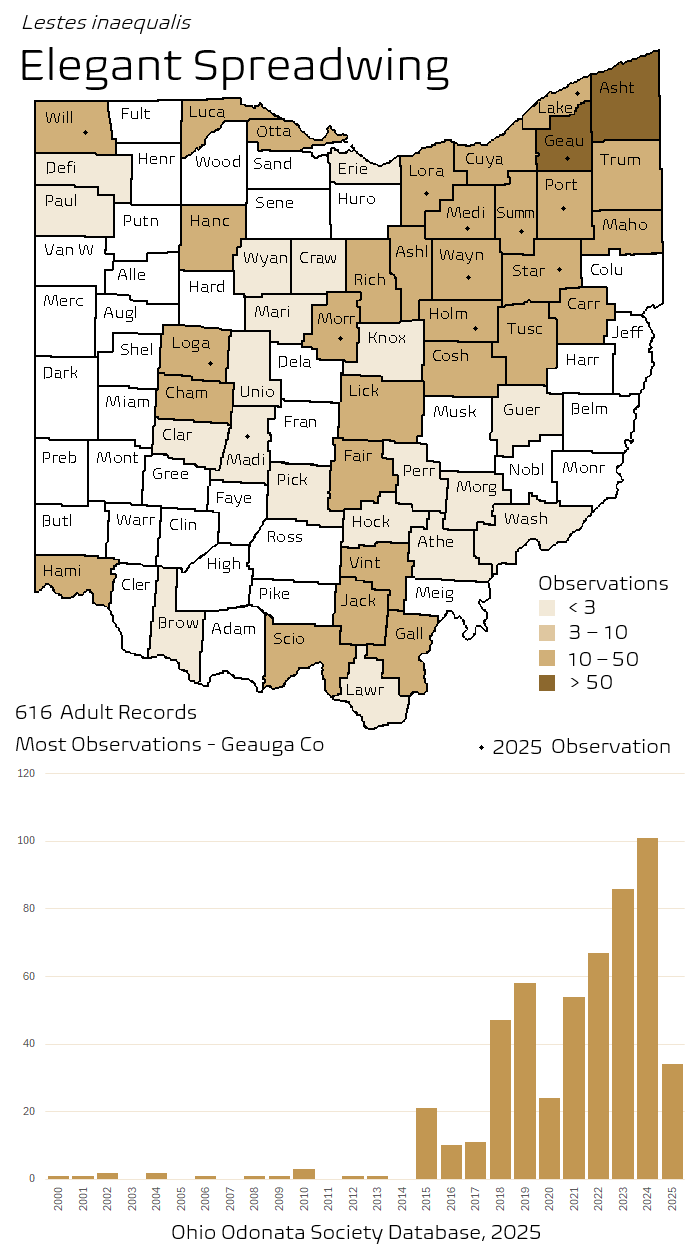
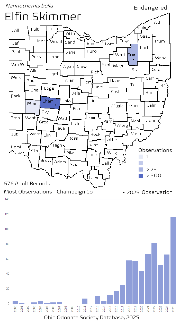
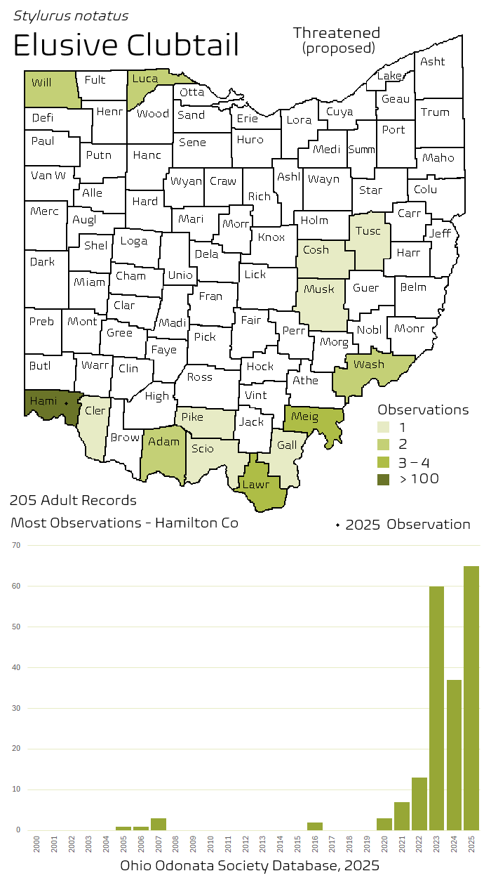
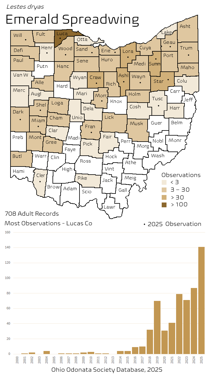
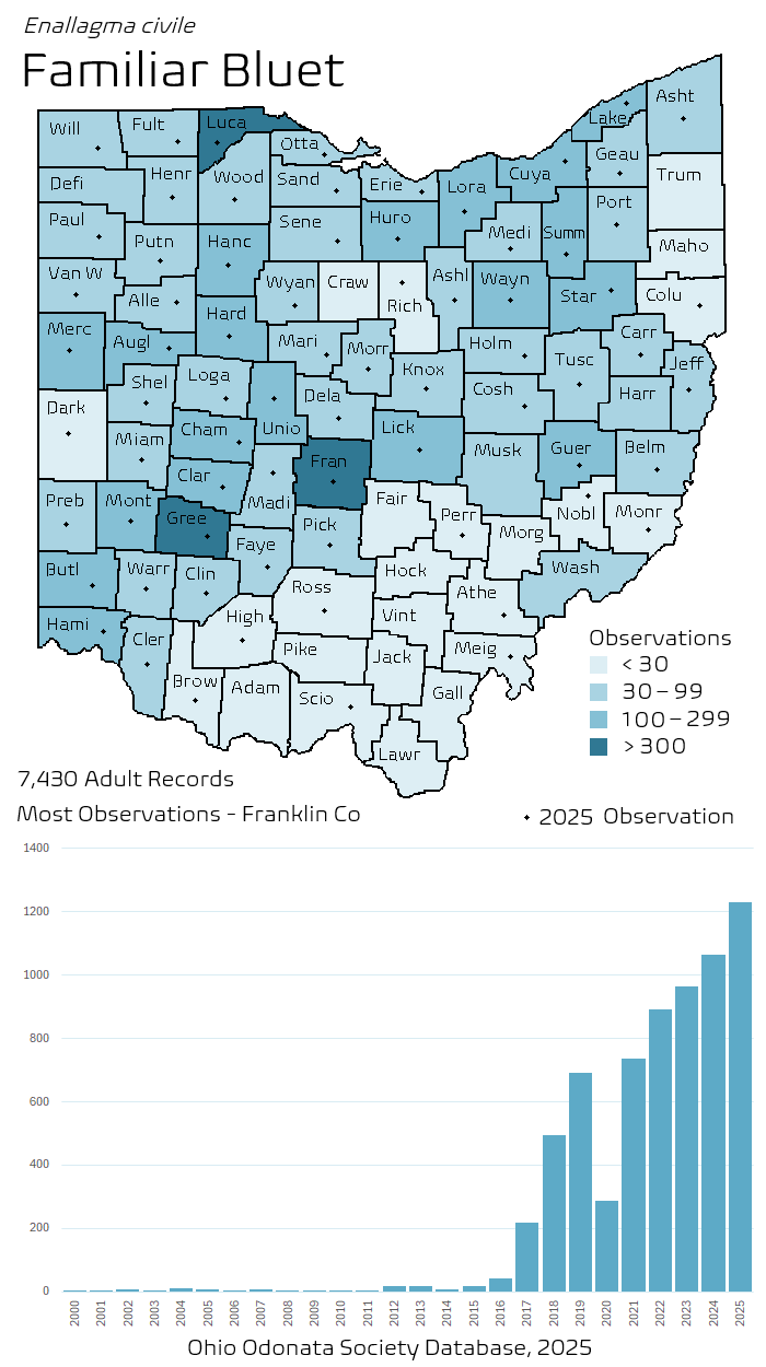
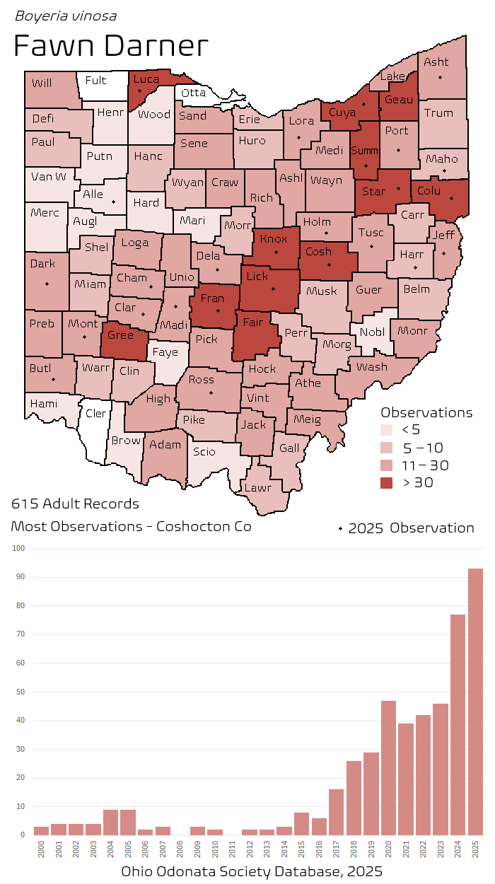
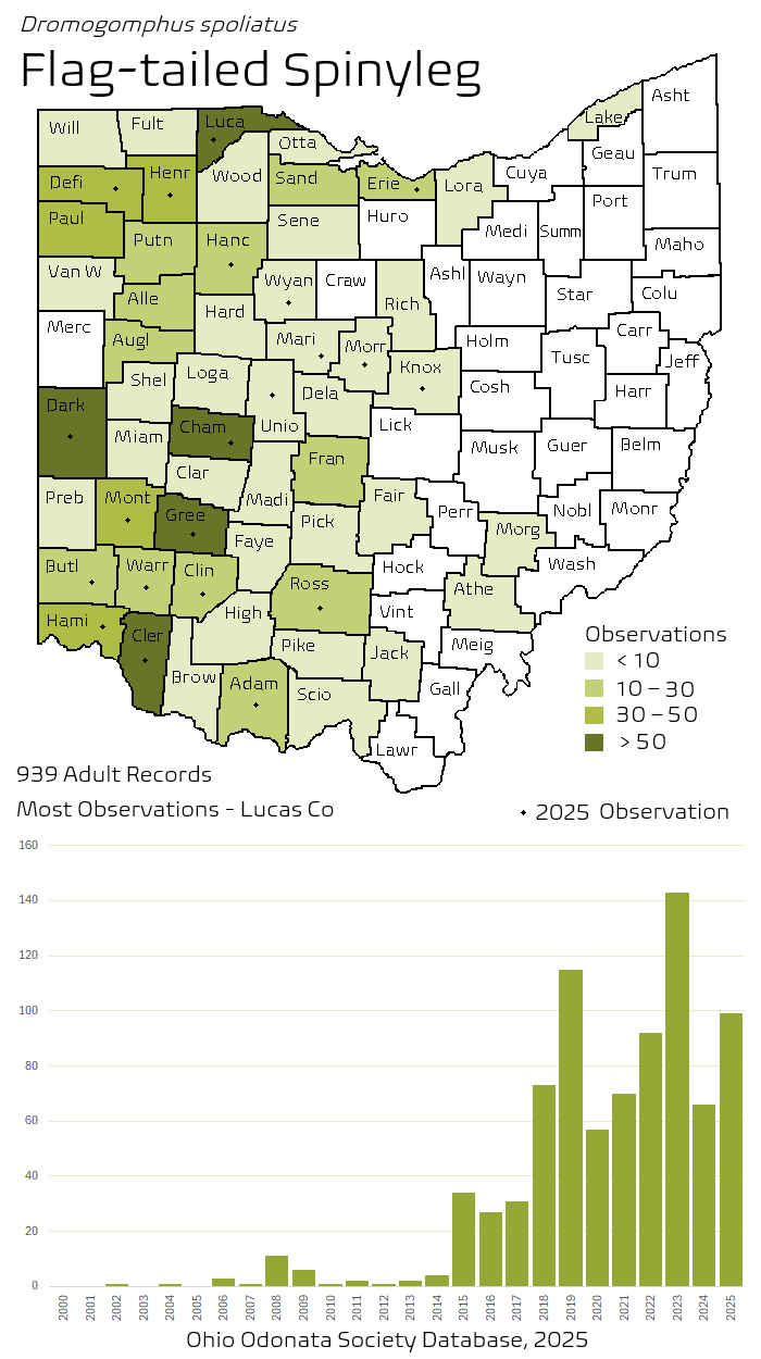
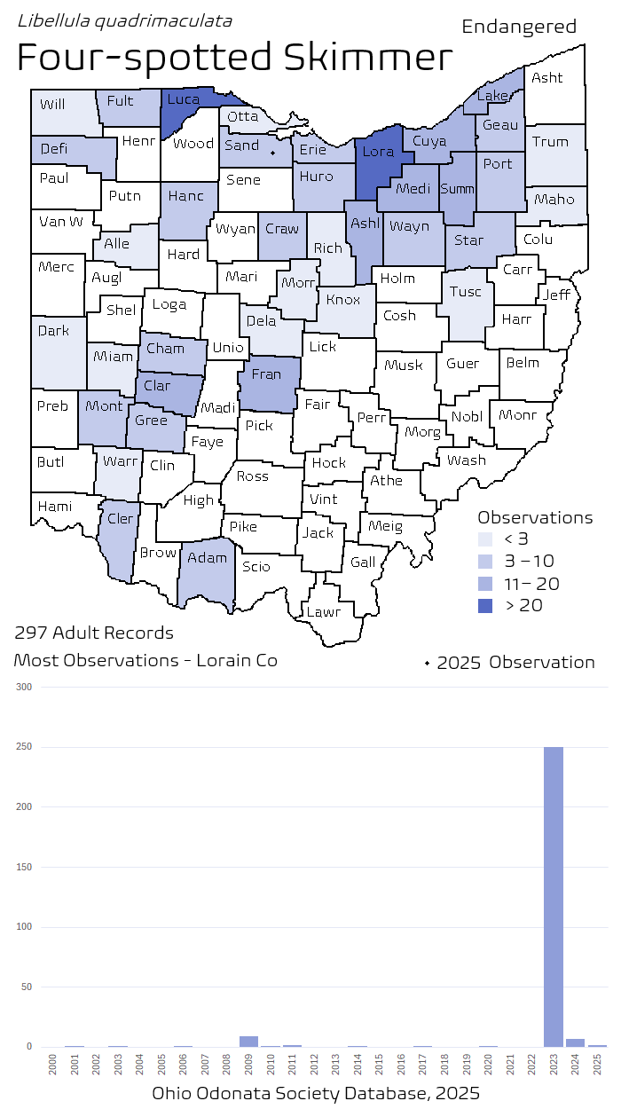
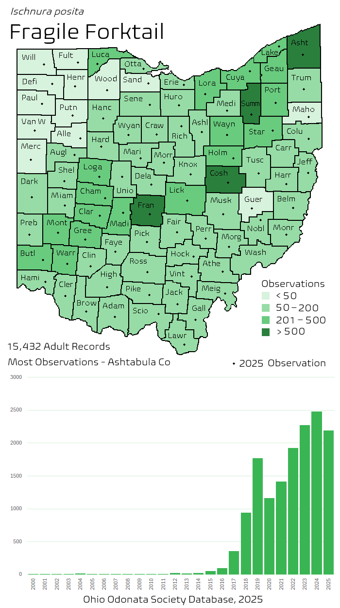
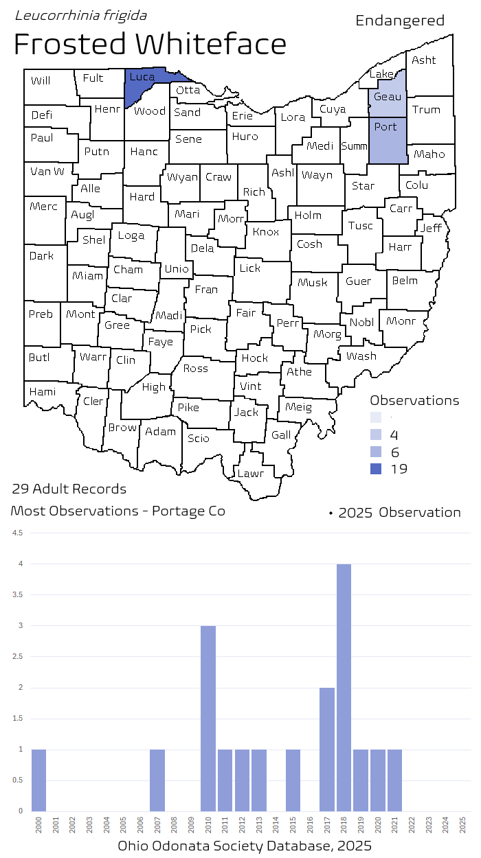
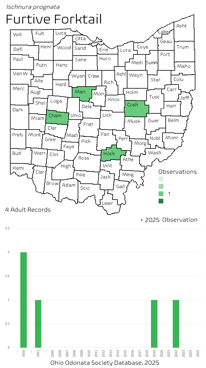
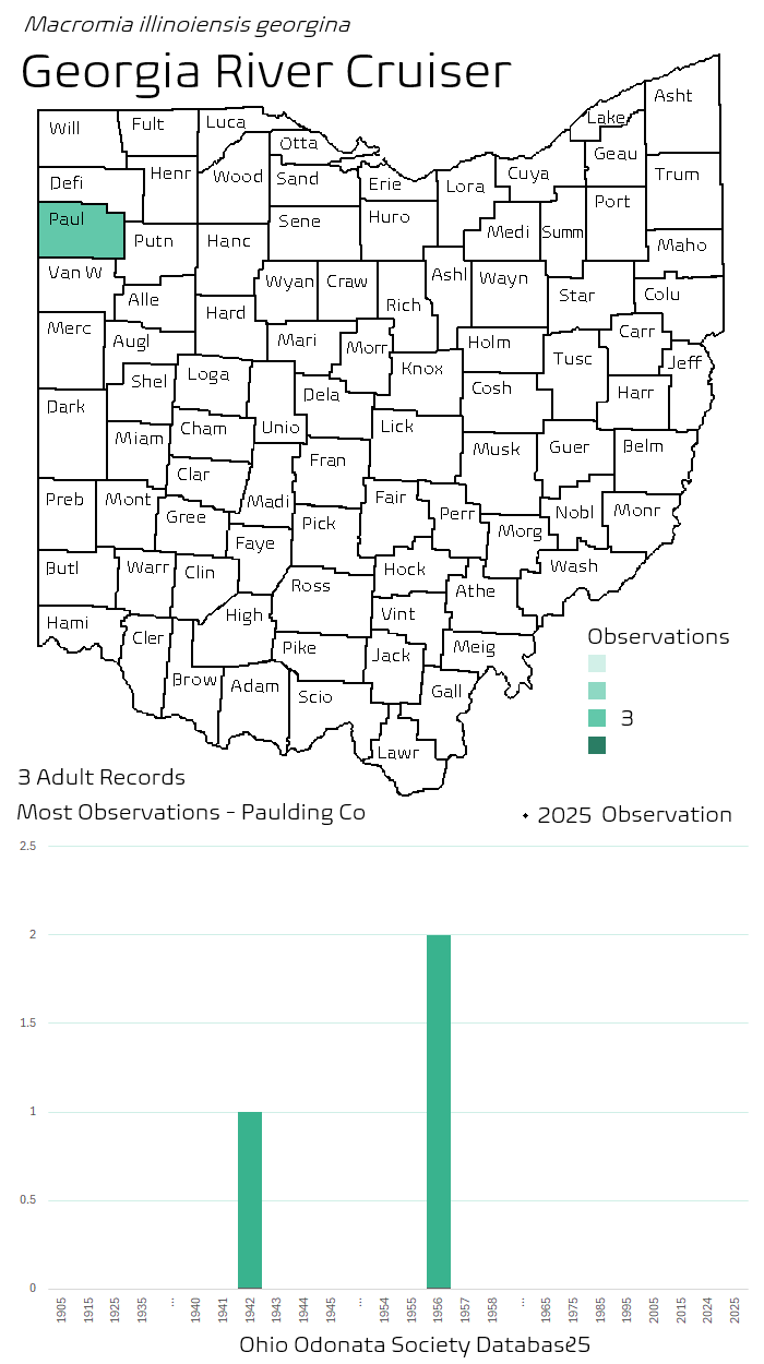
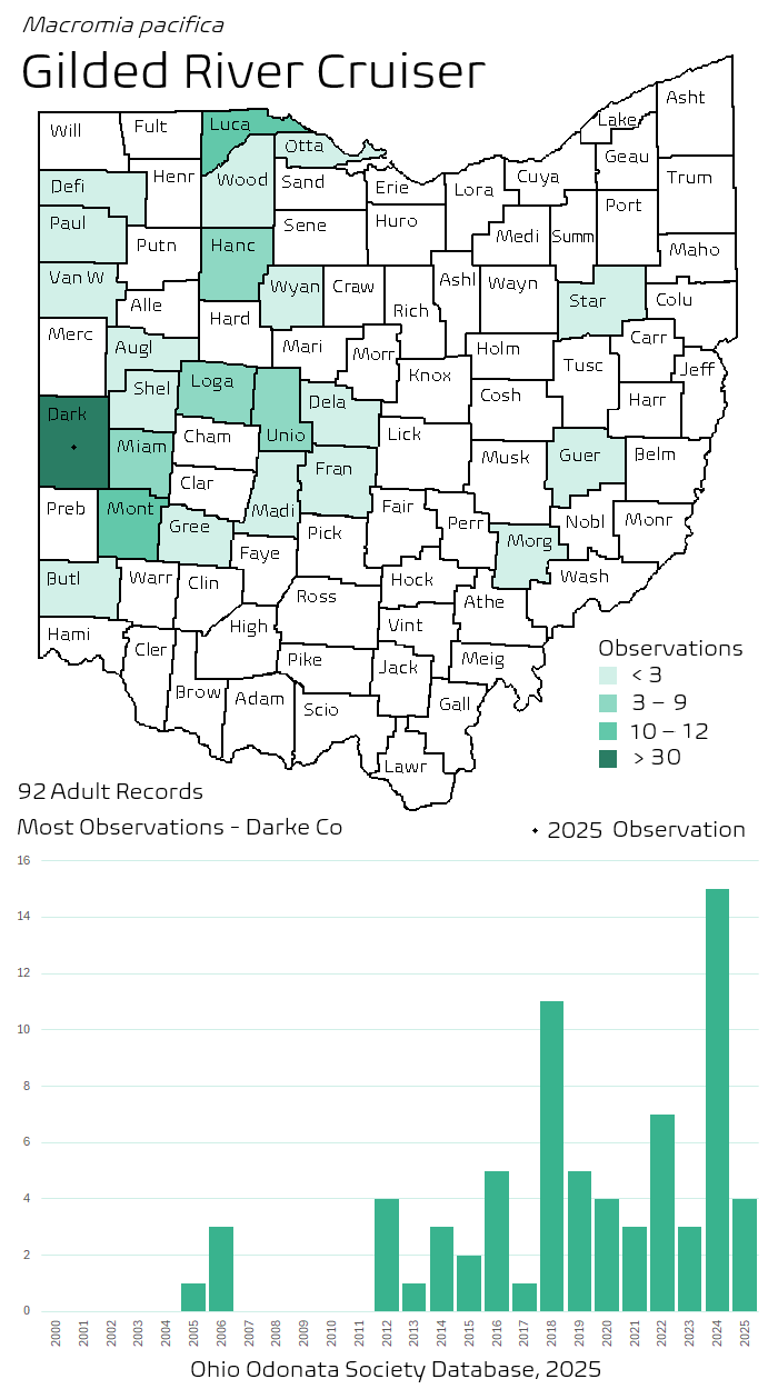
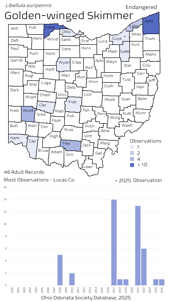
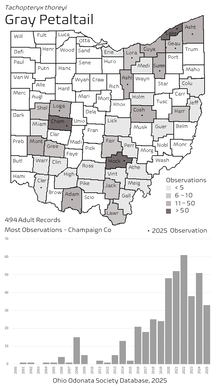
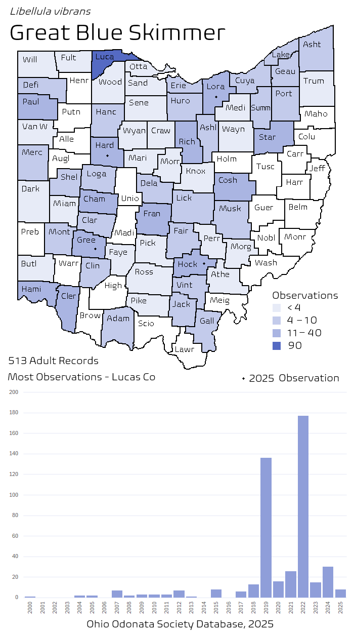
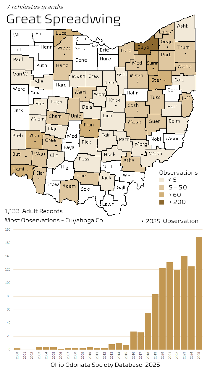
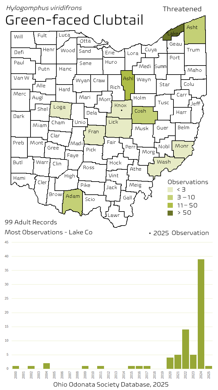
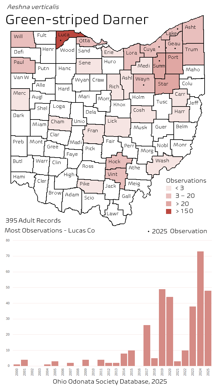
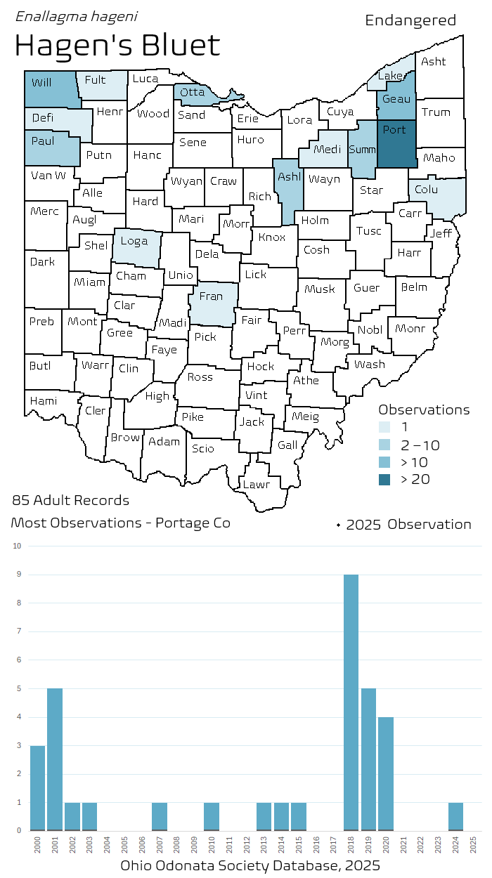
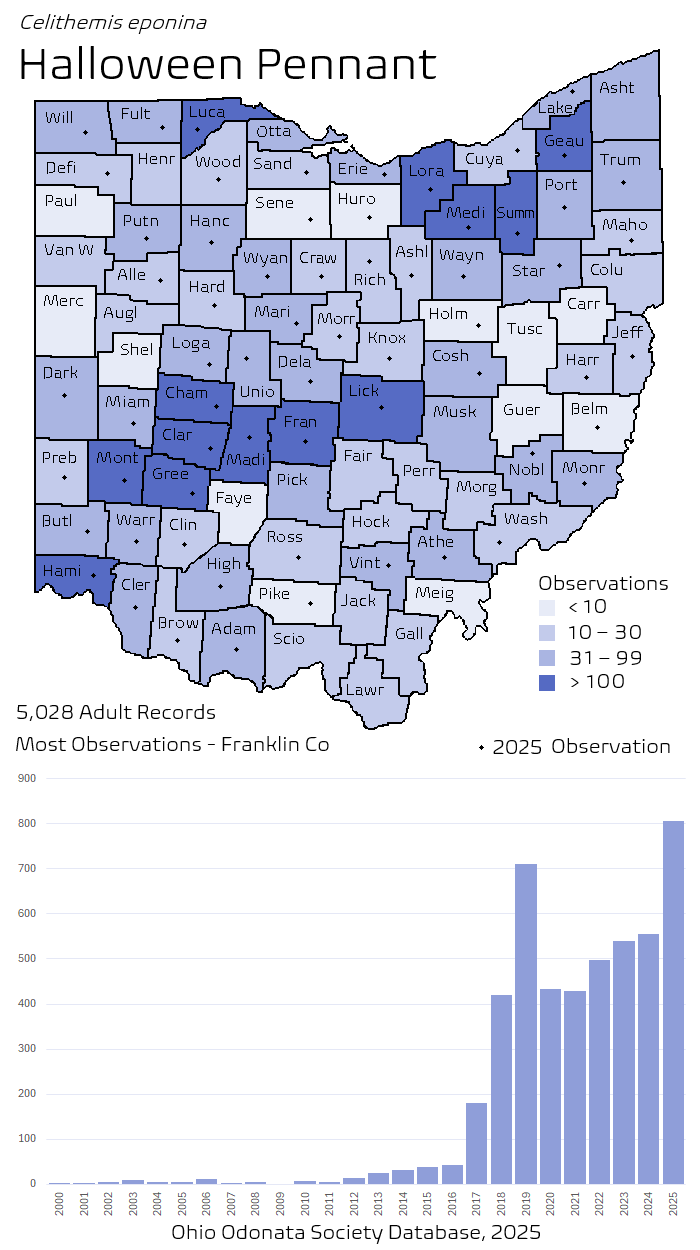
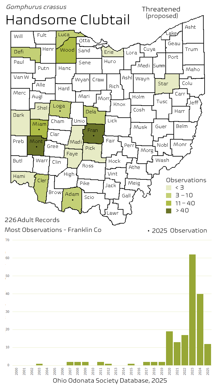
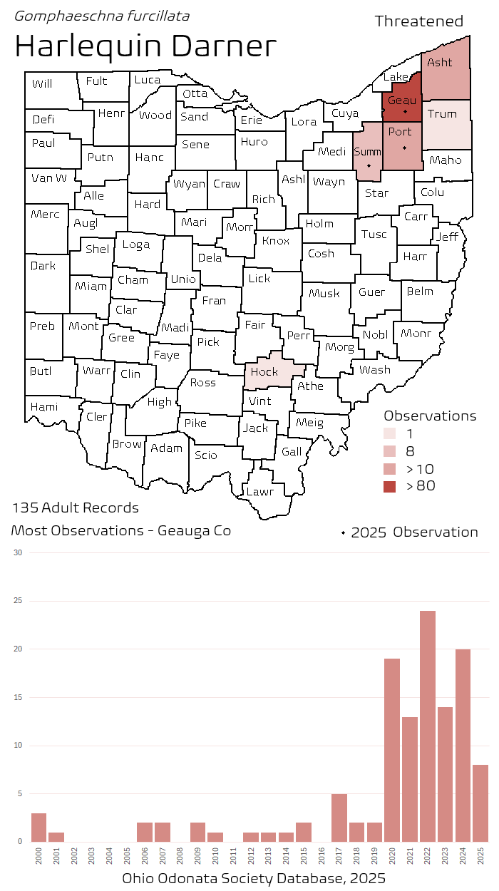
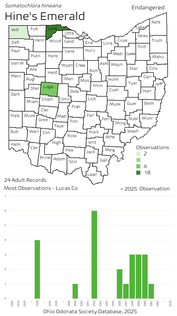
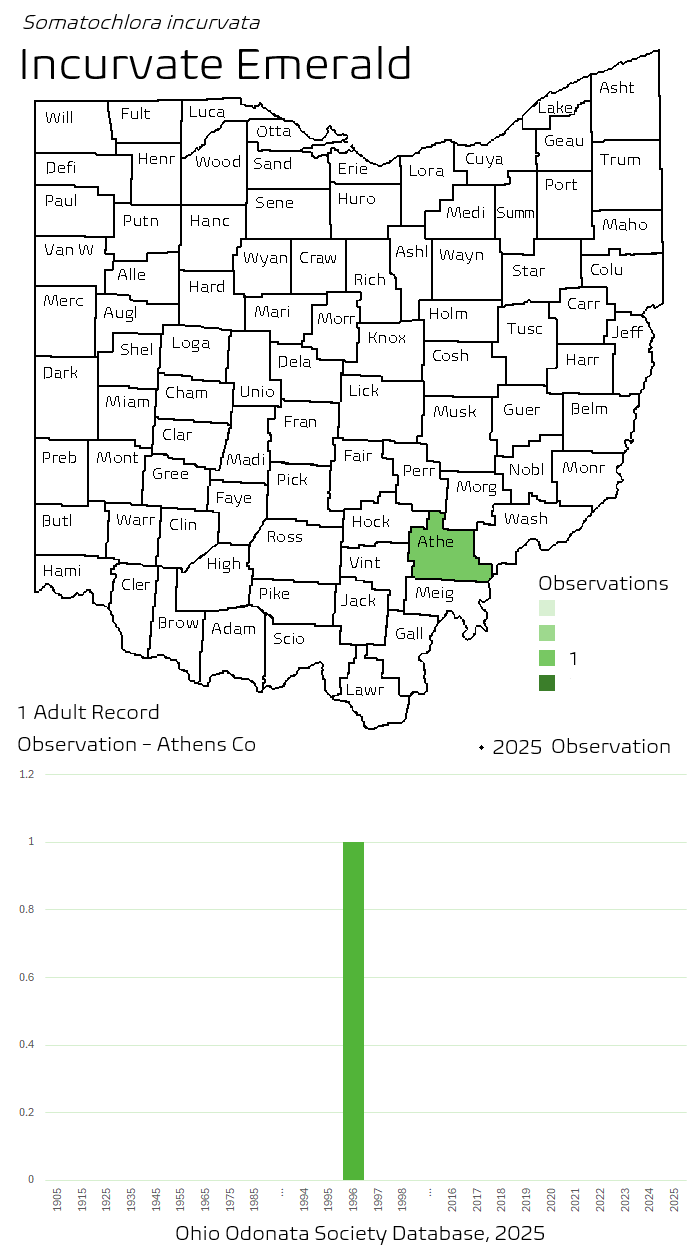
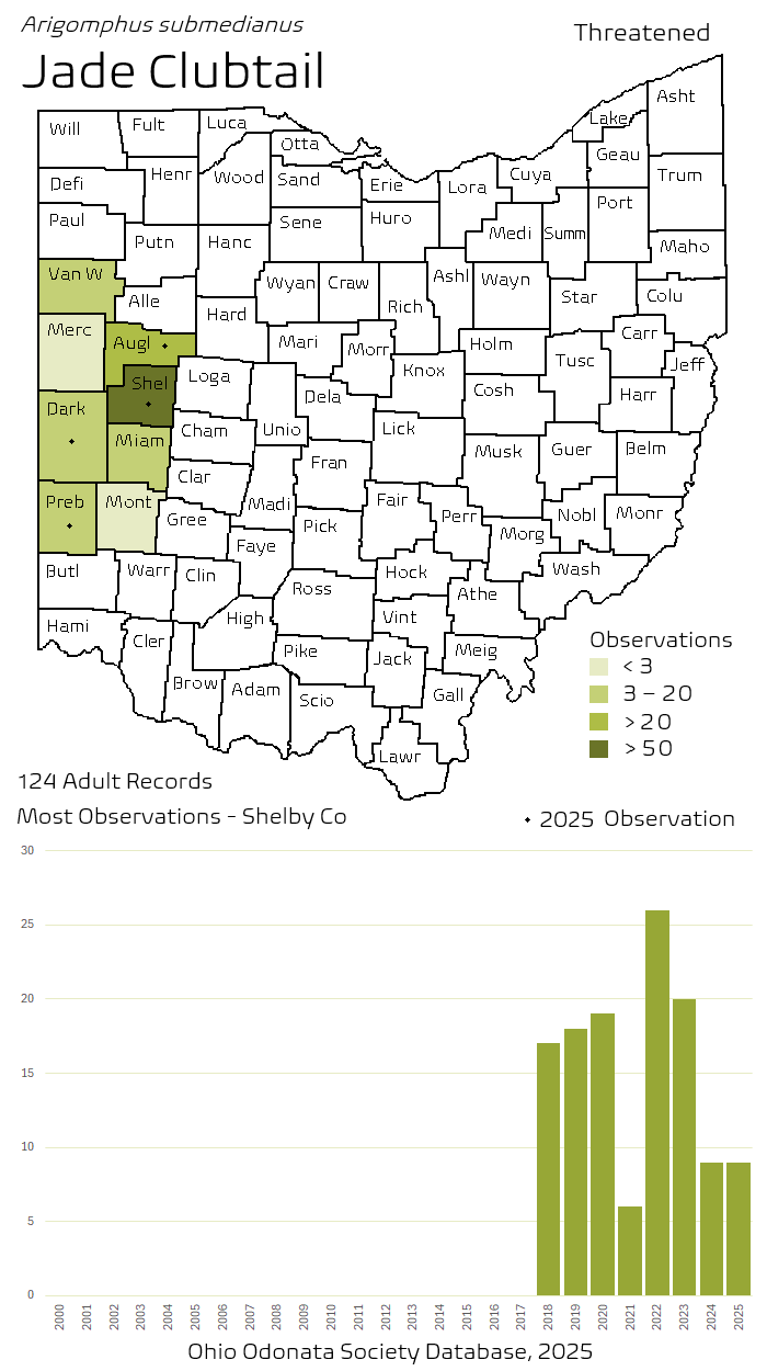
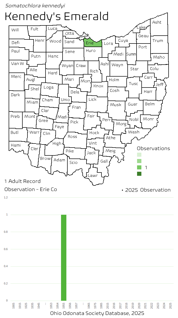
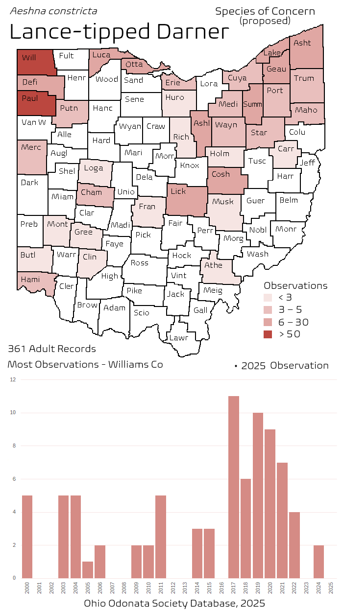
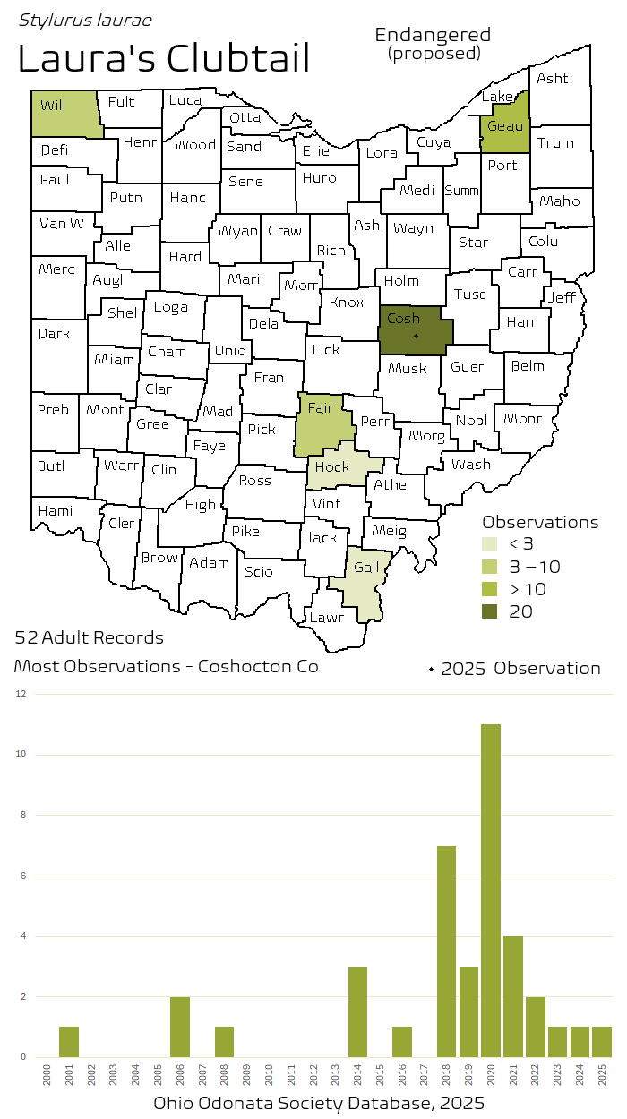
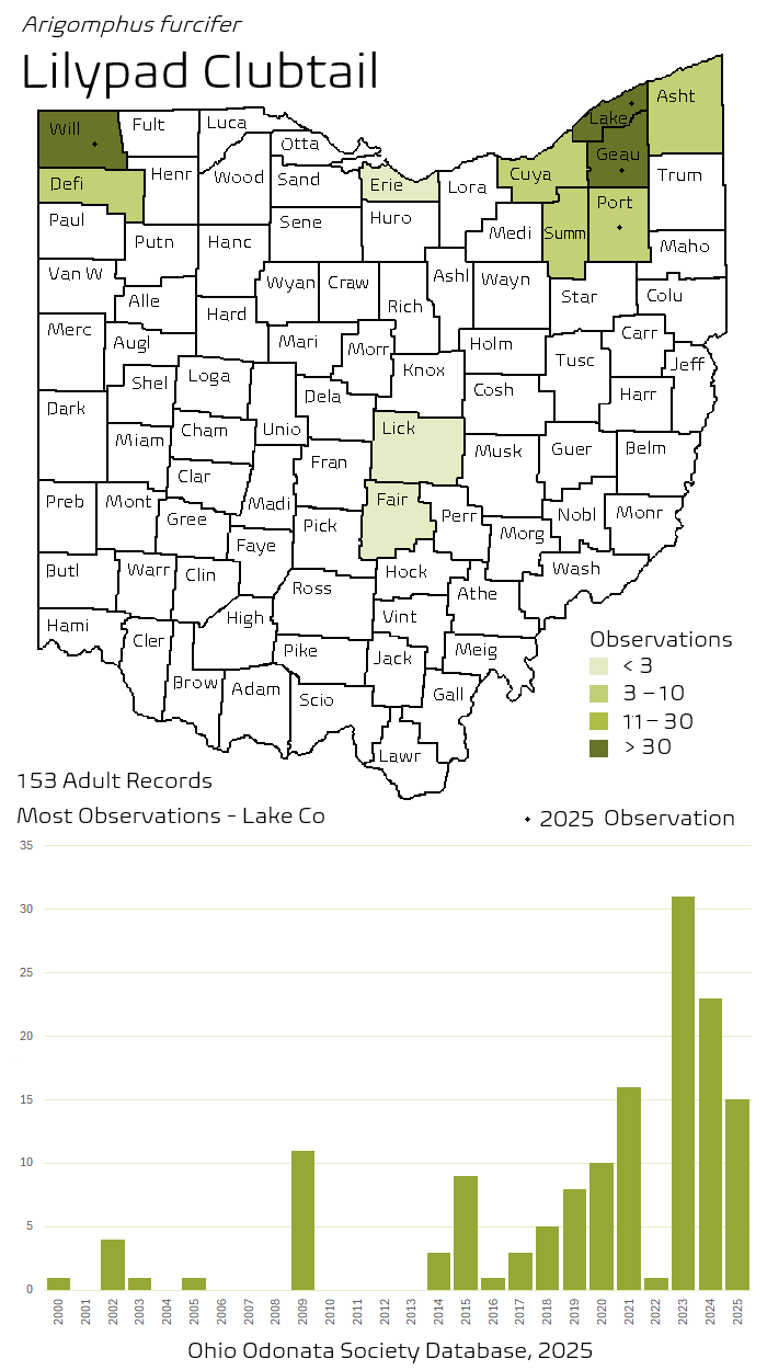
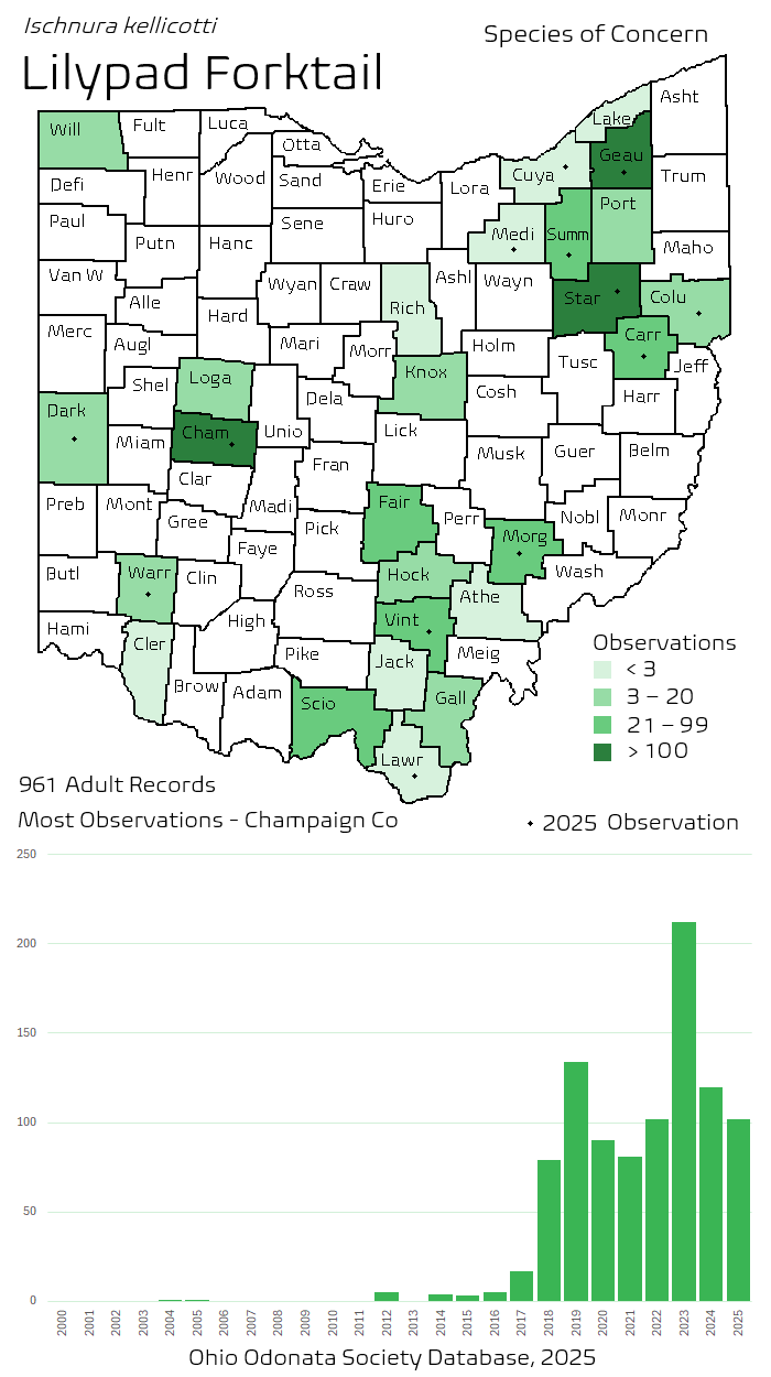
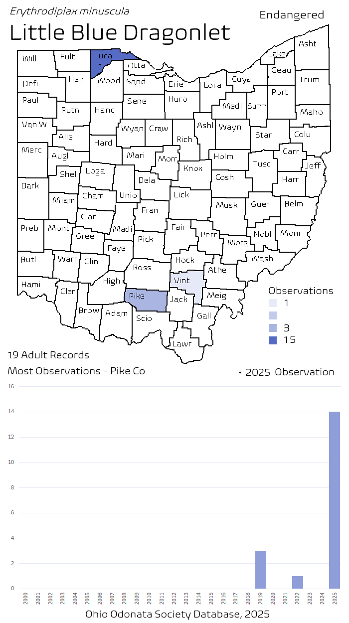
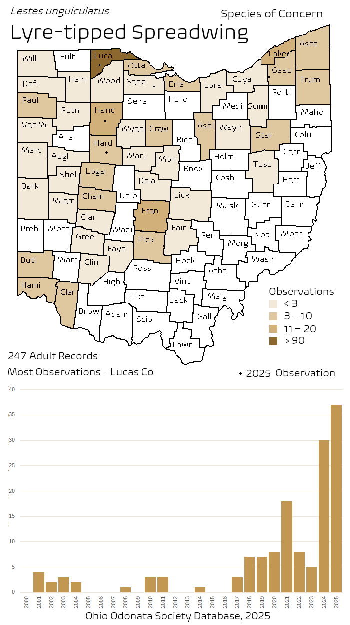
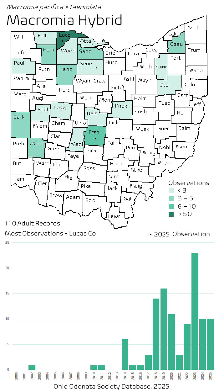
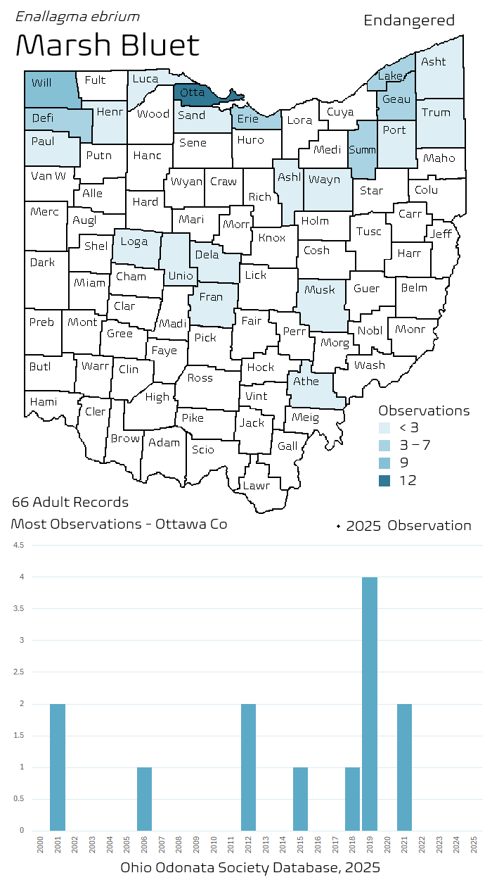
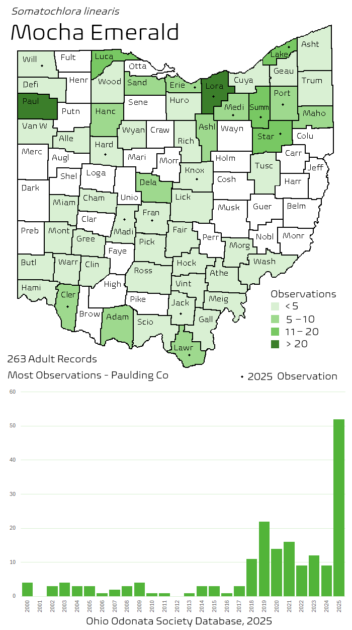
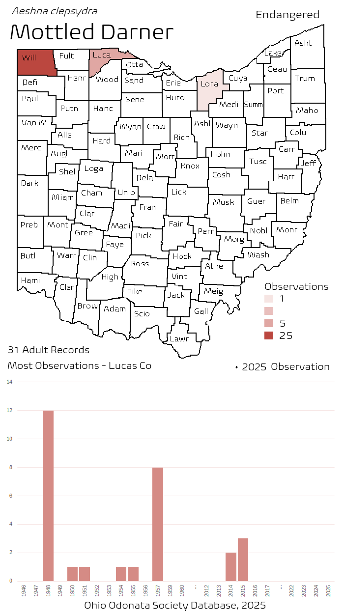
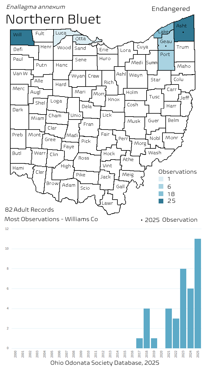
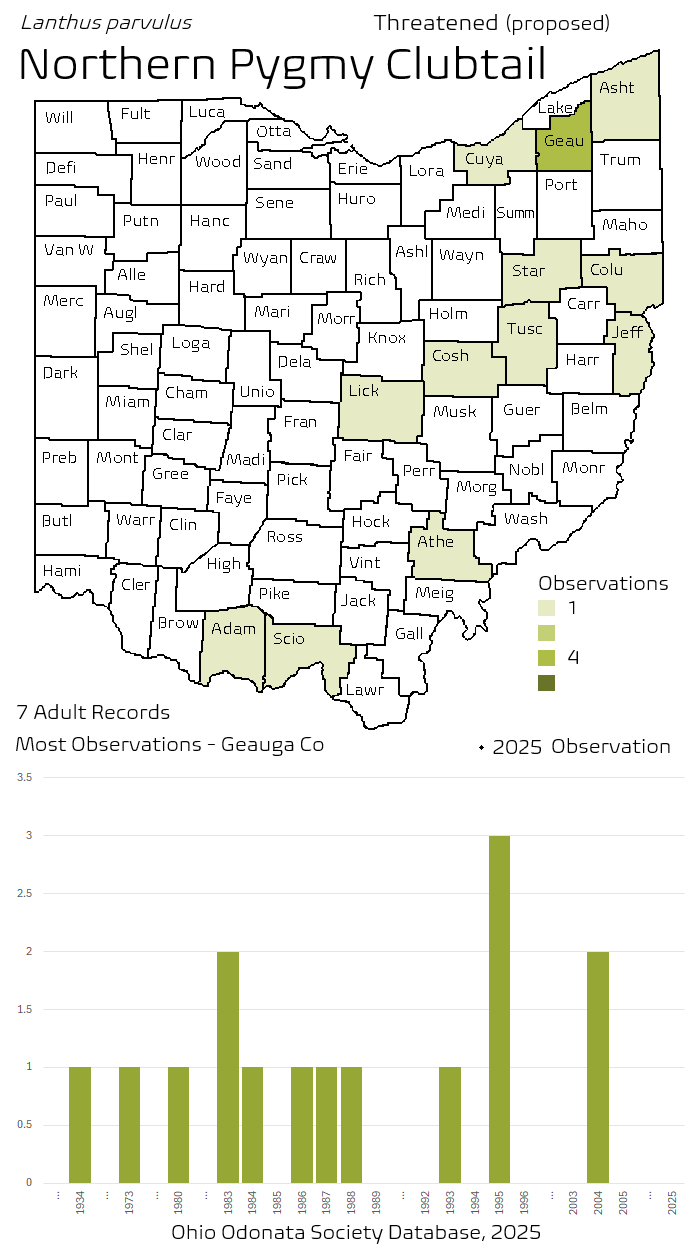
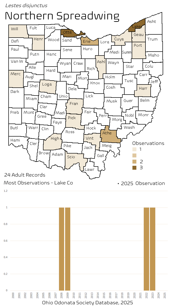
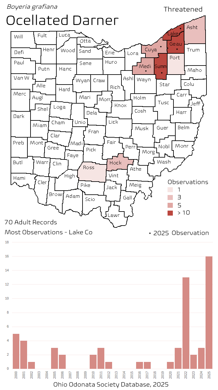
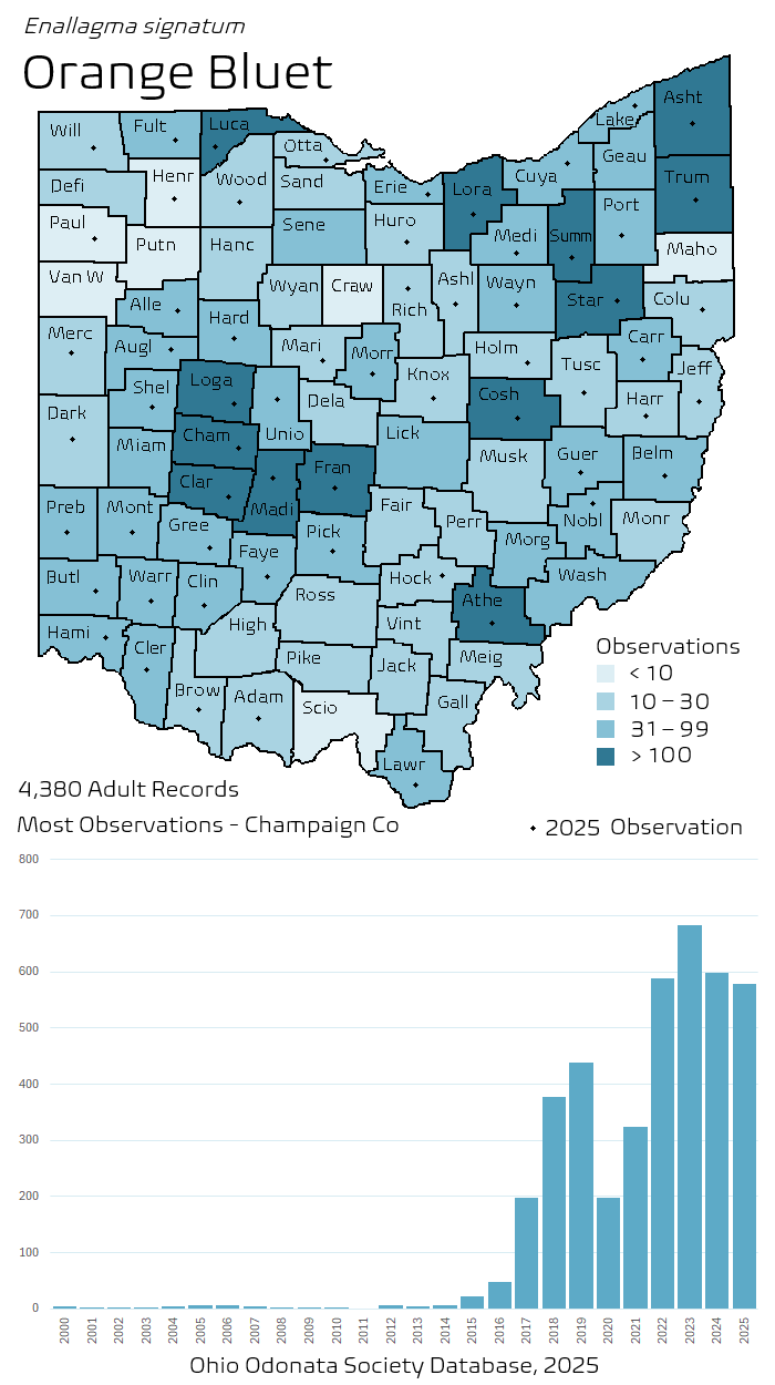
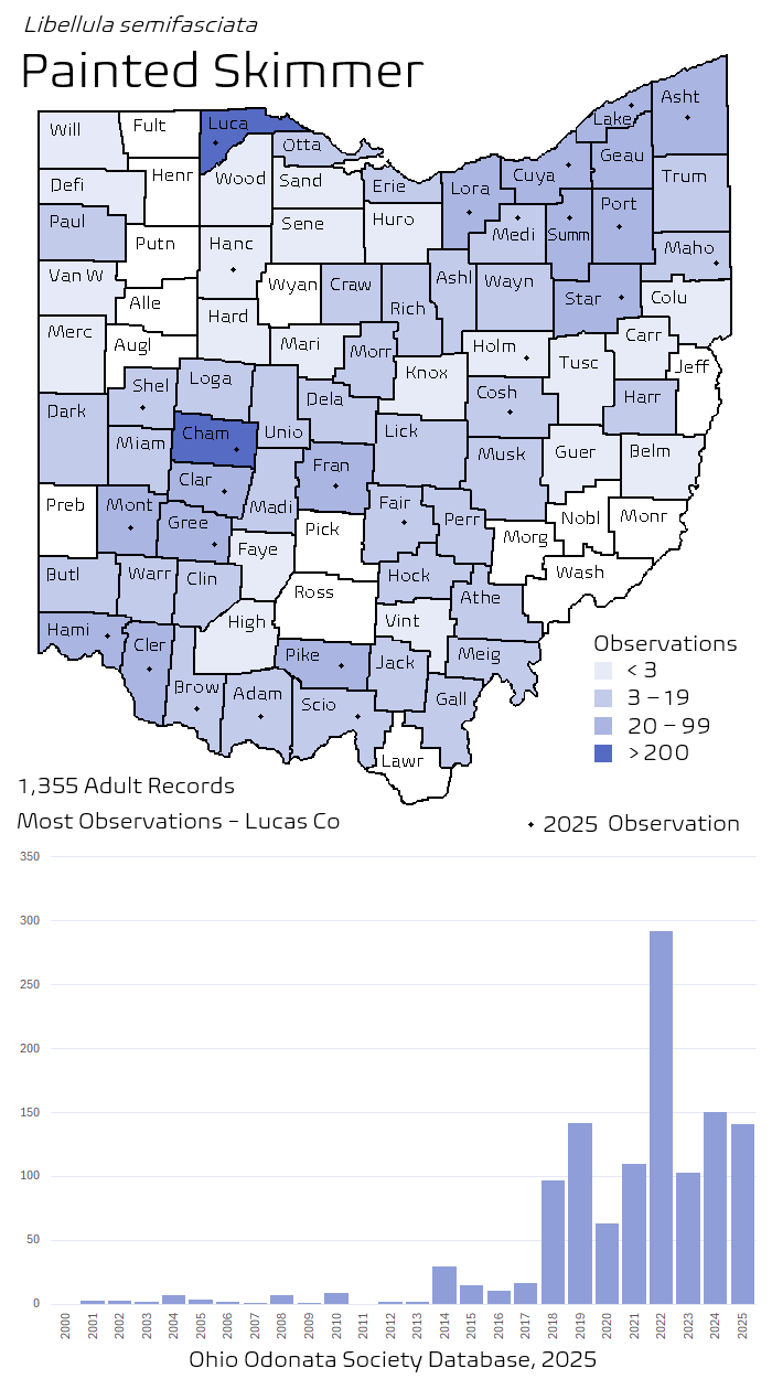
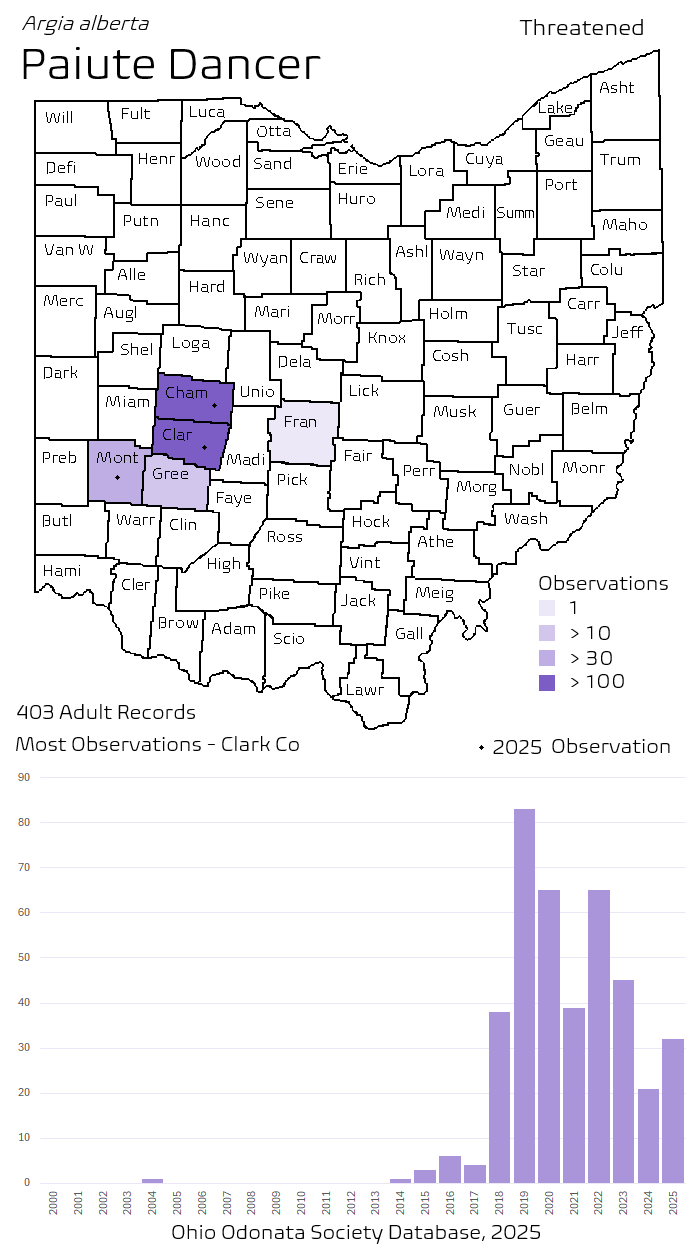
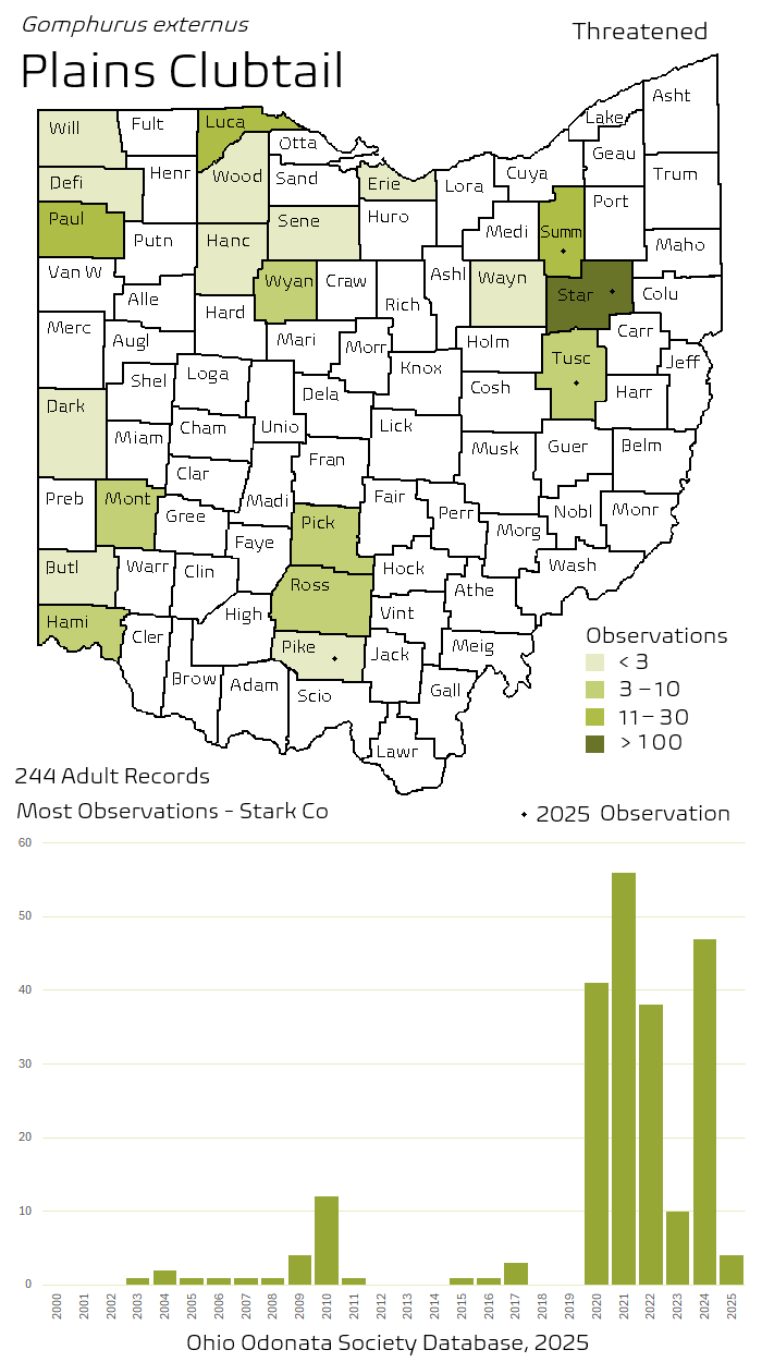
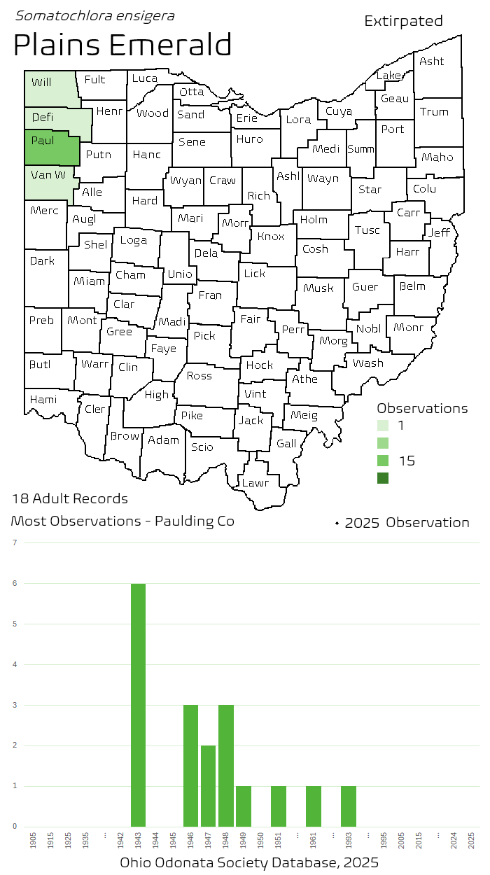
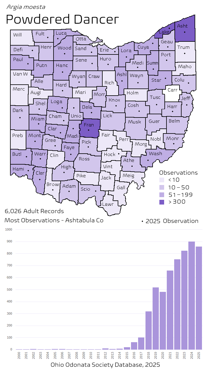
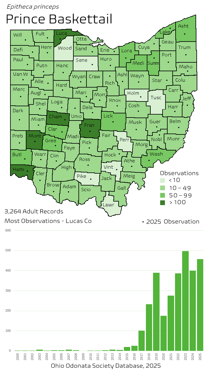
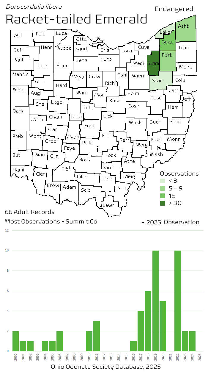
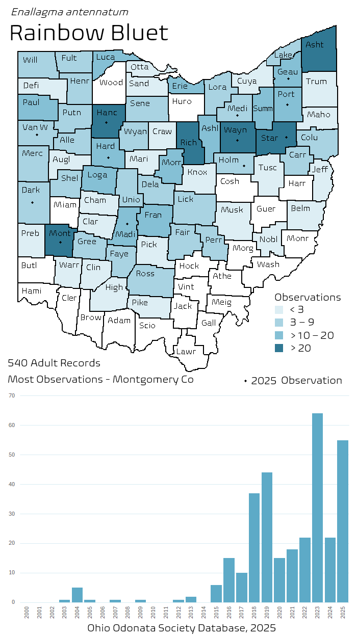
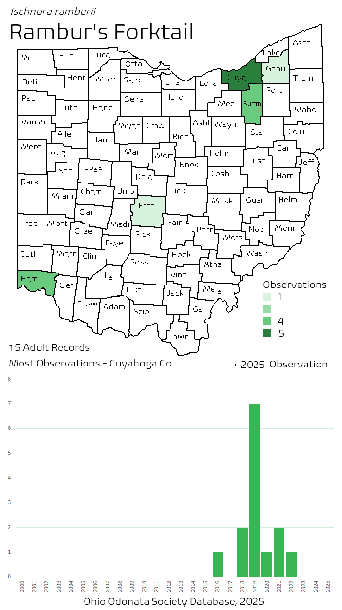
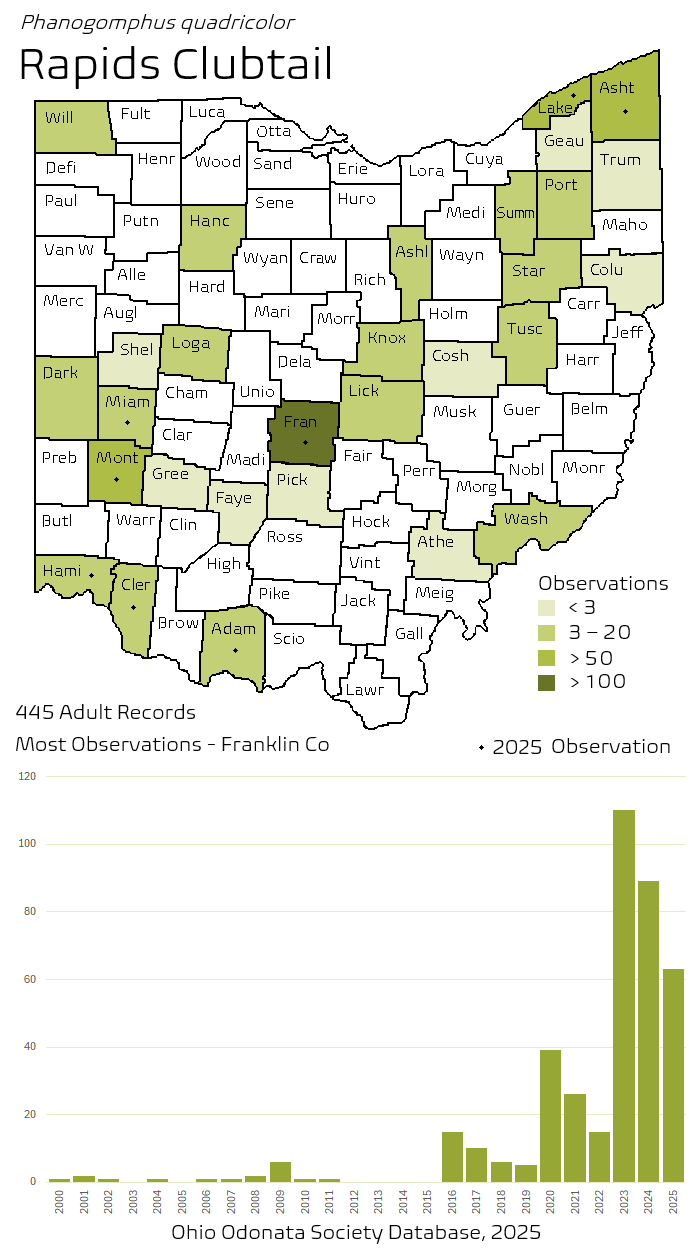
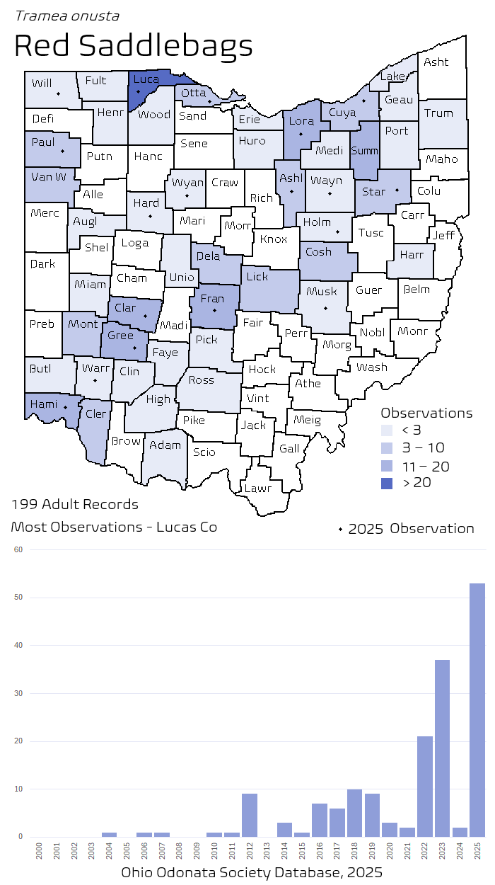
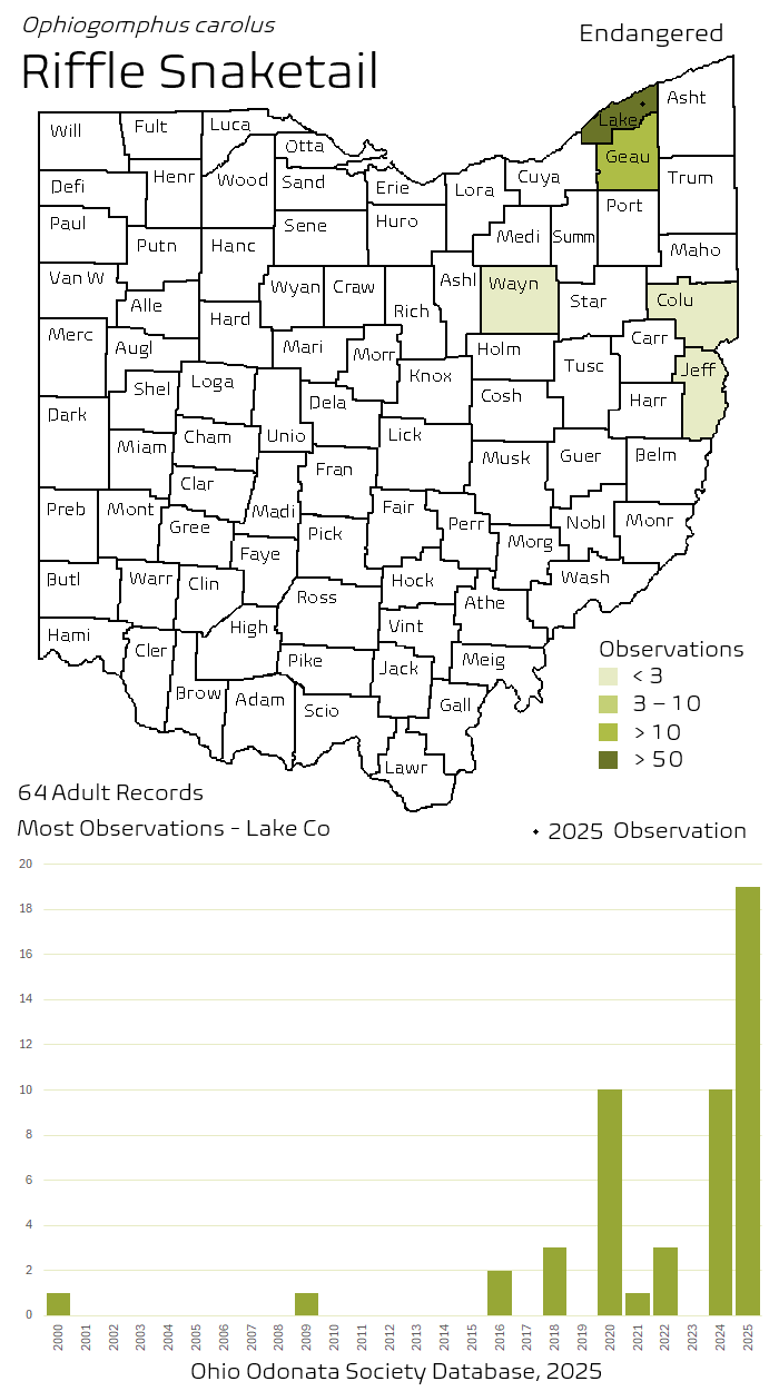
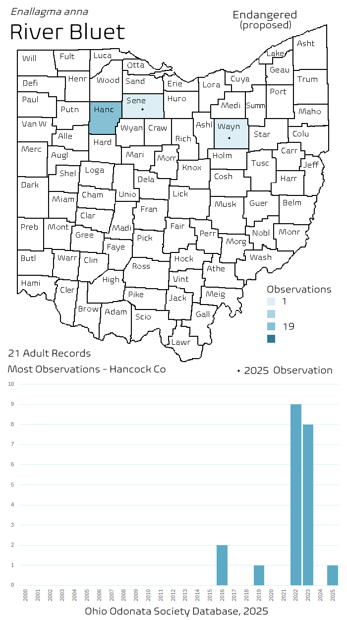
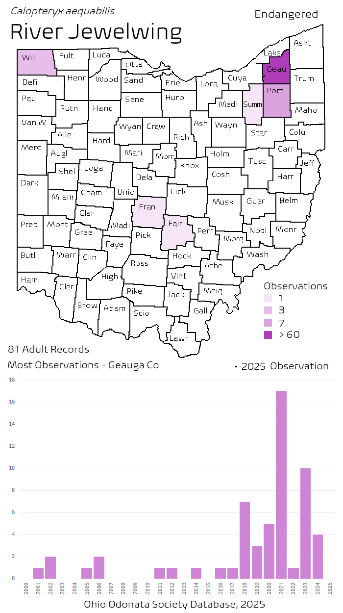
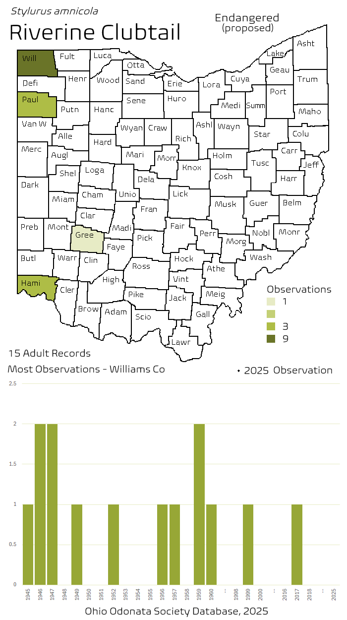
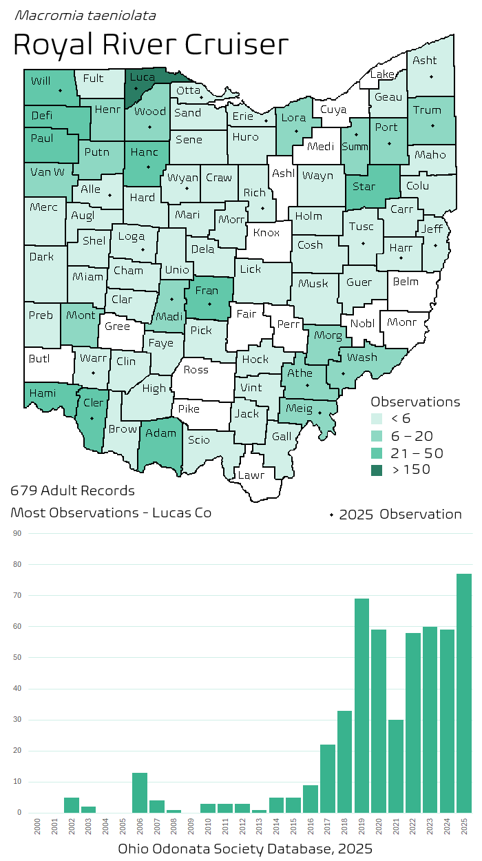
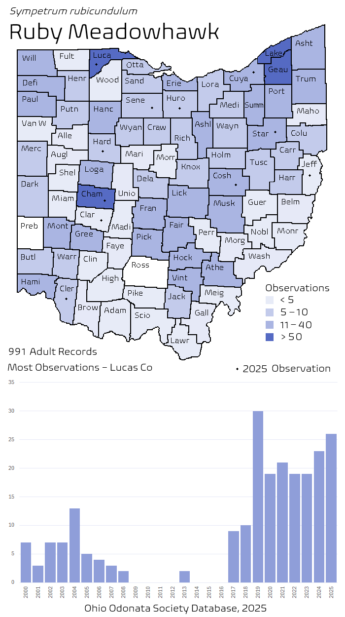
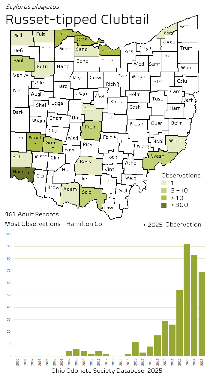
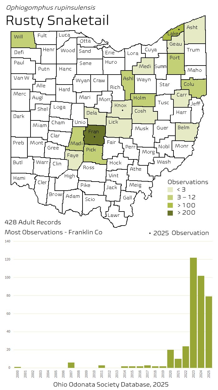
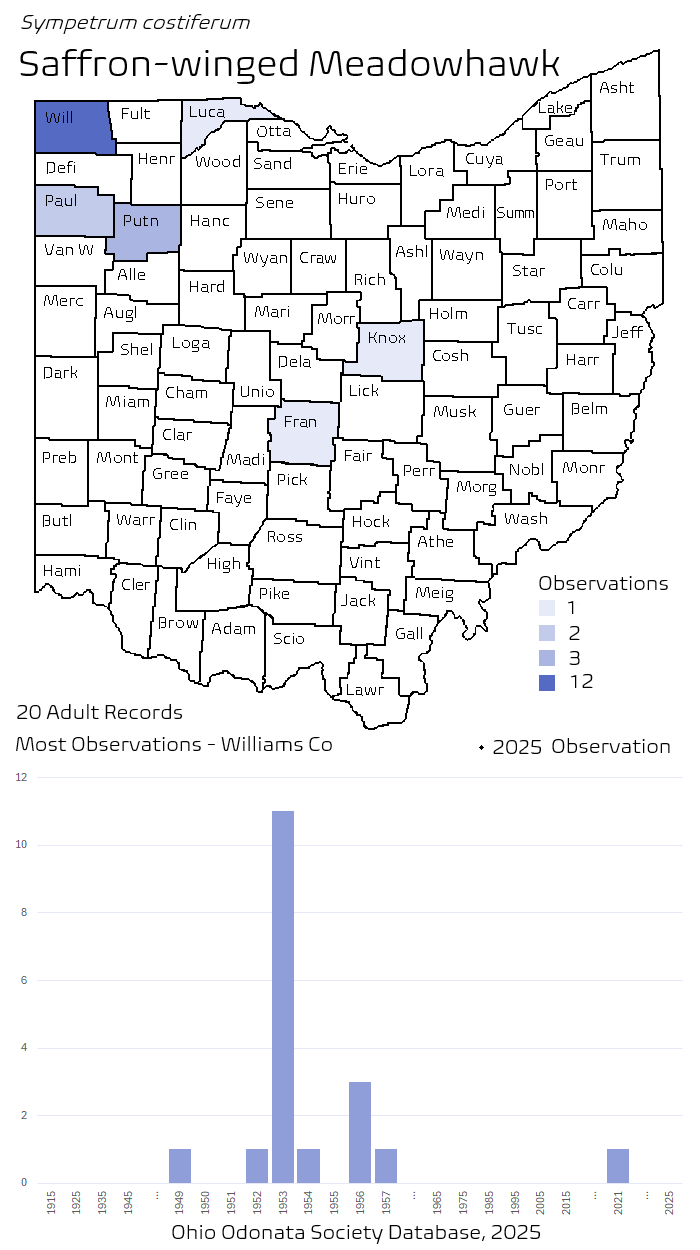
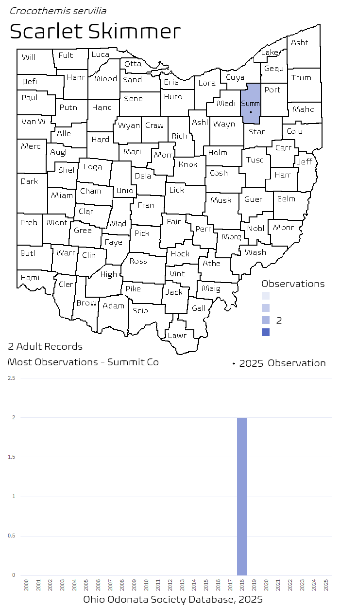
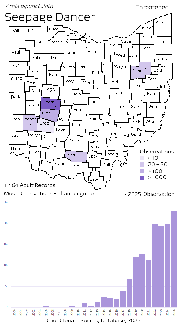
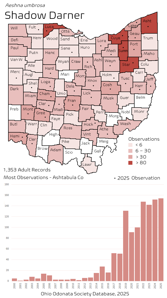
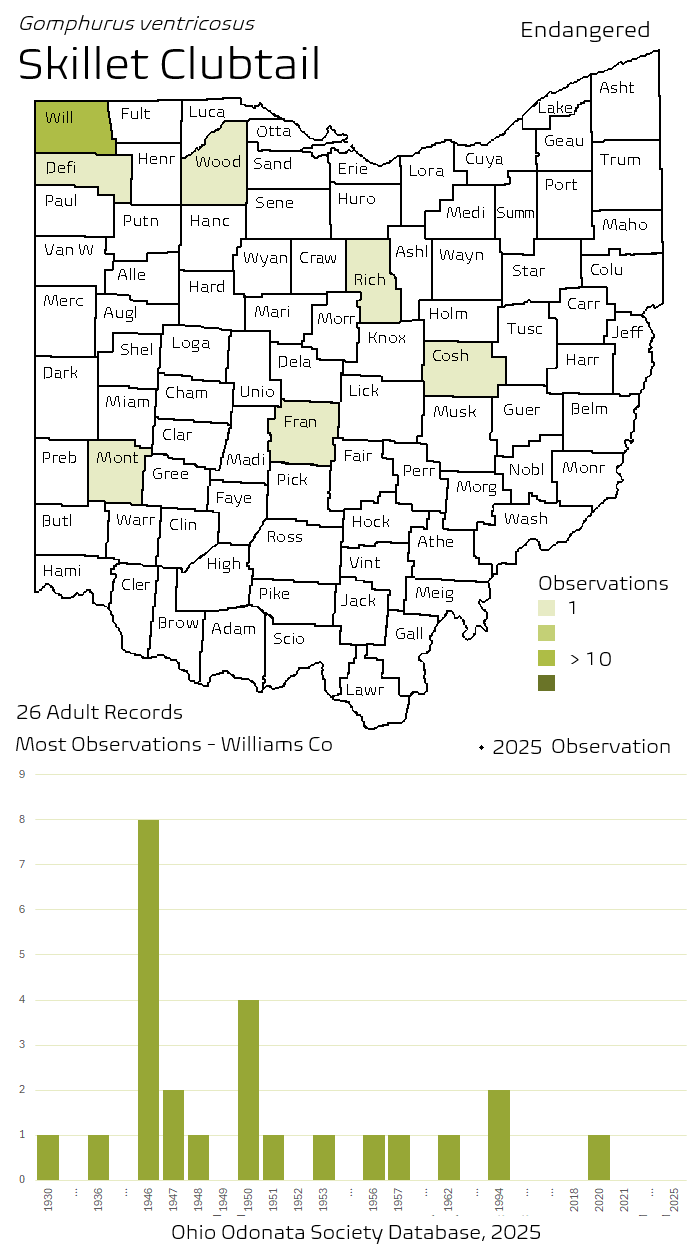
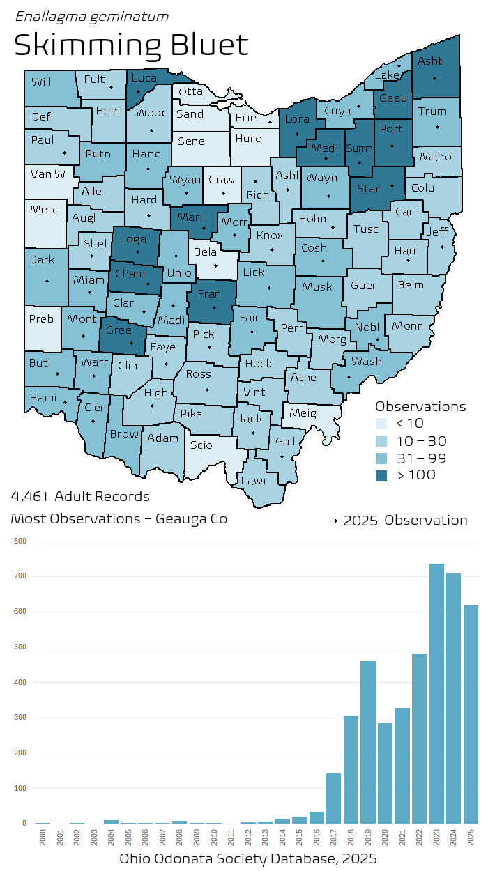
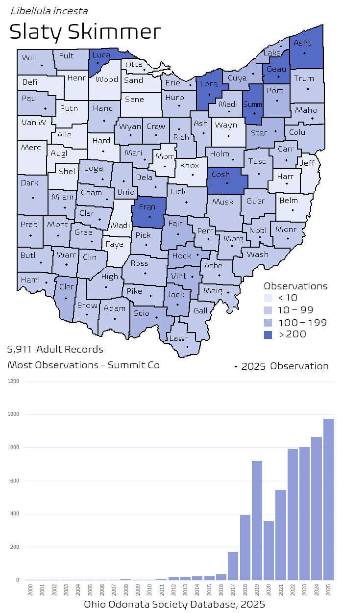
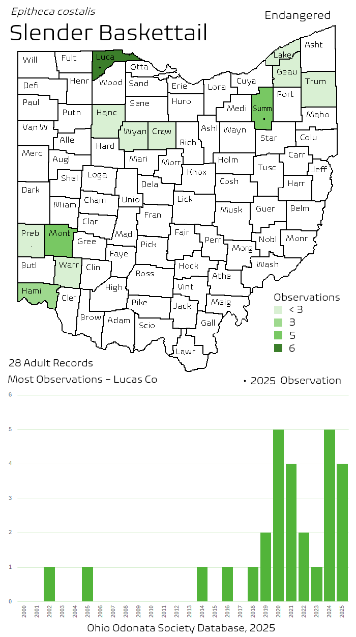
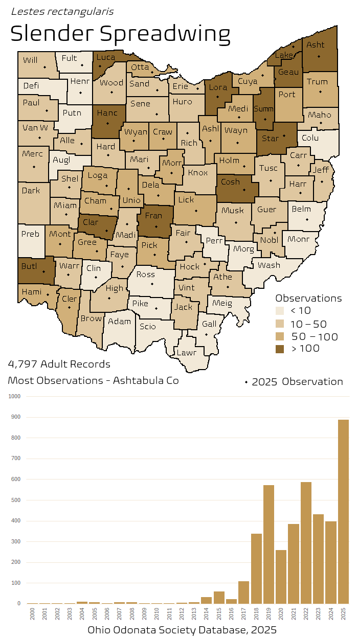
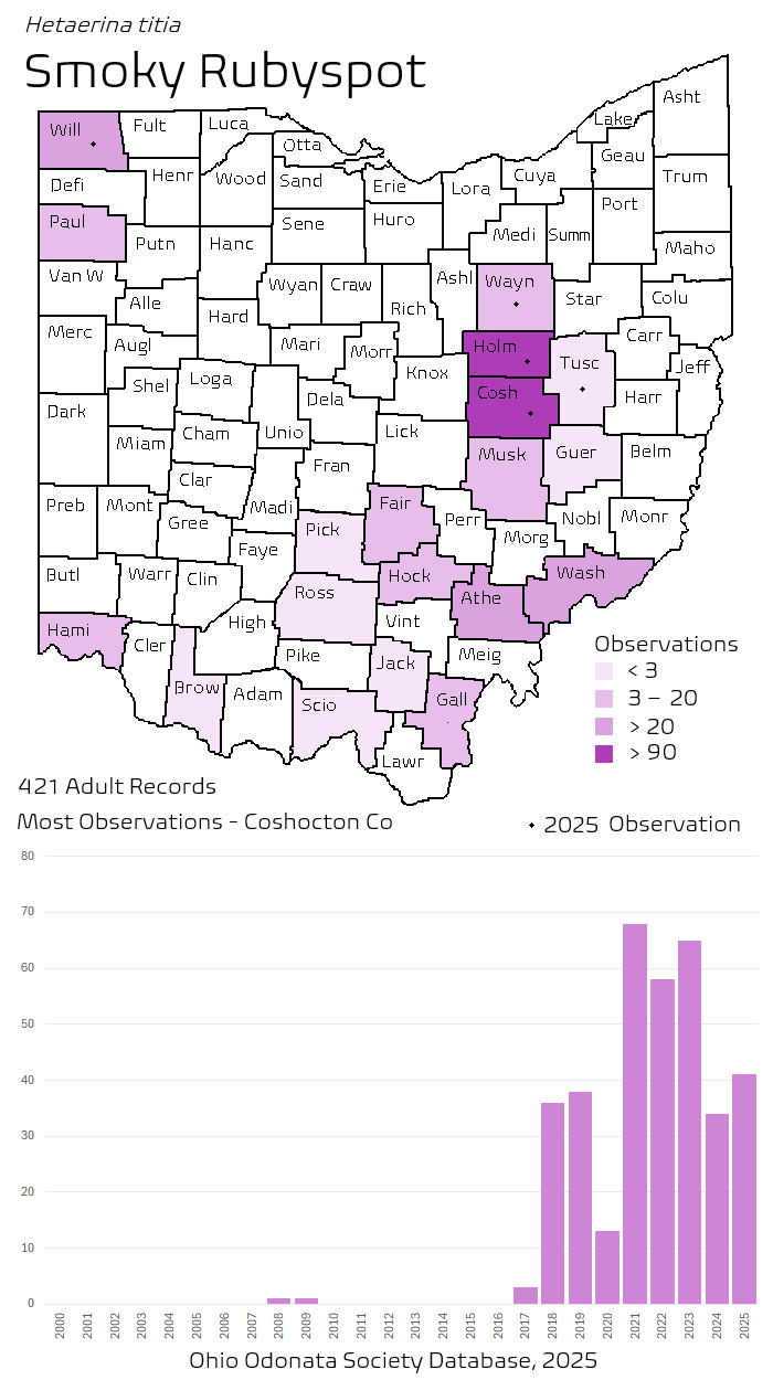
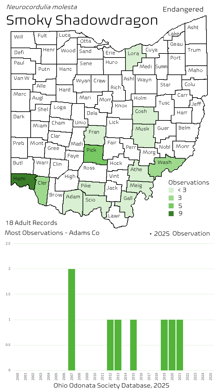
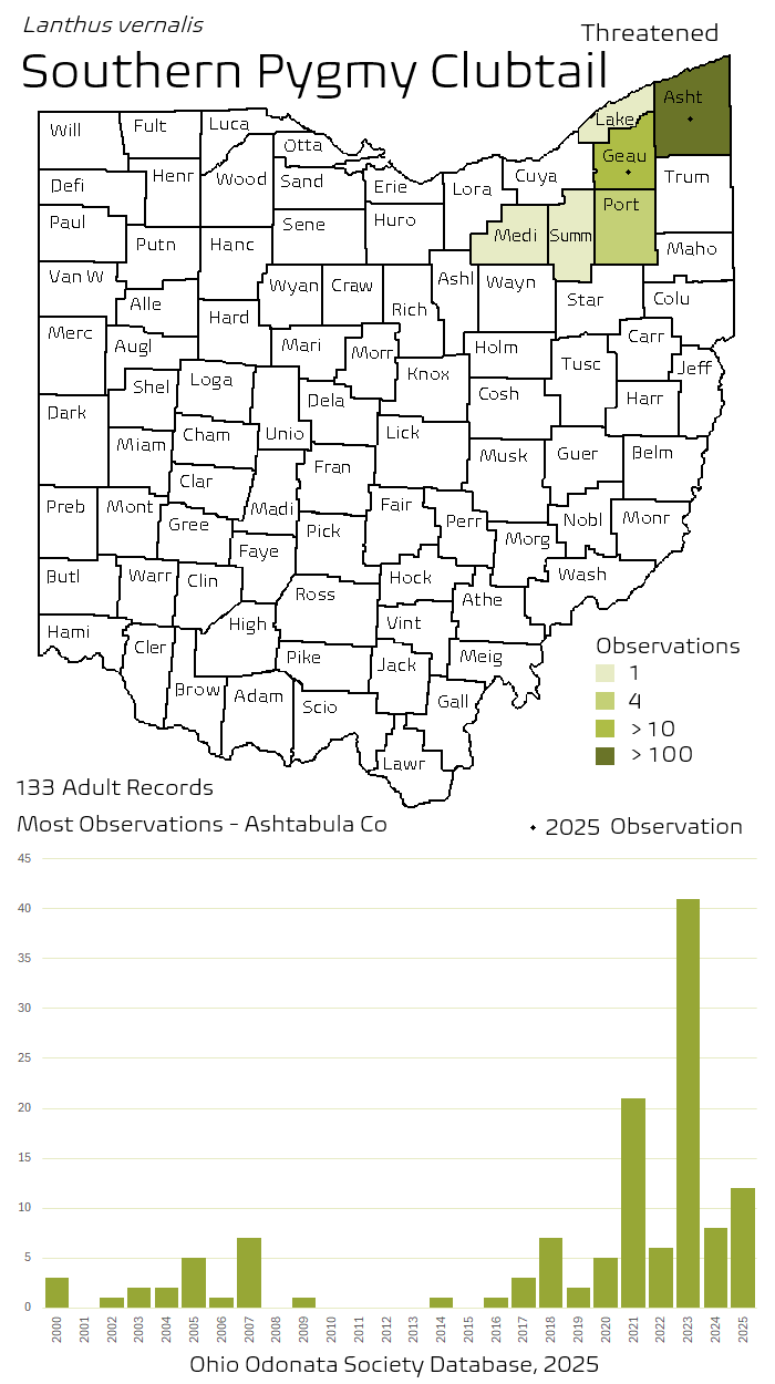
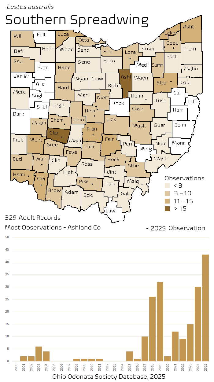
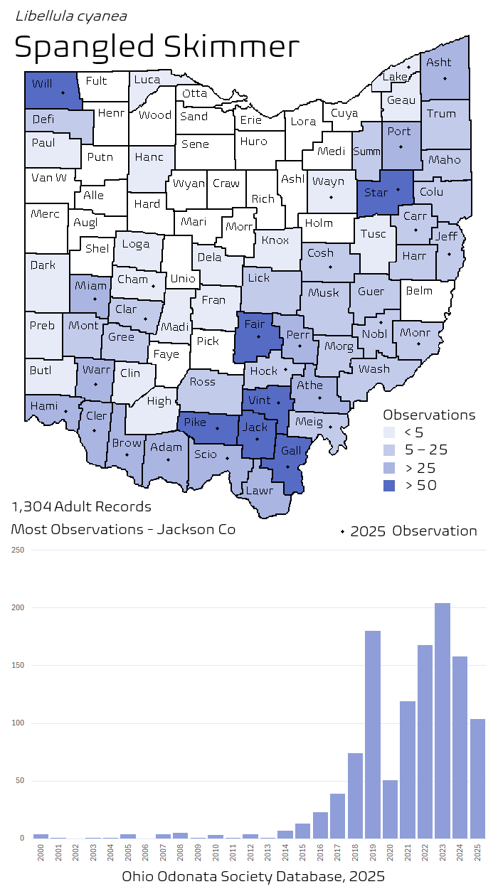
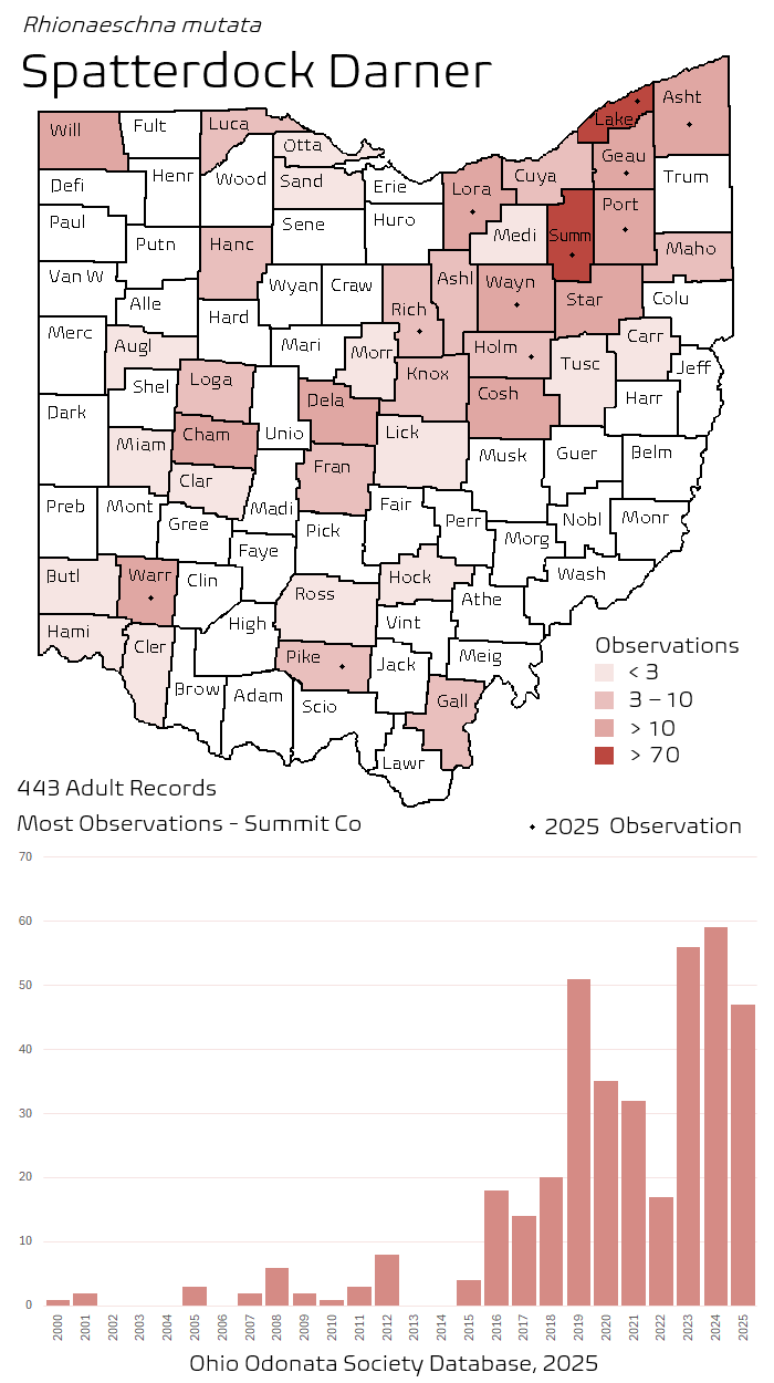
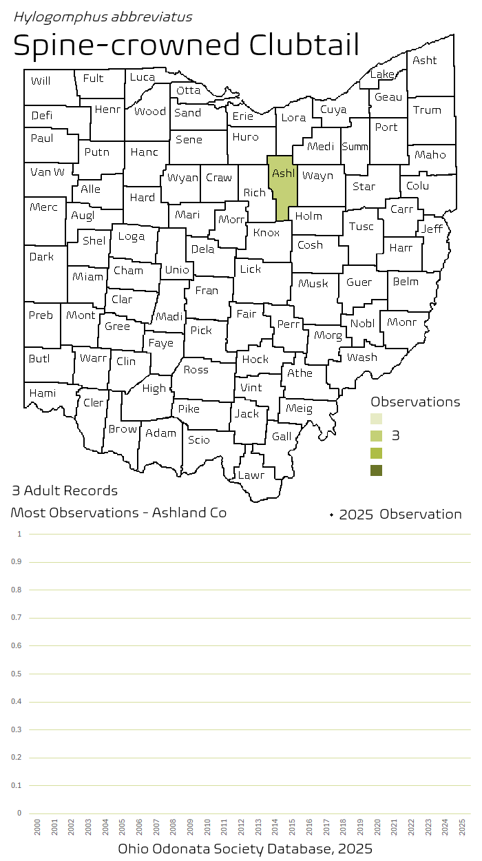
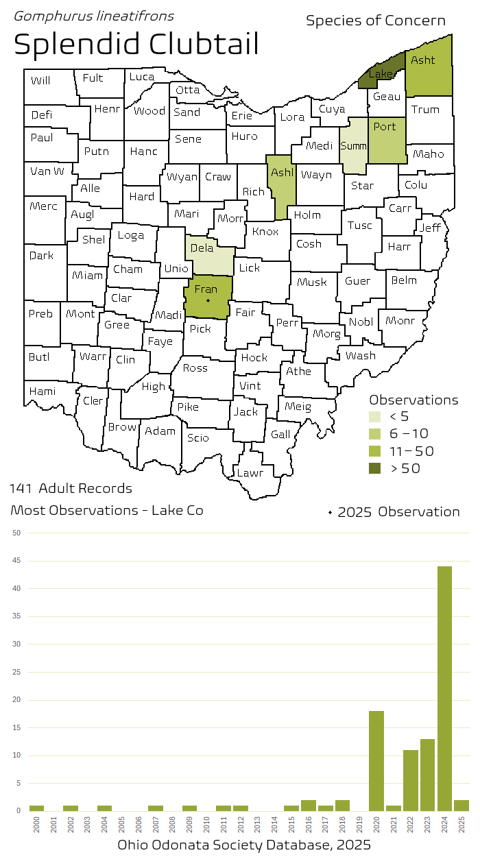
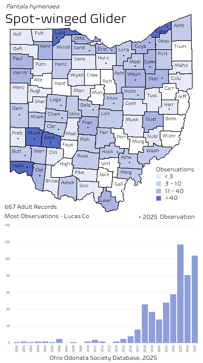
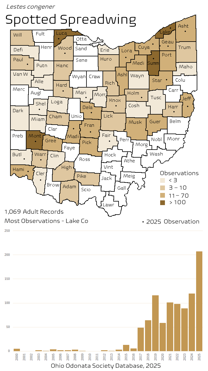
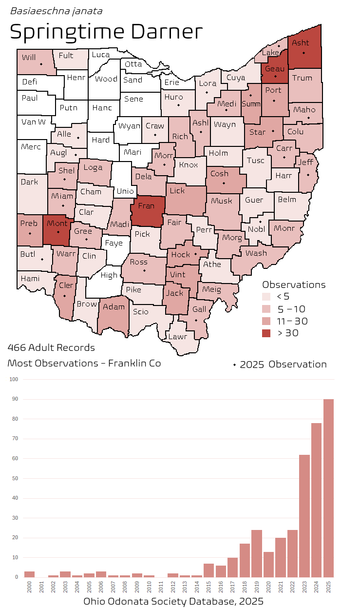
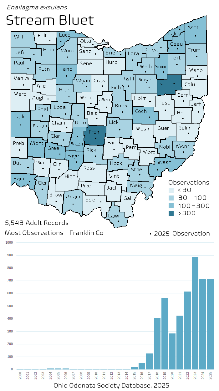
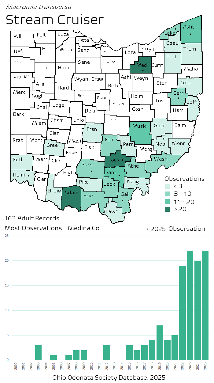
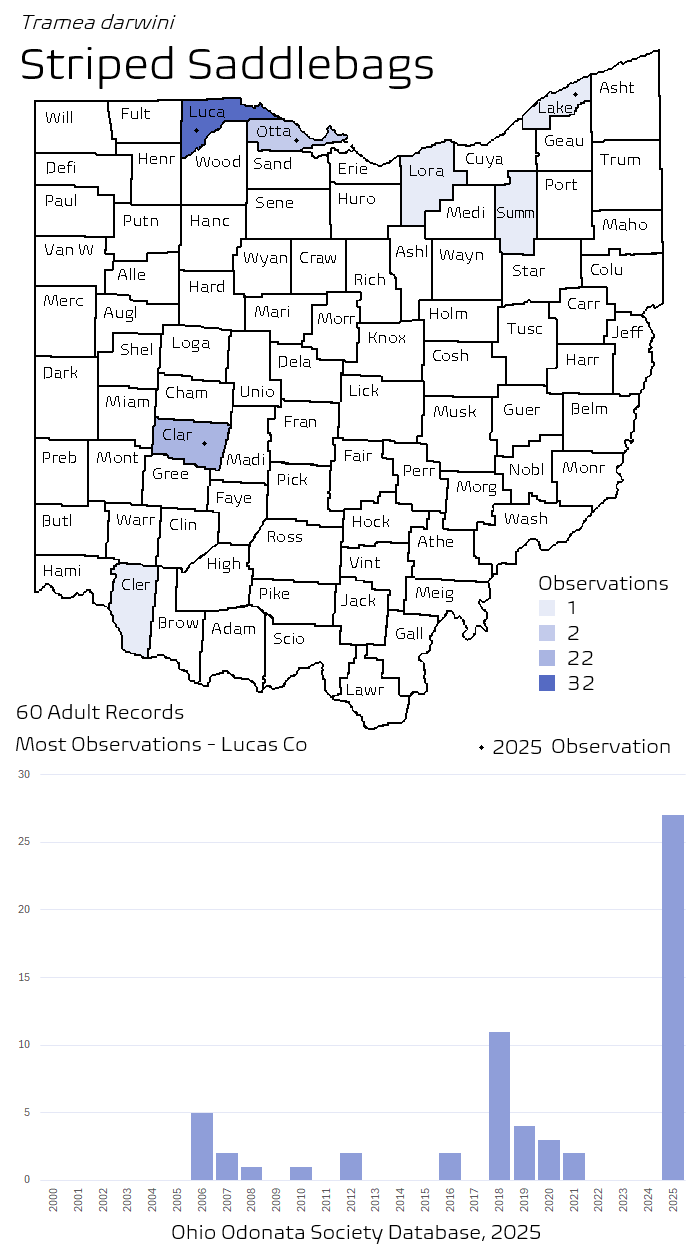
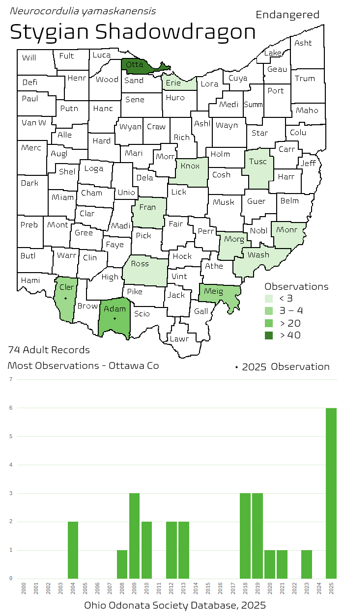
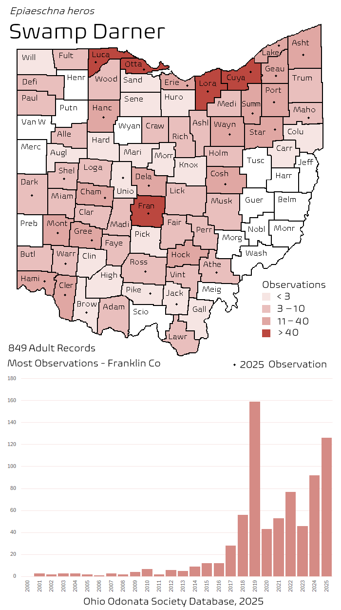
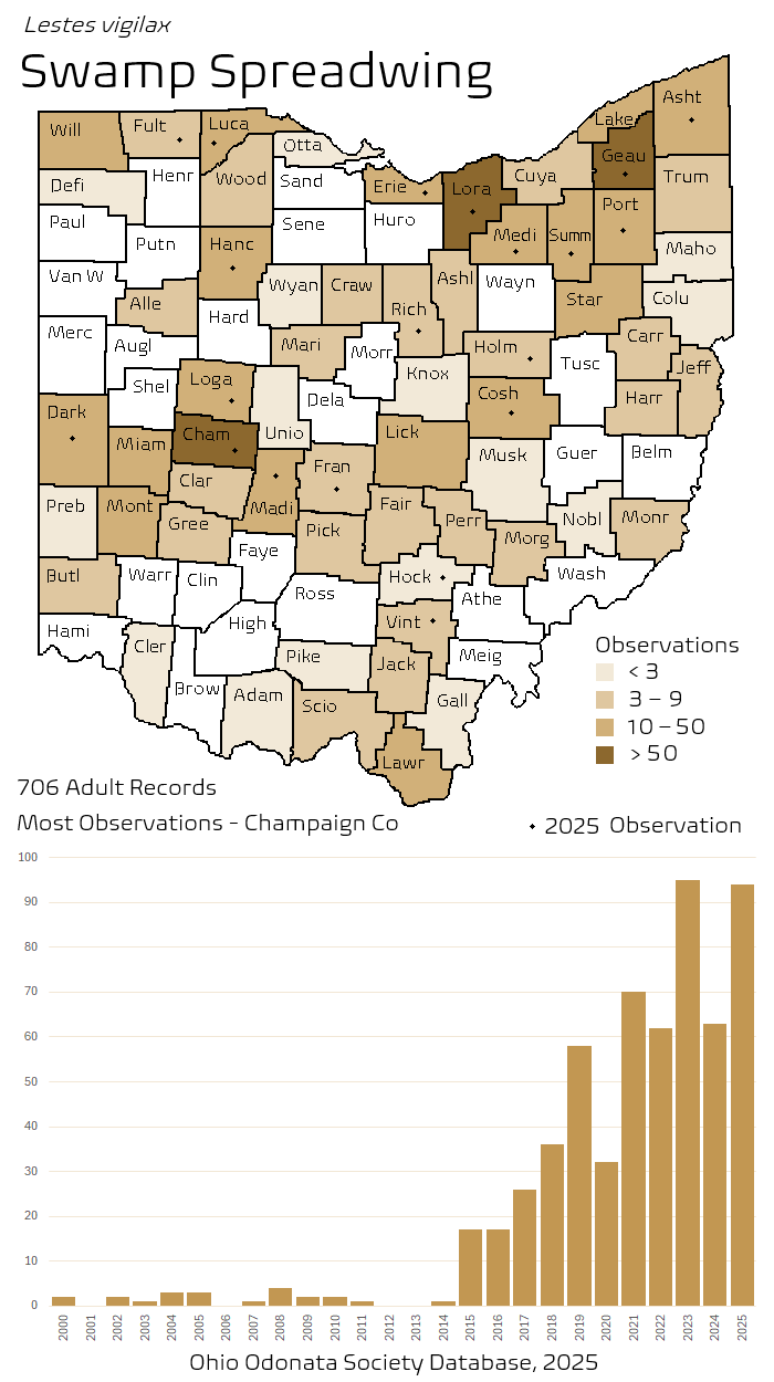
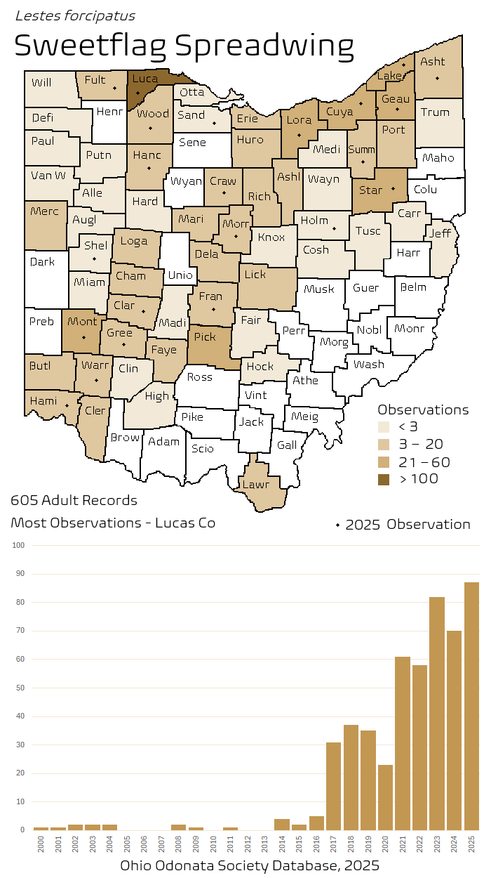
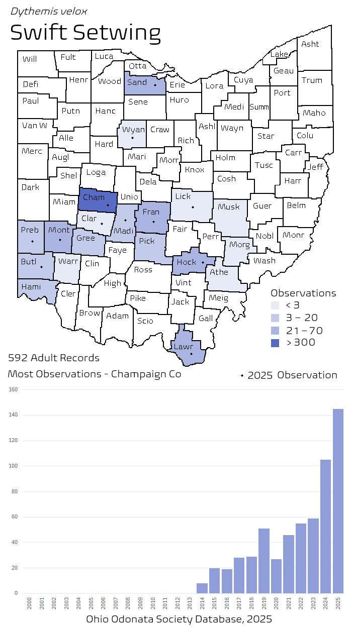
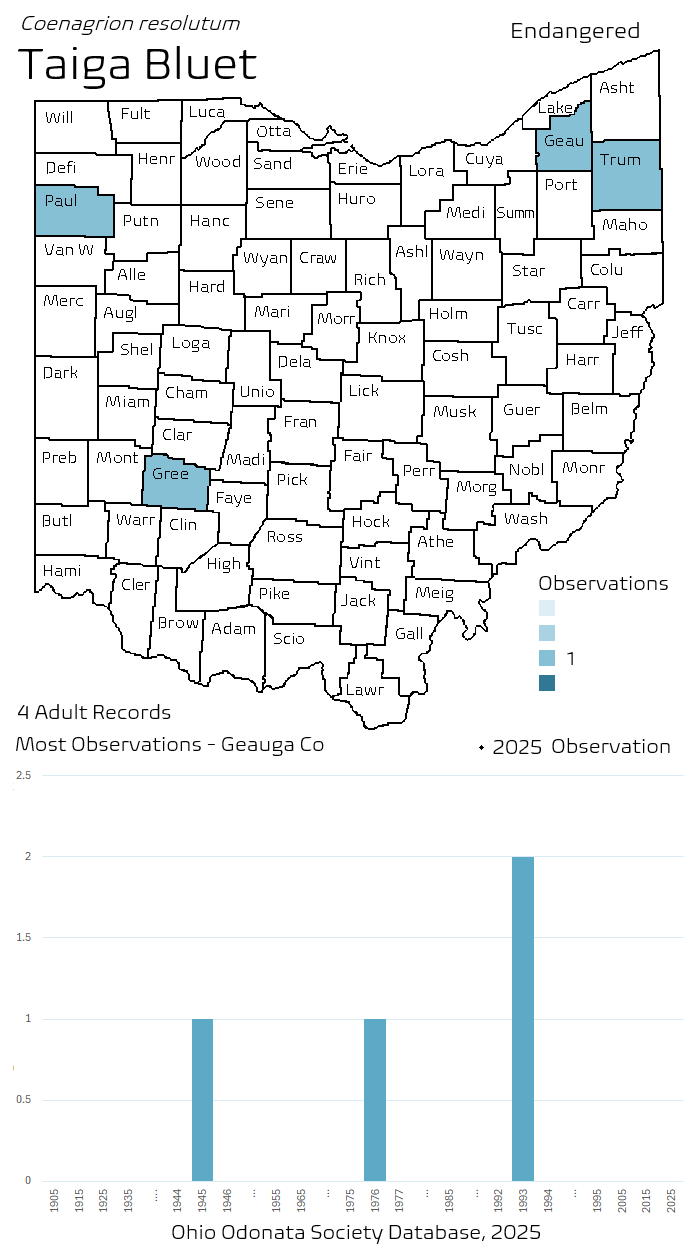
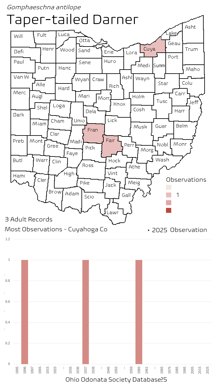
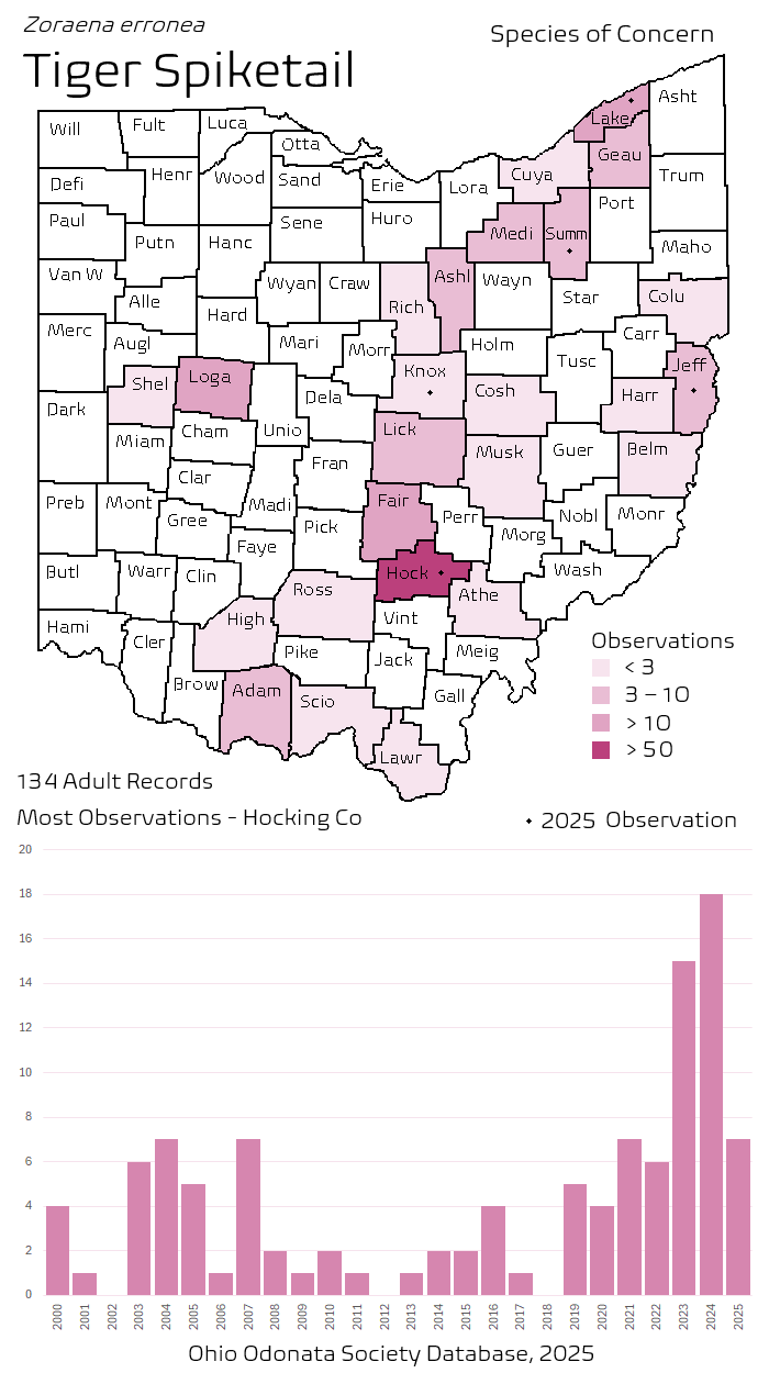
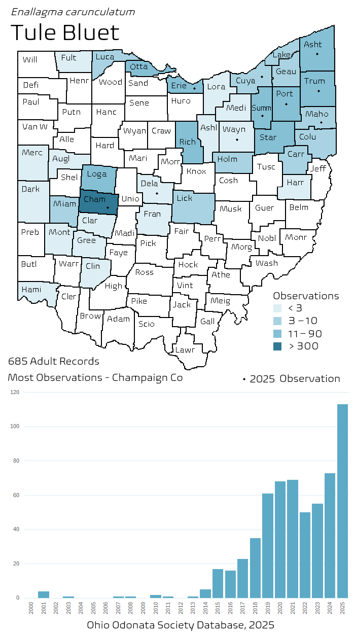
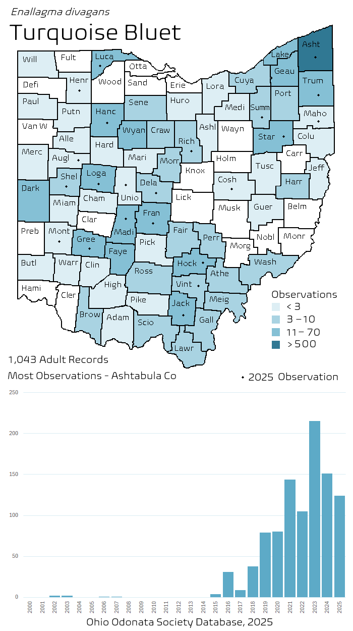
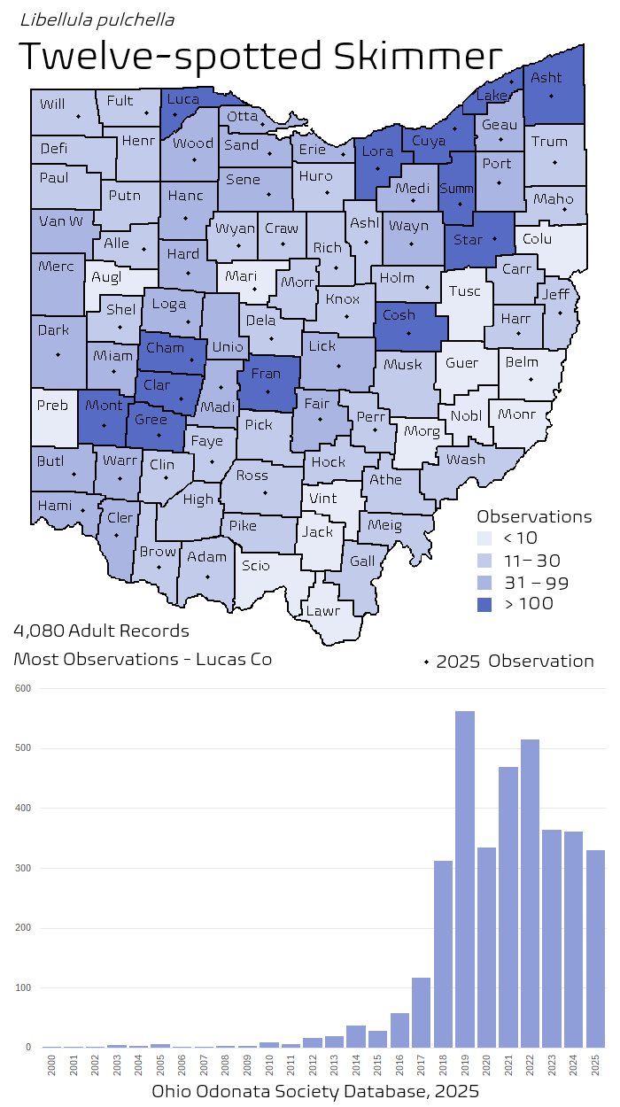
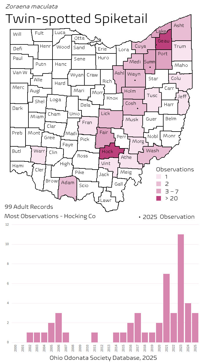
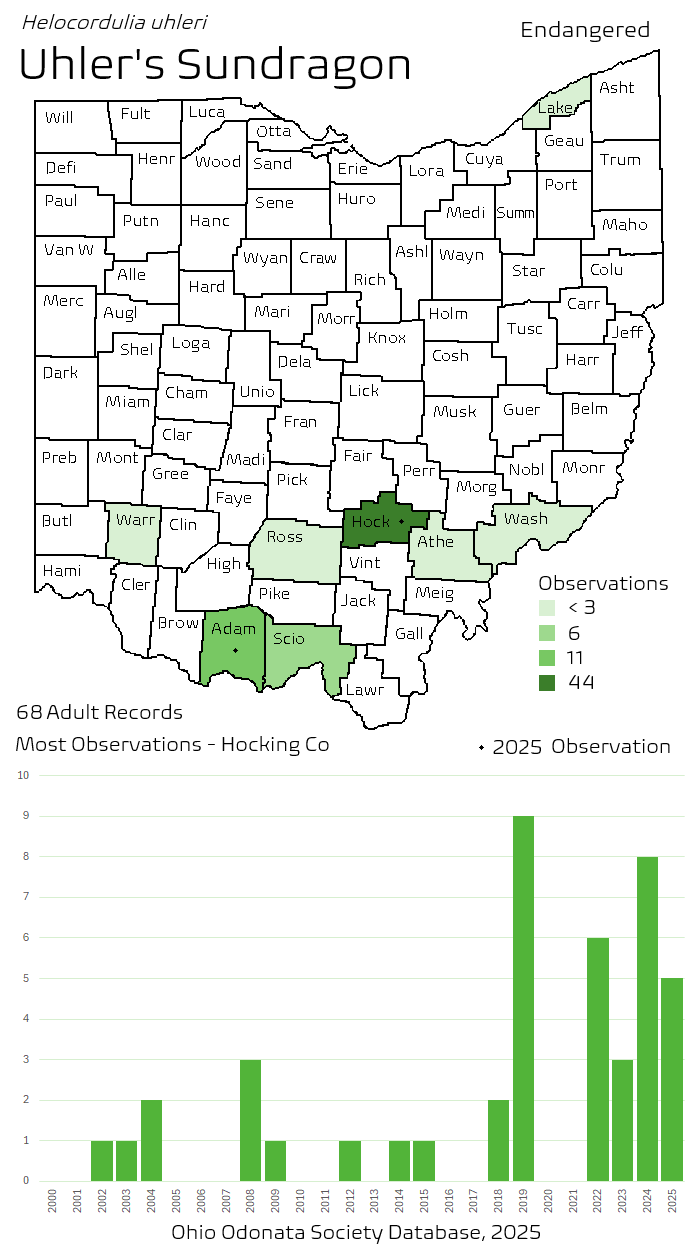
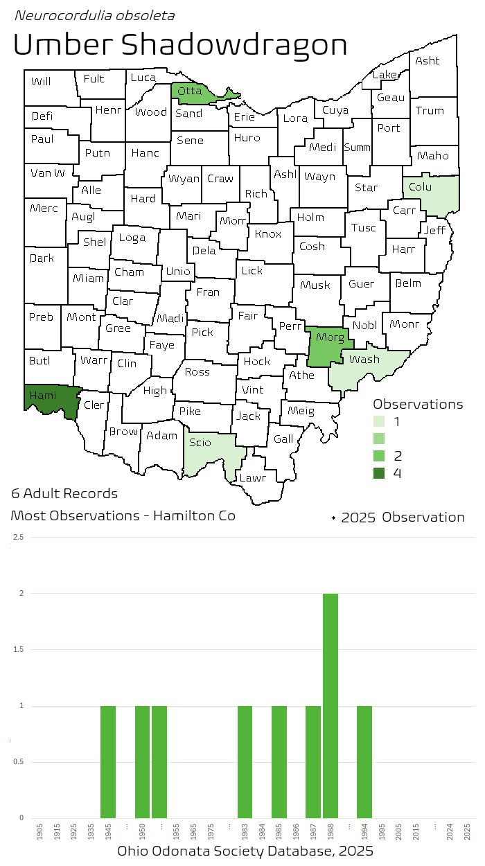
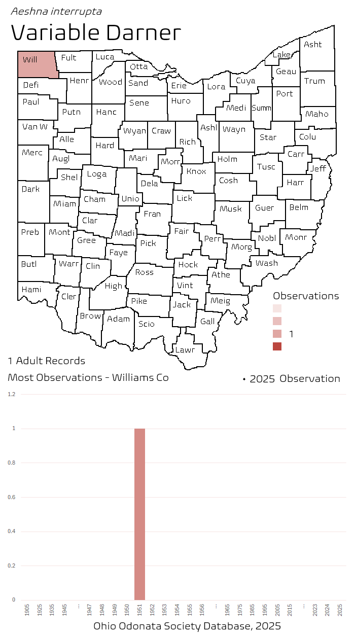
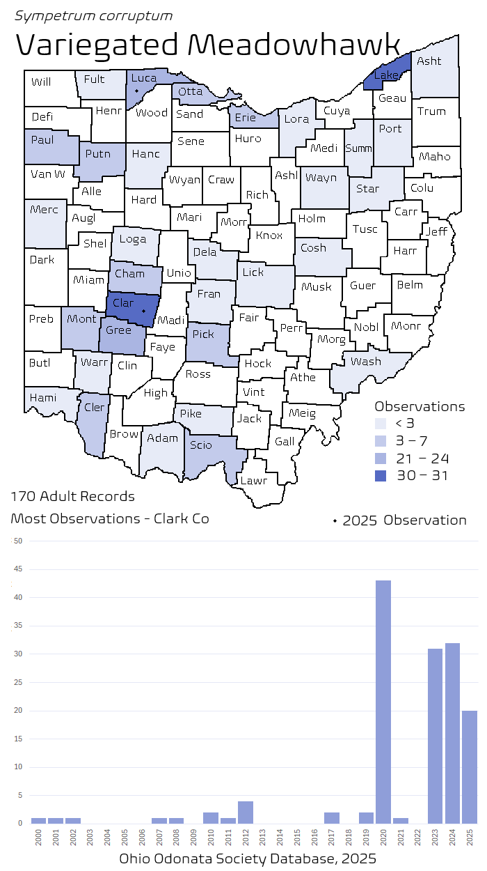
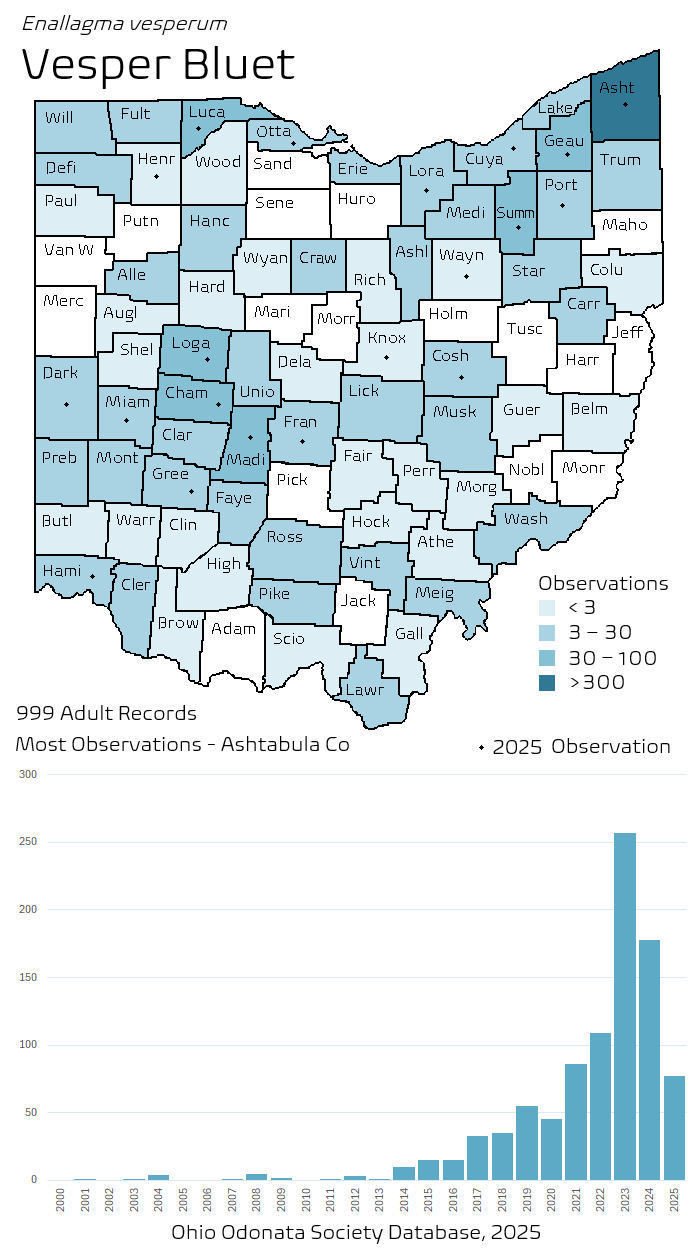
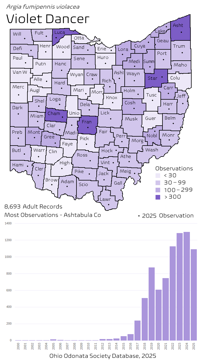
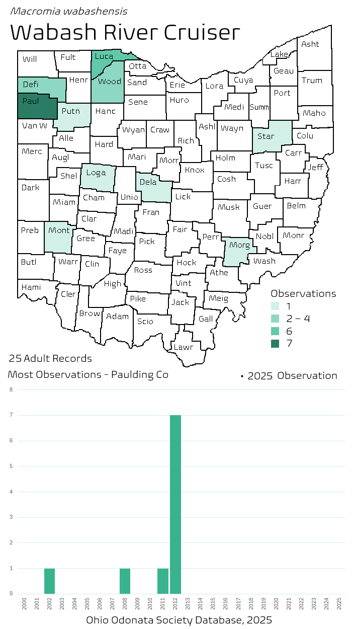
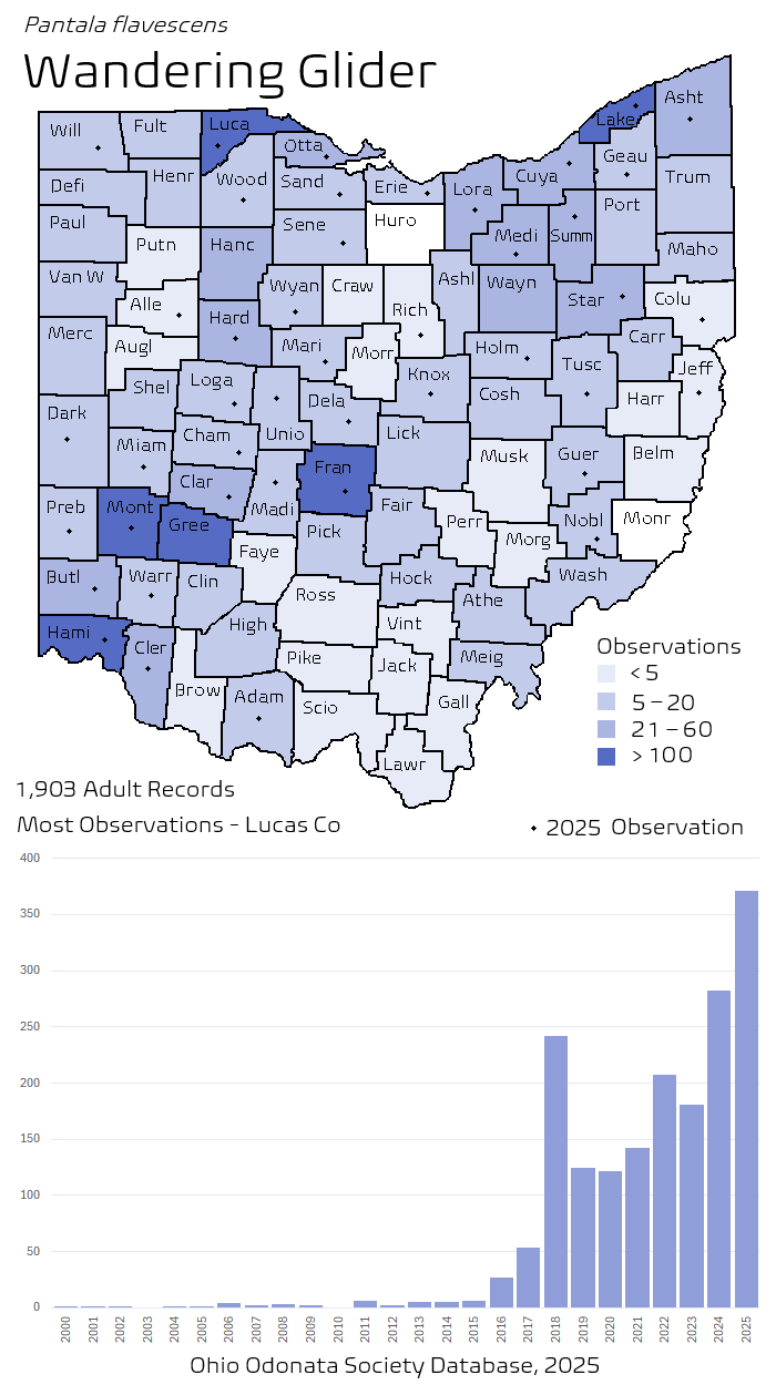
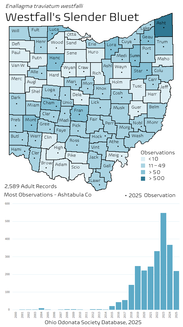
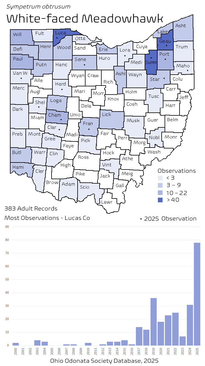
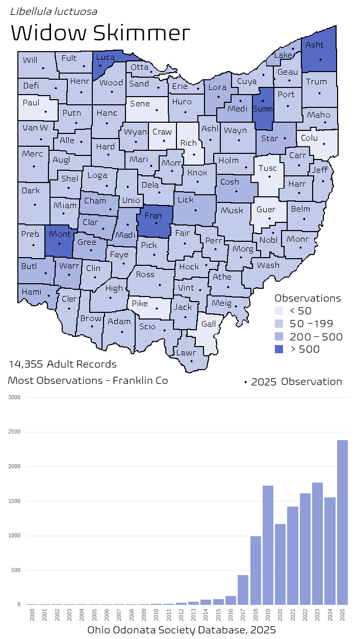
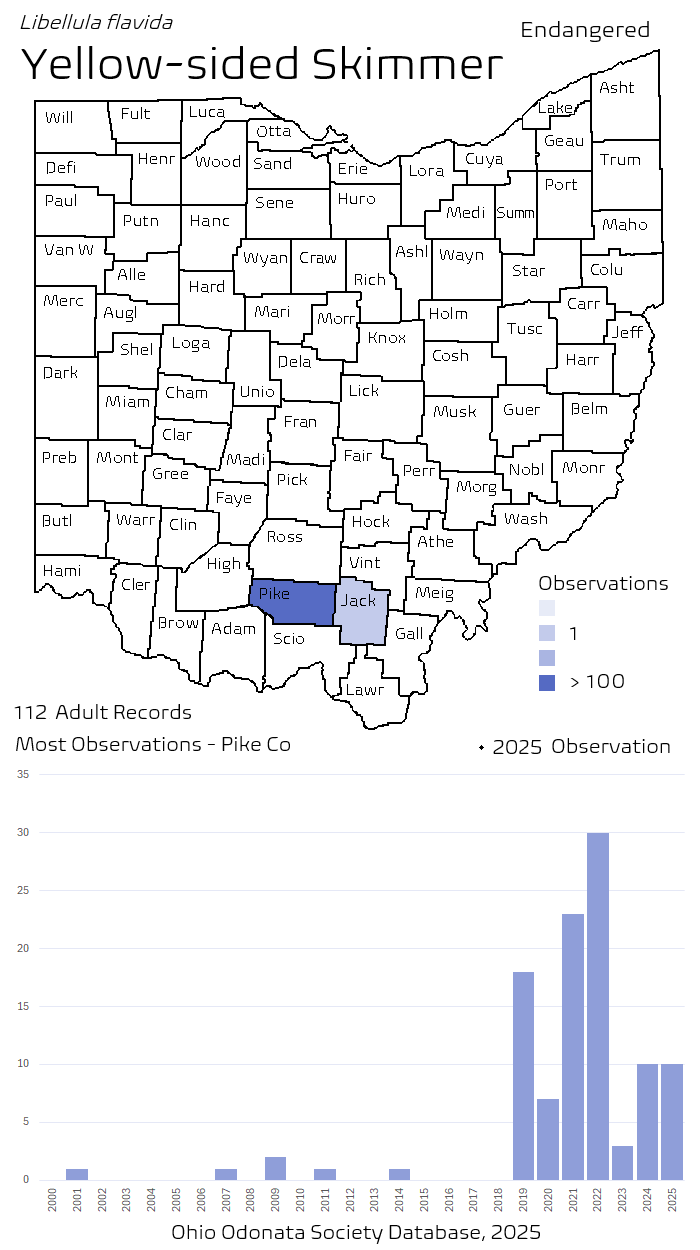
Species Frequency Maps provide insight into species population patterns geographically and chronologically over the previous 25 years.
In comparison to the Ohio Species Distribution Maps, which depicts the most recent observation of each species on a county by county basis, the maps on this page depict the number of observations of each species in each county. The county data depicted here is meant to be a sort of heat map, providing insight into each species’ relative population in each Ohio county, and the degree to which it might be increasing or declining in population.
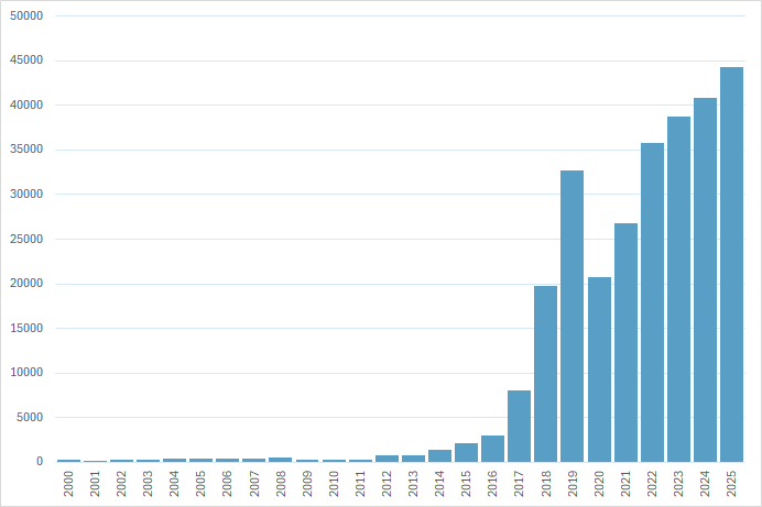
This data is significantly impacted in multiple ways by observation bias, but given the hundreds of thousands of odonata observations tracked by the OOS survey, and the lack of any other mechanism useful for measuring odonata population, it is reasonable to treat this form of information as a useful proxy for the actual geographic and chronological distribution of our damselfly and dragonfly species. For comparison, the bar graph to the right depicts the total number of annual observations for all Ohio species.